About
About 

"I did corrections on things, insane corrections." Patrick Lamar complains about comic publishers and page rates in court in 1941.
Posted in: Comics, Heritage Sponsored, Vintage Paper | Tagged: l.b. cole, power comics
The Pop Art Power Comics Style of L.B. Cole
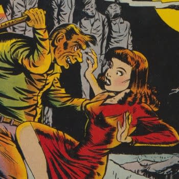
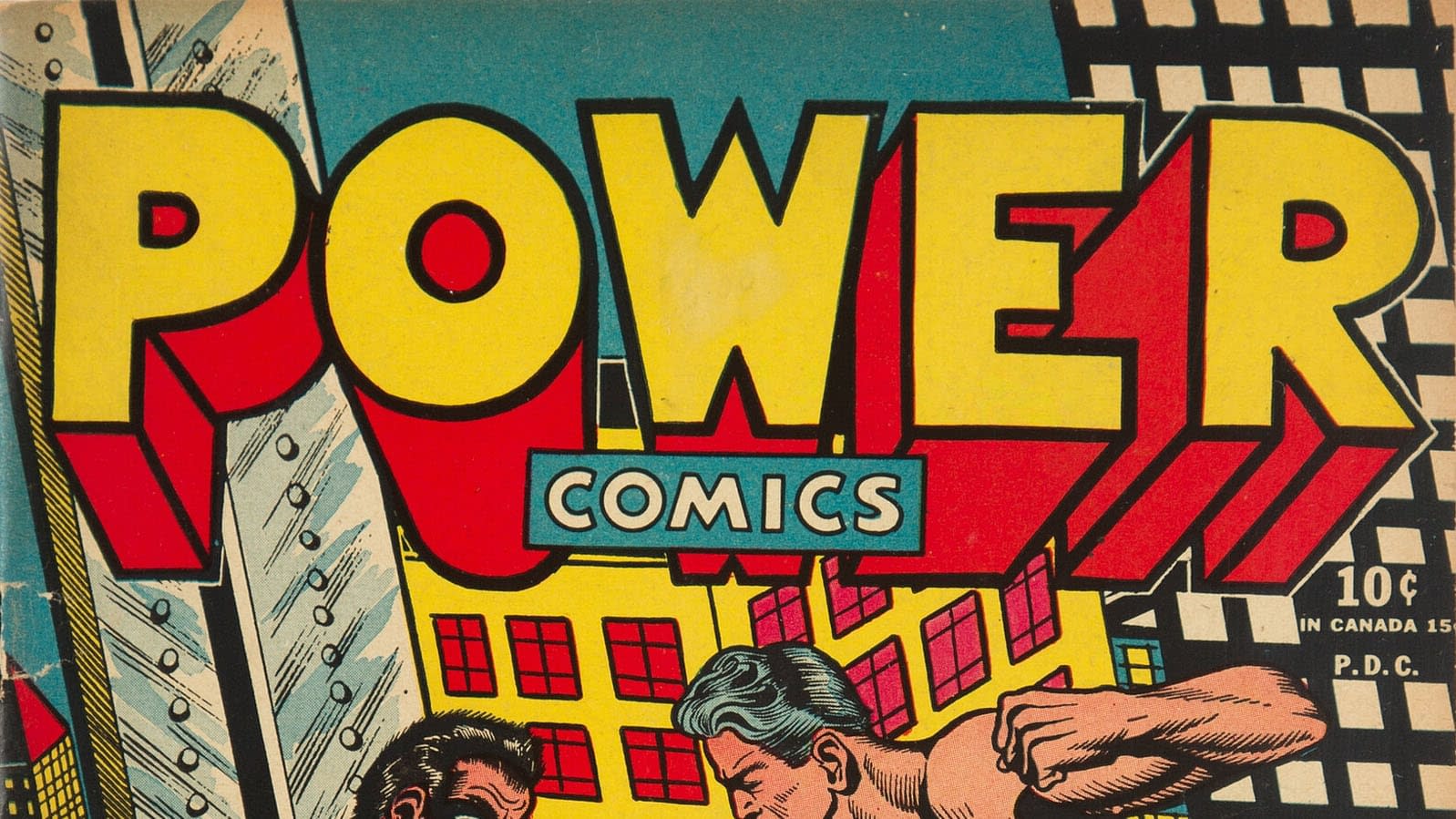
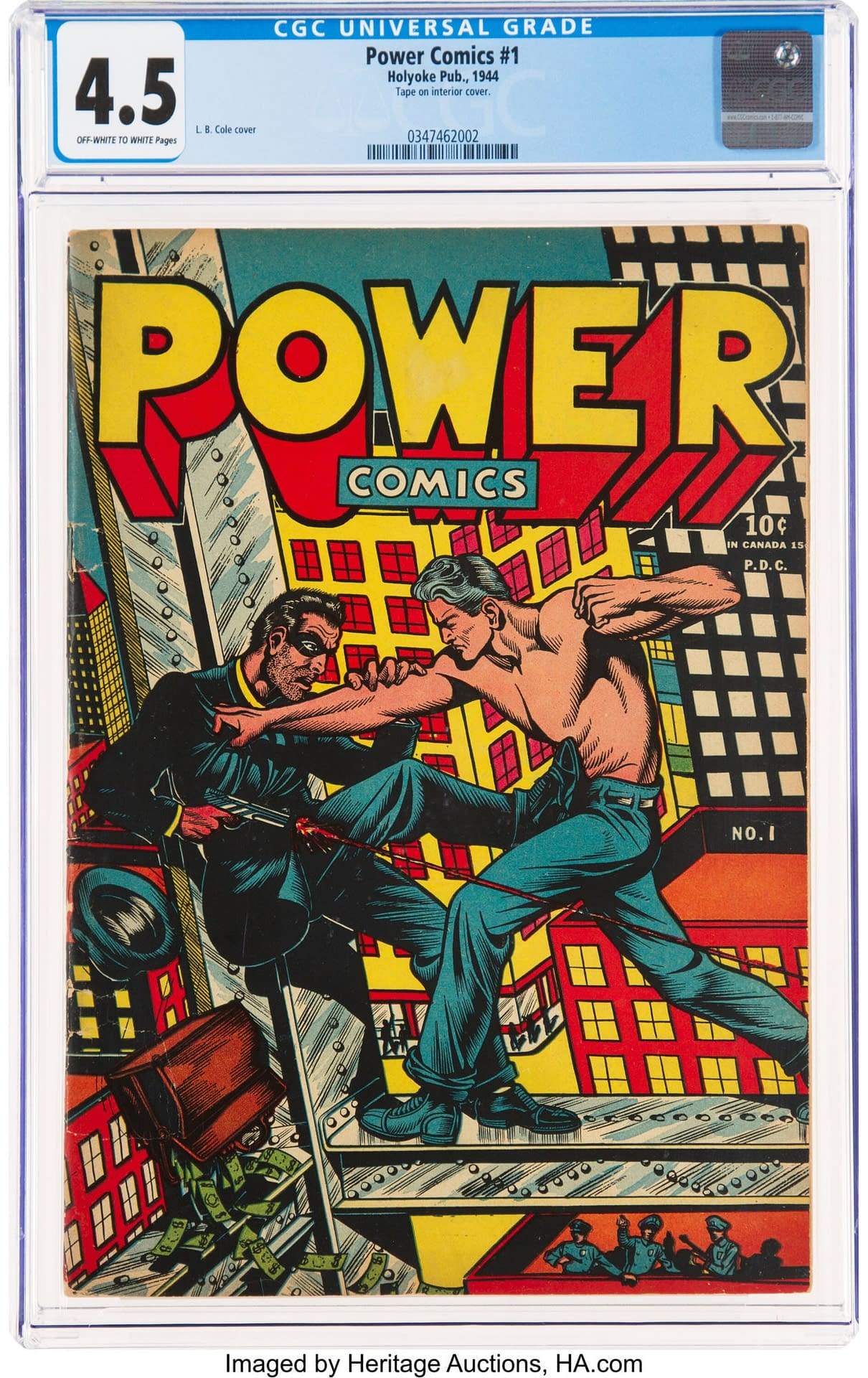
It takes a special kind of artist to raise entire publishing houses out of obscurity. That's all the more impressive when the appeal of that artist is largely based on his covers. While L.B. Cole is not the only Golden Age comic book artist for which this is true, his commercial art and design background made him uniquely suited for comic book cover art. "The covers were mostly designed as posters," Cole once said. "And when I speak of the poster effect, I mean that they should be seen. If they're not seen, they're not picked up, and if they're not picked up, obviously they're not bought." There's an excellent example of this poster art style as L.B. Cole was developing it on the cover of Power Comics #1 CGC 4.5 from 1945 in the current 2021 January 3-4 Sunday & Monday Comics, Animation, Video Games & Art Weekly Online Auction from Heritage Auctions.
L.B. Cole's development as an artist provided him with the sort of work experience that balanced artistic, commercial, and technical concerns. Born in 1918 in the Bronx, New York City, Cole went to work in his grandfather's cigar factory in the early 1930s, soon becoming interested in the label design aspect of the business. By the mid-1930s, Cole joined the art/design staff of Consolidated Lithographing Corporation, by that time the largest printer of cigar bands and boxes in the world.
That background would serve Cole well for what would come next. By 1943, Cole was working for Louis Goodman Ferstadt, whose studio provided art for a variety of publishers including DC Comics, Quality, and Ace. The Ferstadt studio also employed Harvey Kurtzman. Ferstadt was also a noted painter and muralist, and his comic book style is a clear influence on Cole's style. L.B. Cole quickly came into his own as a comic book artist and would start bringing his various experience to bear on covers around the time that he worked on the Power Comics series. Of this period, he would say: "I was always oriented toward newsstand sales, and these stylized covers drew readers. There was a riot of color out there on the stands and I figured something had to be done to catch the buyer's eye. Take a look at most of the other books: they're all done in a linear technique. All of the super-heroes… were a mass of figures kicking and punching and they all looked the same."
But L.B. Cole's covers did not look the same. They stood out among the riot of color on the newsstands, and through the course of American comic book history. There's an excellent example of this poster art style as L.B. Cole was developing it on the cover of Power Comics #1 CGC 4.5 from 1945 in the current 2021 January 3-4 Sunday & Monday Comics, Animation, Video Games & Art Weekly Online Auction from Heritage Auctions.

Affiliates of Bleeding Cool buy from and/or consign to Heritage Auctions.
Enjoyed this? Please share on social media!
Stay up-to-date and support the site by following Bleeding Cool on Google News today!