About
About 


Al Ewing writes and Todd Nauck draws the new weekly USA Today Spider-Man - or is it Alan Partridge?
Posted in: Comics, Dark Horse Comics, DC Comics, Image, Marvel Comics, Rebellion / 2000AD, Titan | Tagged: akira, charley's war, Comics, graphic novel
When Graphic Novels Just Don't Stack Up On The Bookshelf: Part 2
Last week, Bleeding Cool ran an article, When Graphic Novels Volumes Just Don't Stack Up On The Bookshelf.
Last week, Bleeding Cool ran an article, When Graphic Novels Volumes Just Don't Stack Up On The Bookshelf. It was rather popular. And inspired many others to get in touch and show their most egregious examples of when collected graphic novel series offend even the least OCD amongst us.
Fabian Charlton sends us a shot of his Black Lagoon graphic novels. telling us that he "would just like to share my pain. It's been bothering me for a long time that vol 4 says does not have a large red V like the others."

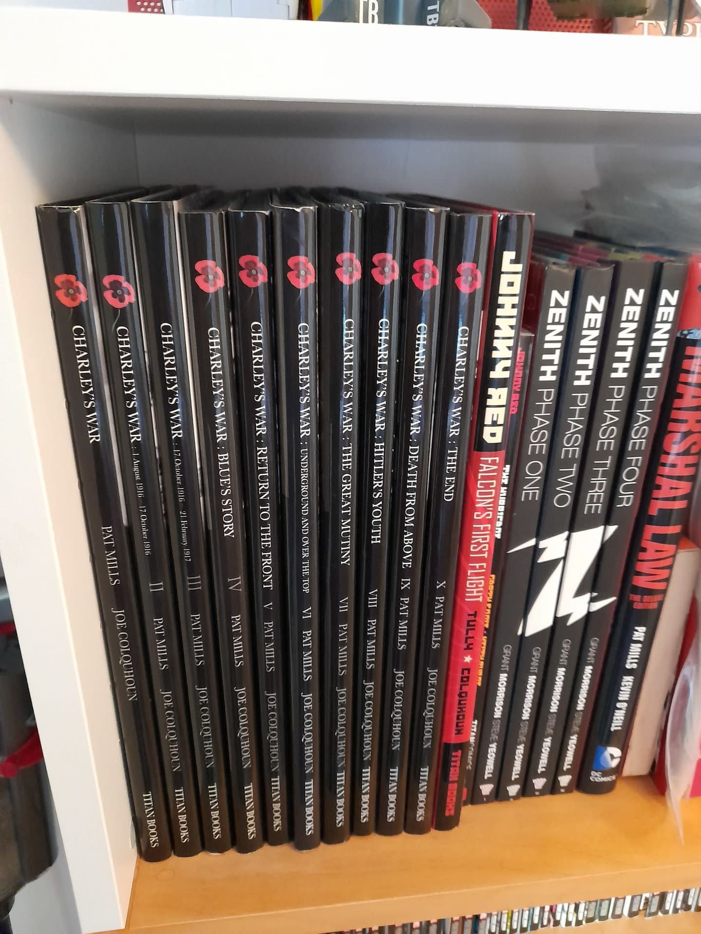
Lewis Brown is one of a number who noted this one. "Why no poppy on vol 3 of Charley's War? And the placement of the creative team after vol 1…"

He has a couple more as well, such as the Akira hardcovers, "book 1 looks jarringly unaligned…" Ignacio Alcuri from Uruguay is all about a lack of bold in Batman: No Man's Land volume 2…

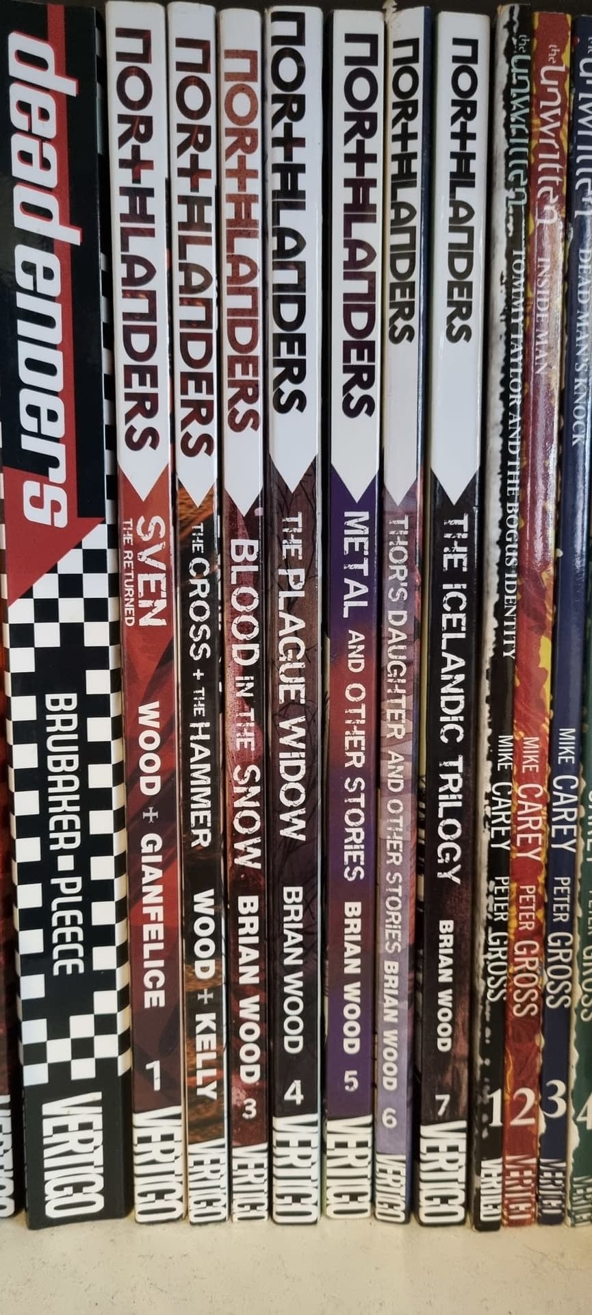
While Northlanders is all higgledy-piggledy.
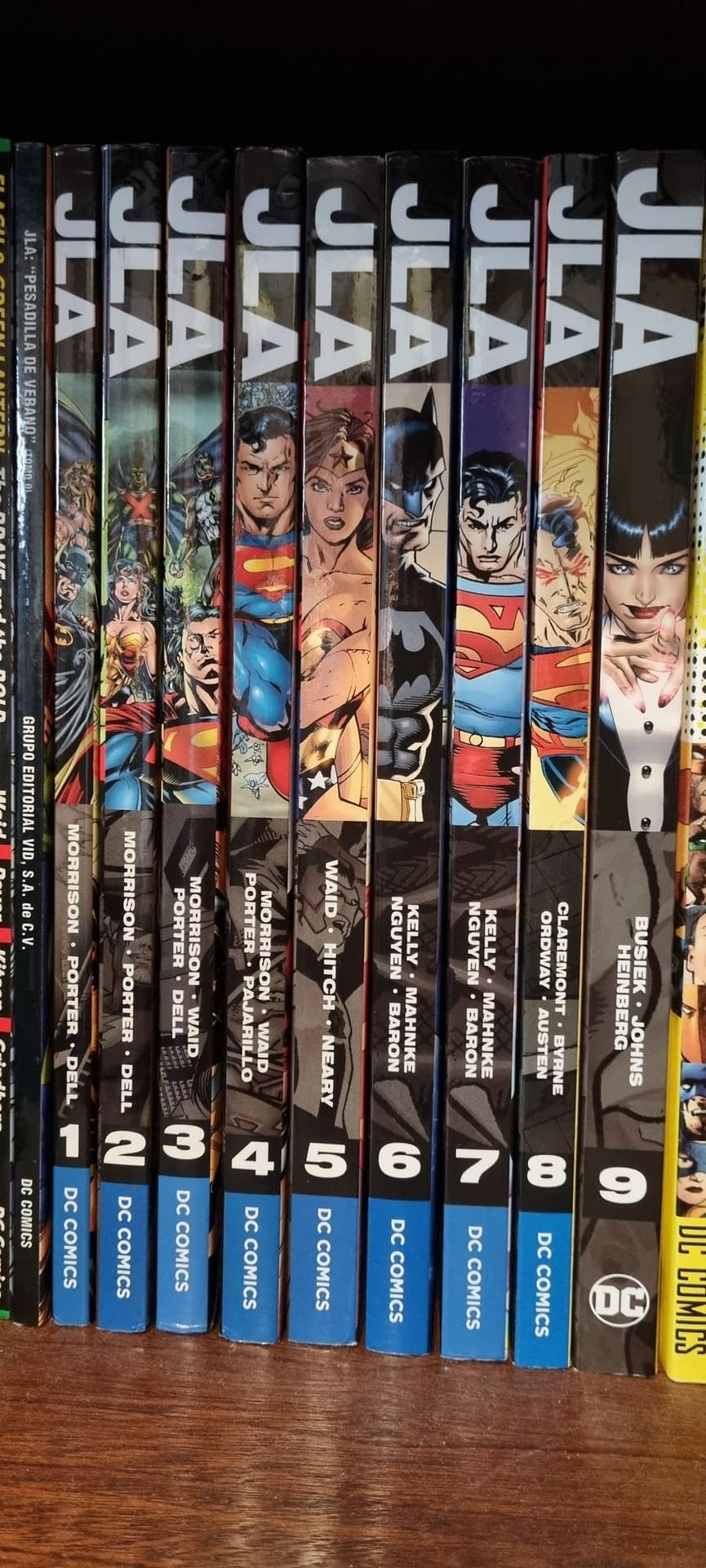
And JLA suffers from a sudden change of logo for the ninth volume…
James W. Shirley, tells about The Invincible Iron Man, lined up in order, telling us "Fear Itself should have been volume 9 in the series. To this day it still pisses me off that Marvel did this."

Stewart Brough has a few to share, but this may be the most offensive.

He states "WHY DOES THE NINTH ONE HAVE A COLOURED LOGO?!?!?!?!?! If you look carefully you can see that all the colours used for the numbers are also used for the Image logo at the top but the ninth one for some inexplicable reason decided to do it for the Invincible logo too. If they were all differently-coloured I wouldn't have an issue (this is what the compendiums did). If maybe the second or third one had done it I'd be annoyed but understand considering they were just getting started but the ninth?! The first volume came out in 2005 with the ninth in 2014. That is 9 years of not screwing up the covers before an inexplicable brain fart happened. Then they just go back to the standard scheme too?! That feels like a final f-ck you just to make it stand out even more. Also just as a quick note I only started buying Invincible hardcovers last year so all of these were bought in the last 12 months. It had been 6 years since the ninth one was published before I started buying them so they had some time to maybe think about fixing this. If I ever meet Robert Kirkman this will be my one question to come, I will just need to refrain from yelling it."
No, Stewart, tell us how you really think. Gregory White from Tennessee tells us "I'm a 22+ year graphic design veteran, and when I saw volume 2 of the series Lazarus from Image arrive, my mind went full rage. I hate this oversight/terrible decision. "

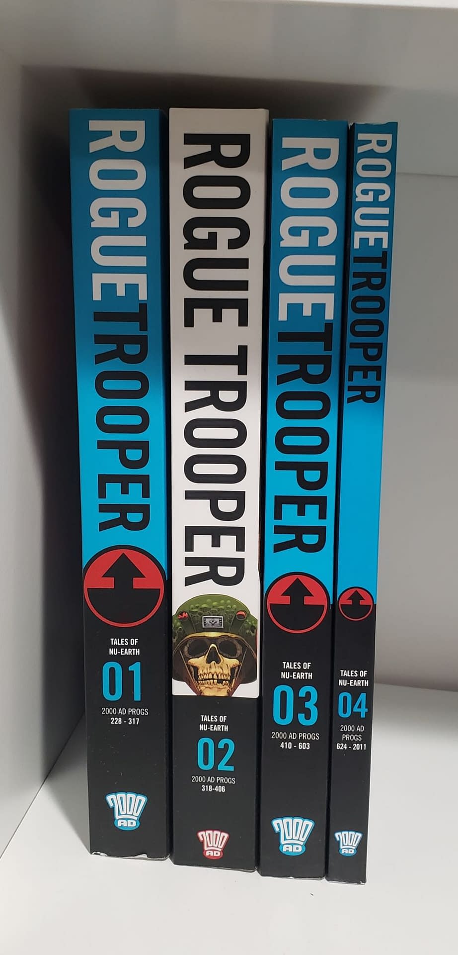
John Kuczaj shows us a horrible sight for Rogue Trooper.
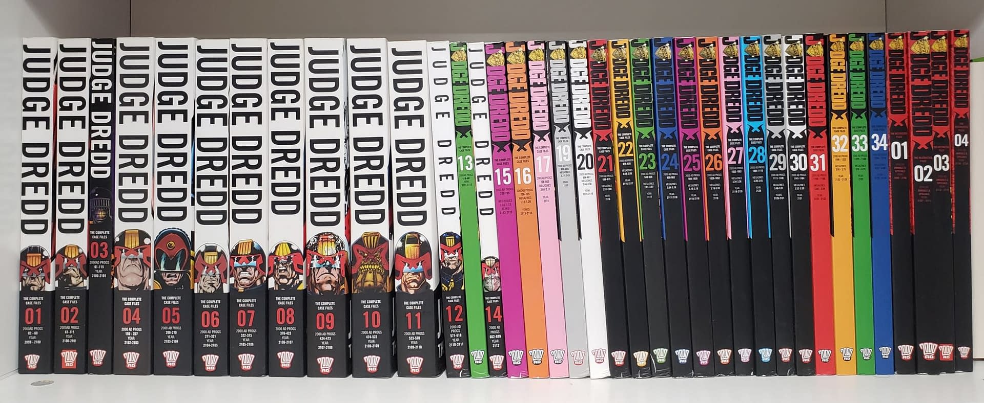
As well as wondering what on the Cursed Earth happened to Judge Dredd Vol 3 and 13 while everything changed…
Eric Schaefges looks to Pirates Of The Silver Coast standing out…

…. but saves his greatest disdain for these Daredevil Omnibuses.

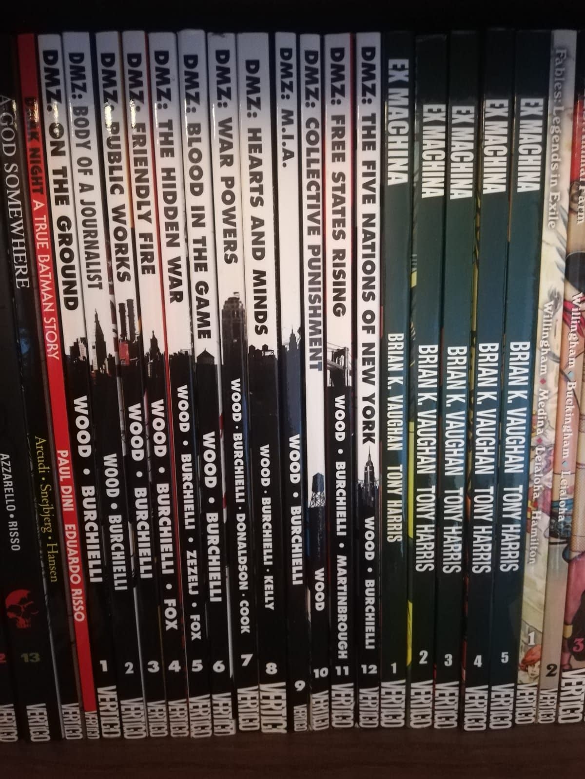
Mert İdil looks at the mess that is DMZ – each spine forming a skyscape until vols 10 and 12 ruin it all…
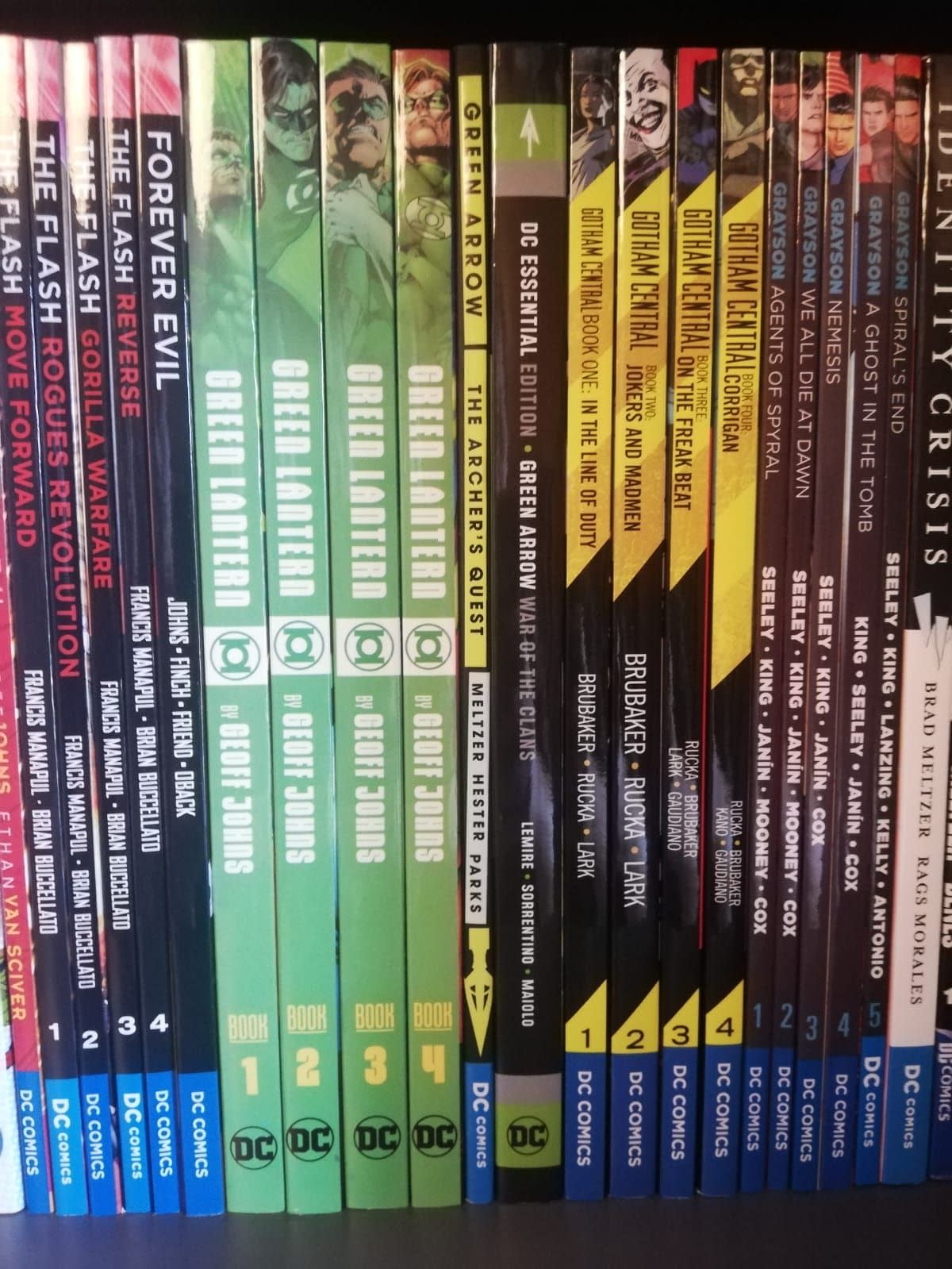
While the wrong placement of the Green Lantern logo buy a fraction may annoy – what is it with Gotham Central Vol 4?
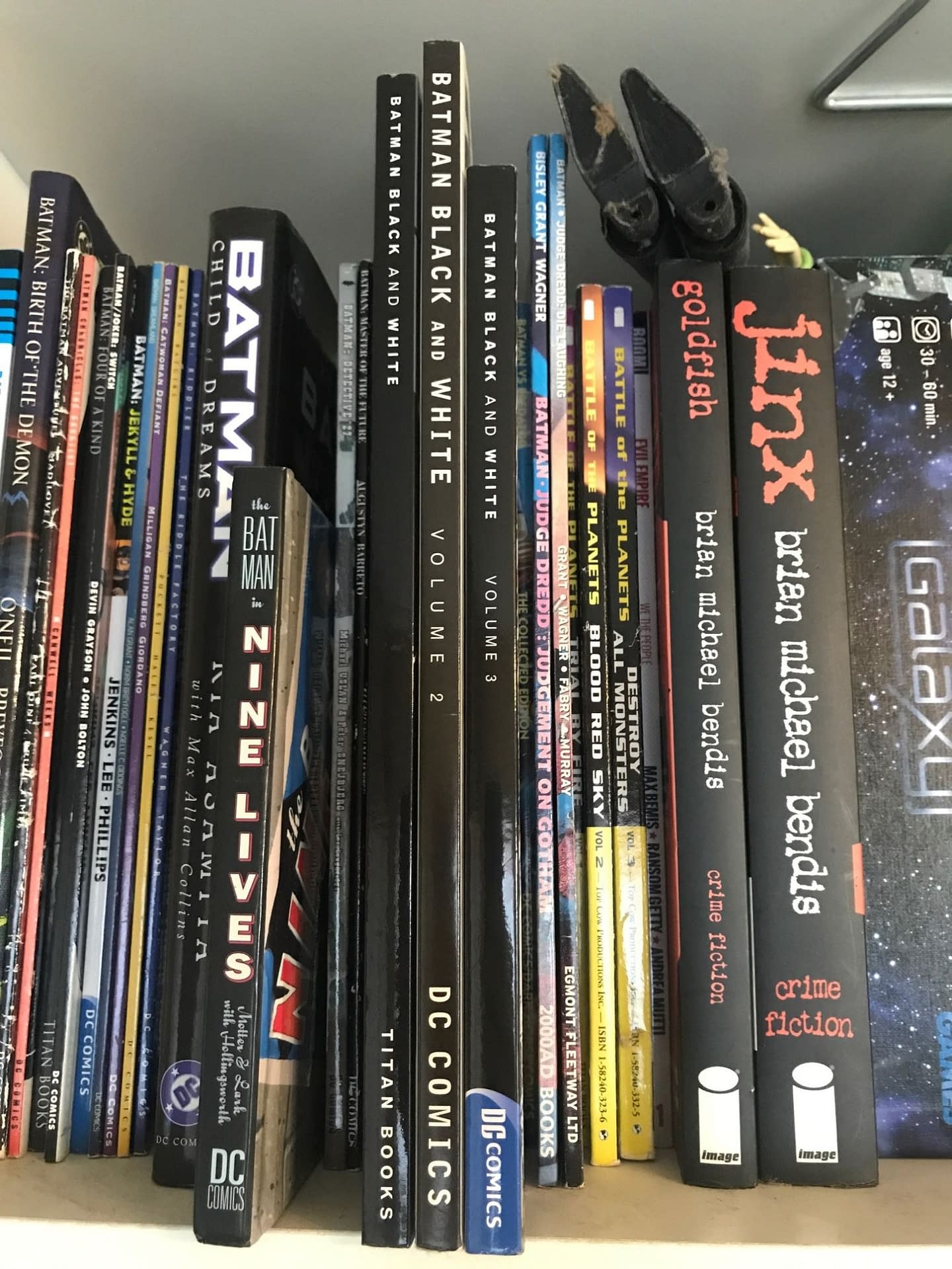
While for Batman Black & White volumes 1-3, as Dan Condon-Jones writes, they couldn't even keep the same height…
Any more for any more?
Enjoyed this? Please share on social media!
Stay up-to-date and support the site by following Bleeding Cool on Google News today!