About
About 
Hello BC readers, it’s been a while. I’ve been off working on comics (The Freeze Vol 1 trade from Image Comics/Top Cow is in stores now…) but after
Posted in: Comics | Tagged: anthony del col, Comics, Dave Bullock, dynamite, entertainment, nancy drew, The Hardy Boys
Writer's Commentary – Anthony Del Col Talks Nancy Drew & The Hardy Boys: The Big Lie #2
Dynamite has sent over a writer's commentary featuring Anthony Del Col talking about his latest pulp inspired Nancy Drew & the Hardy Boys: The Big Lie #2, which hits stores today. Cover art by Dave Bullock and interiors are by Werther Dell'Edera.
PAGE 1
My lovely wife Lisa and I took a trip to Portland, Maine last summer and went out on a lobster fishing boat to learn more about the process. I asked all sorts of questions about the business and how lobsters are caught, and tried to capture (pardon the pun…) the entire process in a span of a couple panels. Unlike a lot of hunting or fishing, the traps have been designed to trap the prey yet keep it alive until the fisherman pulls it up. Really interesting.
Werther (Dell'Ederra, the artist) has done a great job with the lobster illustration here. I know that some animals are REALLY tough to draw (horses apparently are the worst for some artists) but I think he caught the feel here.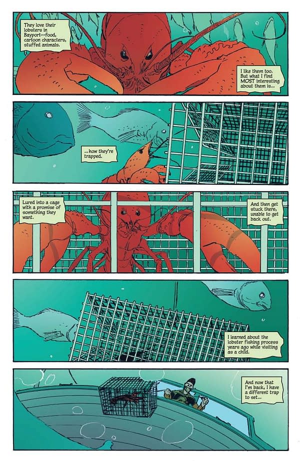
PAGE 2
And now we really start to meet our heroine, Nancy Drew. I had a lot of fun teasing her in the first issue (we don't meet her until the final page of Issue #1) but, as you'll see, this is really her issue.
The goal was to show in this full-splash page that she's in charge. She's appears as the largest with the light shining on her (like a spotlight), and both Frank and Joe are deferring to her. But I like that Werther's still kept her face a bit of a mystery – we're learning more, but slowly doing so…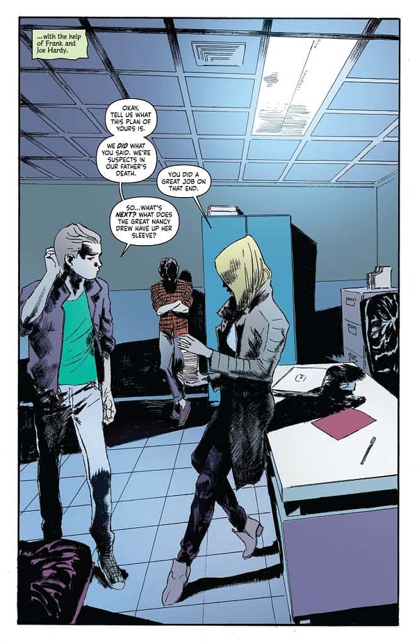
PAGE 3
All great drama comes out of conflict. And here (specifically in Panels 2 and 3) we see the conflict between Frank and Joe, and how they have different approaches. Frank's laidback while Joe's a little more antsy. And Nancy serves as the referee here (with a literal time-out in Panel 4).
I like that the first time we really get a good look at Nancy's face (and eyes) is in the close-up in the final panel. Stefano Simeone, the colorist, continues his stellar work with not only this page but the entire issue. We'll see on the next page his contrasting style in the flashbacks but the cold, purples and blues at the beginning. So great.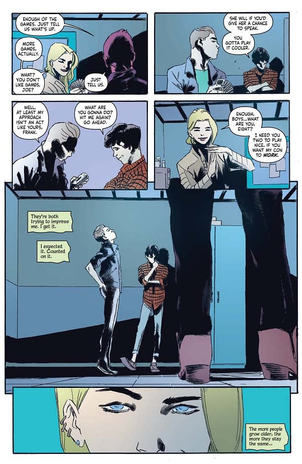
PAGE 4
How could we NOT put a shot of Nancy Drew with a magnifying glass? And… spoiler alert… it may not be the last time we see her hold one in this series…
I really enjoyed writing this flashback sequence, especially these two pages. In some sense it's a sort of continuity – Nancy, Frank and Joe HAVE taken part in a number of mysteries over the years but some of them were when they were younger (like 8-year-old children, in this scene). Doing something like this is a nod to the fans of Nancy Drew but also gives me freedom as writer to give them a past history. They're not meeting themselves for the first time but instead know each other from years ago.
On a side note, my wife asked me recently if there was anyone from my past that I had lost contact with, wondering how they are. I immediately thought of my childhood days and friends that I used to visit the playground with. Where are they today? Do they look the same? Act the same? Nancy, in this page, acknowledges that Frank and Joe are older but in many ways are the same.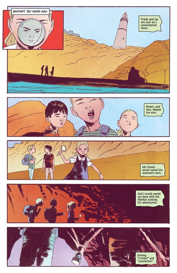
PAGE 5
I have to give a shout-out to one of my editors, Matt Humphreys, here. Very early on in the process he mentioned that his favorite Hardy Boys' title was "The Case of the Missing Chums". So as I was constructing this scene I thought I would throw it in as a reference point, something that only hardcore fans of the Hardys would get. Yes, Easter Egg alert…
I love what Werther's done in the final panel. You can tell Frank and Joe, even at age 8, are both infatuated with Nancy. And who wouldn't? She was (and is) fearless, decisive and in charge. Qualities that they'll need quite a bit in this adventure.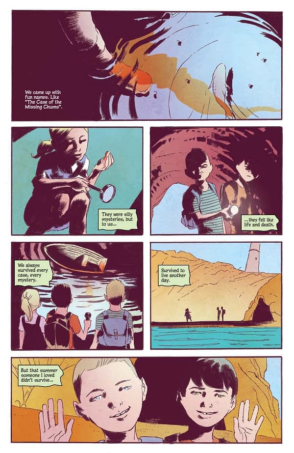
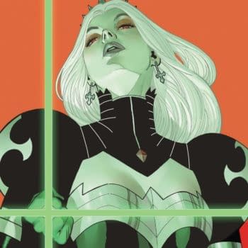
COVER B (Dave Bullock cover)
In the last Commentary I raved about Fay Dalton's work as the primary cover artist. I'm happy to repeat myself but would like to drill down on this cover by Dave Bullock, who is a great illustrator and animator that needs to do more comics (he's spent a great deal of time working in television). I find his work similar to that of Darwyn Cooke, who was not only an inspiration for this series but also my comics career, so I jumped at the opportunity to have Dave and this style featured in the series. I'm really happy with how it turned out, especially the color scheme. The salmon (I'm horrible with the names of colors…) of the titles really pops, as does the blue and purple. Such a great cover.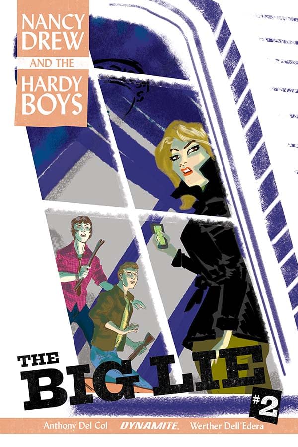
Enjoyed this? Please share on social media!
Stay up-to-date and support the site by following Bleeding Cool on Google News today!