Posted in: Comics | Tagged: bucky, bucky barnes, iron man, kyle higgins, marvel, Rod Reis, sharon carter, tony stark, winter soldier
Winter Soldier #1 Review: Bucky's Got a Brand New (Boring) Bag
SUMMARY: Writer: Kyle Higgins, Artist: Rod Reis, Letterer: VC's Clayton Cowles,Associate Editor: Alanna Smith, Editor Tom Brevoort, Varant Covers: Bill Sienkiewicz; Butch Guice & Frank D'Armata, Publisher: Marvel Comics, Release Date: Out Now, Price: $3.99.
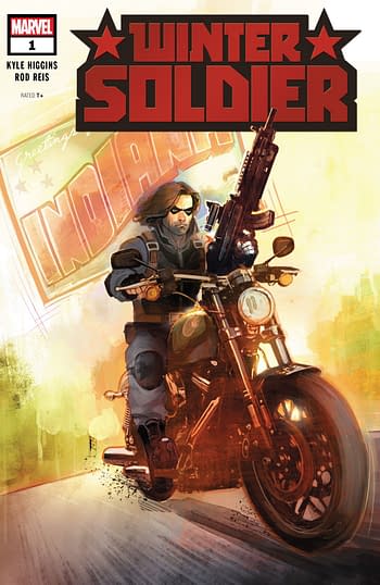
This new Winter Soldier mini (by my count the sixth WS series in the last 7 years) seems focused on setting Bucky Barnes up in a new status quo, jettisoning some of the baggage that the character has accumulated over the years (the Thunderbolts team and being some sort of space cop for instance) in favor of a grounded gritty approach that wants to be reminiscent of Ed Brubaker's work on the character or his depiction in the movies.
Writer Kyle Higgins (of Power Rangers fame) and artist Rod Reis (Secret Empire) are only partially successful in this. It's grounded sure, but up until the very end I'm afraid that (to me at least) it all comes across as deathly dull.
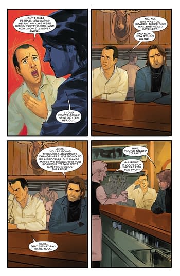
Bucky (aided by Captain America's erstwhile love interest Sharon Carter) has set up a system to help whistleblowers – giving them the opportunity to enter a kind of witness relocation program he manages. This is mostly explained in dull expository scenes featuring Carter and – in what seems like a gratuitous cameo – Tony Stark.
Iron Man may play a part in the story as it pans out so this is perhaps an unfair criticism, but in this issue he functions basically as someone for Carter and Barnes to explain their new set-up to. It's all a little clunky.
Reis' art is very reminiscent of Phil Noto's work – but unfortunately right now he lacks Noto's skills as a draughtsman – his figures and faces coming off as stiff and uniform. Reis is doing full art including colors on this book and he does communicate mood well – especially in the early scenes set on a rainy New York night – but as the issue progresses that mood is too often drab and pedestrian.
At the very end of the book a new character is introduced in a dramatic splash page that sets up the next issue. This intro is a burst of colour, a welcome relief from what comes before and a visual that hints at an interesting play on Barnes' history. It may be too little too late for most readers though.
Hopefully that last page it is a sign that the creators will pick up their game in the following issues –for now though there's lots of great books out there – this may be one to skip unless you are a big fan of the character.


