Posted in: Comics, Dynamite | Tagged: A Clash of Kings, game of thrones, landry walker
Landry Walker's Writer's Commentary: A Clash Of Kings Vol 2 #4
Landry Walker has a Writer's Commentary for A Clash Of Kings Vol 2 #4, on sale now from Dynamite, He writes,
Hi people! I hope all is well for everyone reading this and that you are staying healthy and safe. We're back with another look at the adaptation process of GRRM's A Clash of Kings.
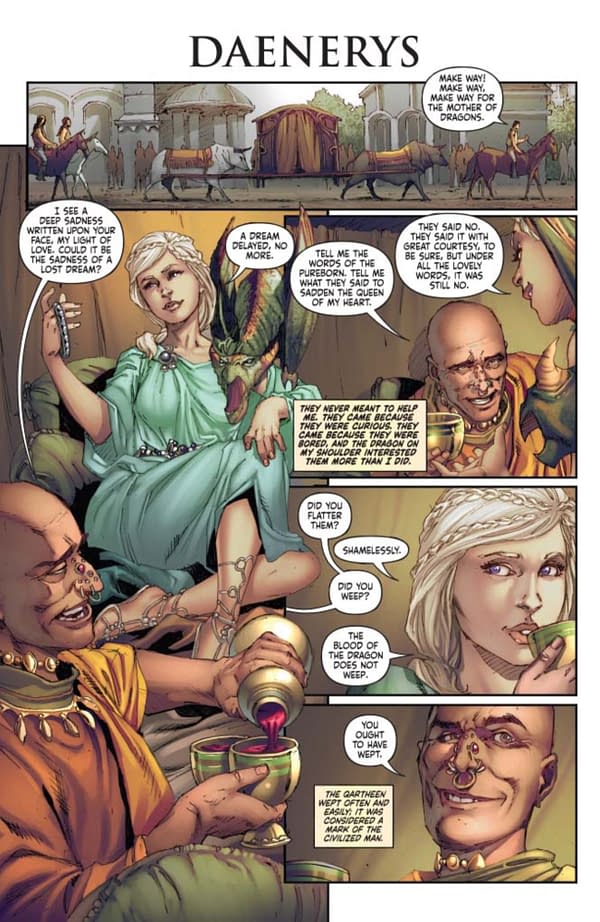
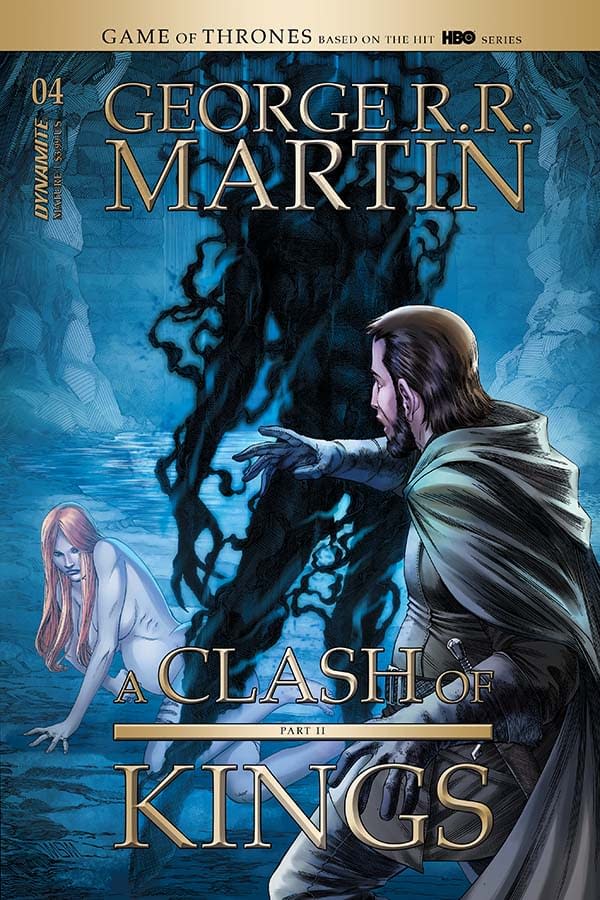
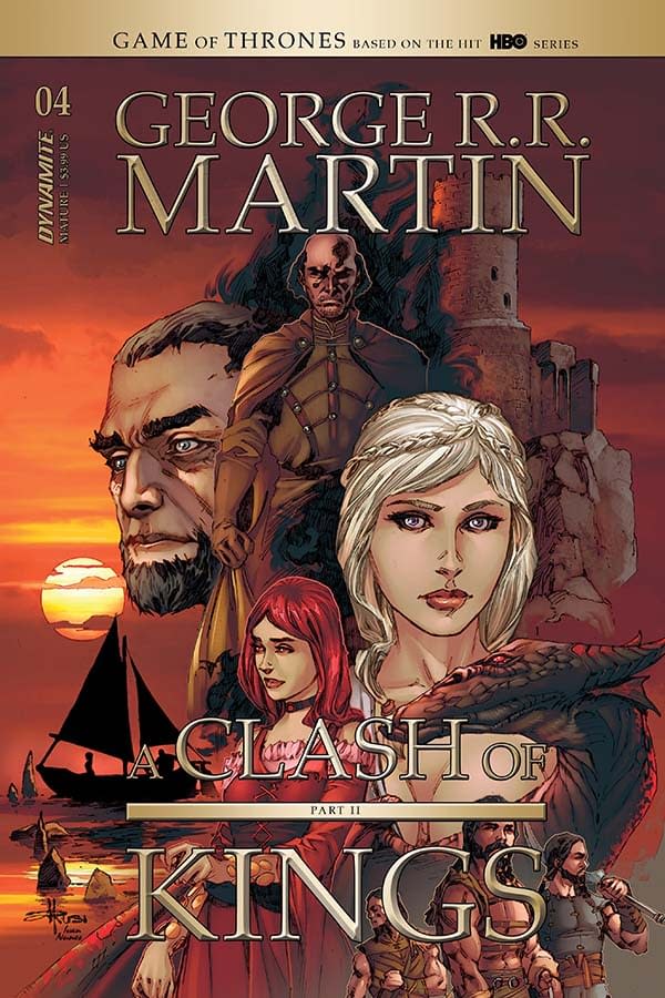
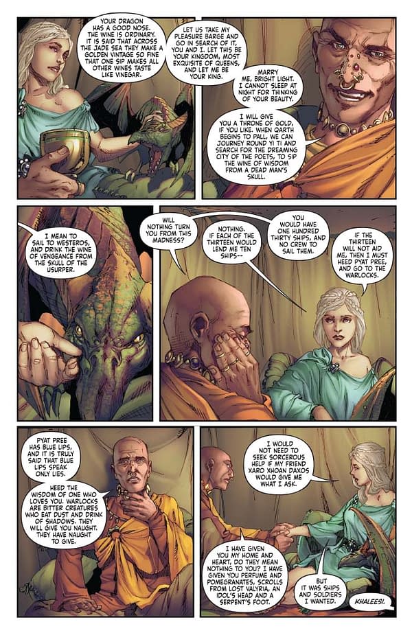
This issue starts us off with a fun bit. So… the book calls for Daenerys to have one breast exposed during this scene. However, we need to be careful with visual depictions of the characters in this adaptation for a variety of reasons. Subsequently, the decision was made to keep Daenerys covered. The artists tried to draw the scene as written but with strategic blocking. Unfortunately, the effect was fairly… comical. Go ahead and take a close look at panels featuring Daenerys, some of the blocking remains intact. Now imagine that in every panel of the character. It's better that we changed it.
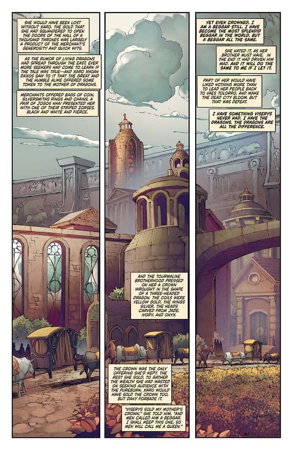
PAGE 2:
I know there is a name for this technique, but it's eluding me. It's a splash page to show the scope of the location, but we break it up into panels to allow the palanquin to move through it and give a sense of the passage of time. It's a great trick, and we use it a bit, but I think it doesn't quite click here. It looks as much like it might be a procession of palanquin instead of just one moving through the page. So that's something for me to remember when giving direction in the future.
PAGE 4:
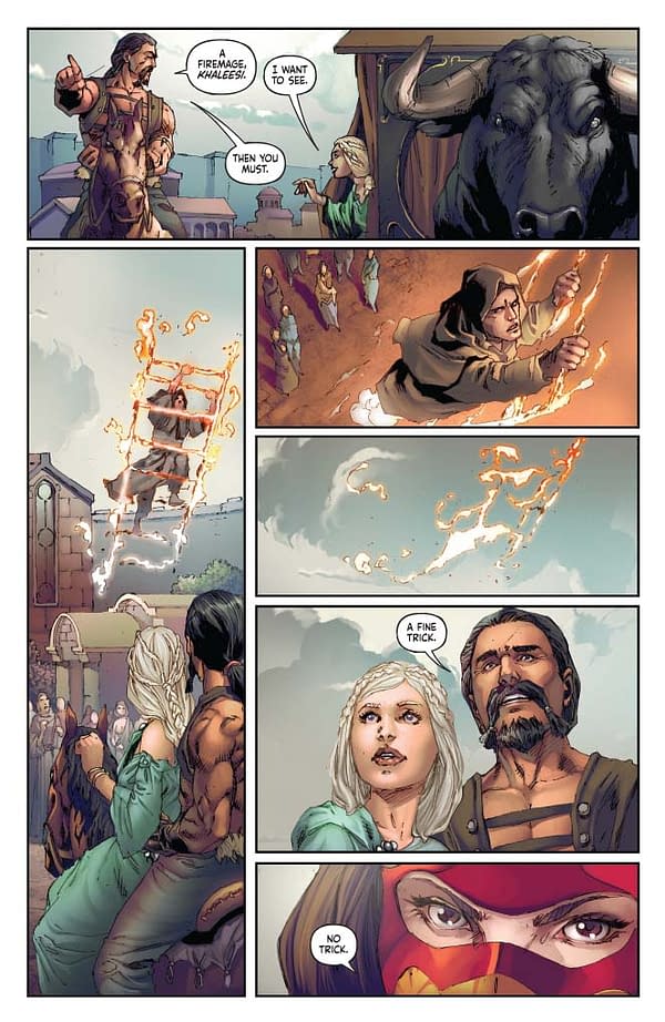
Figuring out the spacing for this was a challenge. An entire page out of 21 pages is used up just for the fire ladder magic trick. That's a huge amount of real estate to sacrifice, and if this were a traditional comic, you would likely search for another way. But since this is an adaptation of a prose novel, our choices are limited. You can't pull this scene… the following scene wouldn't make sense. Plus, it sends an important message about what is happening to the world and why. So… we give a whole page to something that on its own is totally inconsequential. But it's a load-bearing scene, and so it remains.
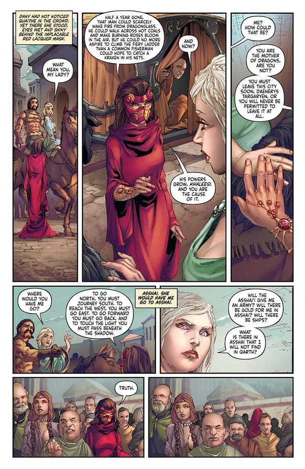
PAGE 6 and 7 — See the aforementioned note about strategic nudity blocking.
PAGE 8:
I think Mel Rubi's art is getting better with each issue. There's an evolving looseness to the faces that I think serves well on panels one and two of this page. The colors by Ivan Nunes augment this quite a bit too. The fog is pretty wonderfully painted here.
Not that the two characters in panel one and panel two face opposite each other. On panel one, the man standing against Stannis, then panel 2 Stannis, then panel 3, pull back and show both. We have limited space, and we need to set the stage. We could have reversed this, and there would be some logic to it, particularly with the flow of the dialog. But it wouldn't have opened as large, and that matters.
PAGE 13: The humanity of Stannis has always spoken to me, and I wanted to make sure it came through here. This is a man doing what he thinks he must because it is the correct order of things. He really does not want the crown. He didn't want to fight his brother. He has his vanity and ego and pride, certainly, and these affect his choices, but regret is essential. And here, as he talks about Renly's peach, it's a moment we can show how the death of his brother haunts him. I think we had another bit about this in the following scene that we had it cut. I originally wrote it in – my first draft cuts nothing and adapts every word of GRRM's prose. But again… 21 pages is all I get to play with.
PAGE 17:
Ivan uses color here to really help push the scene change. This is huge when doing this kind of comic with its abrupt and frequent scene transitions. We go from a warm scene to a cool one, and you know without reading a word that time and space have shifted. In a different world in a book that required less literalism, it would be nice to use more unnatural color choices to augment moods over-literal lighting. We're going for something that feels "real" here, but I would argue that sometimes the stronger choice with comics is to play to medium and use the tools we have on the page to evoke a mood rather than give a realistic type of record of events.
I'm reminded of something I heard George Lucas once say about continuity between shots. I think this might have something to do with shifting scale of some miniatures and how they abruptly shrink or grow for the needs of a frame, and his response was something of a dismissal. It didn't matter if it was "realistic." It matters how the scene makes you FEEL.
PAGE 20/21
The birth of the shadow demon. One of the rare bits of magic in this series. I was specific in the direction of this, and it needs to look powerful, but not exploitative or graphic. Melisandre is in control here, and not vulnerable as a woman might be in a natural childbirth. So I knew we needed a side shot and an explosion of light and shadow to get the right effect. Of course, I just describe this stuff in a script. Mel and Ivan pulled this off.
Also, note — We have 21 pages in A Clash of Kings, and they are crowded. Overall, we have had to scale back on our font size, just a touch to make things read better. So we are making the choice to have almost no dialog on two pages… but as I think anyone can tell by reading it… dialog would be an anchor here. There are times when you just have to shut up and let the art drive the story. That's most of the time, really.
