About
About 


Topo Wresniwiro who played Master Hamir in the Doctor Strange movies is a Reform UK candidate in Greenwich for upcoming UK local elections
Posted in: Comics, Comics Publishers, Current News, Marvel Comics | Tagged: Marvel Comics, marvel logo
Marvel Comics Gets A Brand New Logo (Update)
Just as Marvel has had a new logo for Marvel Animation which is basically just sticking Animation onto the end, so Marvel Comics is getting a logo too.
Article Summary
- Marvel Comics unveils a brand new logo, evolving its iconic branding.
- Rian Hughes previously refined the logo, now recorded by Bleeding Cool.
- The logo's history reflects Marvel's transformation from comics to multimedia.
- The latest logo adds 'COMICS' again, stirring feelings of 'neostalgia'.
A decade ago, designer, typographer and comic book creator Rian Hughes fixed the Marvel logo. As a man of a thousand logos for comic book publisher, the deficiencies in the logo rankled him so much that, in a spare moment, he fixed them and sent the result to Marvel alongside his usual work for the company. They noted he had a point, replaced the files on their system, and said no more about it. But Bleeding Cool recorded those changes and the notes that Rian had made, for posterity.
![]()
Might he want to take a look at the new logo? Just as Marvel has had a new logo for Marvel Animation which is basically just sticking Animation onto the end of the Marvel logo, so Marvel Comics is getting a logo all to itself.
Delineation, keeping Games, Animation, Comics and Studios all in their respective labelled boxes… UPDATE! Bleeding Cool is told by a source at Marvel that the new "Marvel Comics" logo is to be used for more corporate purposes, branding and PR and whatnot, but will not be used on the actual comics themselves. It will be used for Social media as Marvel is changing and getting its own "handle"…
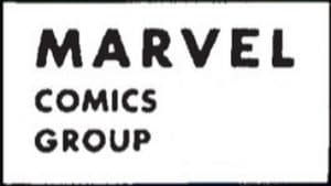
When Atlas Comics was officially rebranded as Marvel Comics in 1957, there was no logo for it, and it would take some time until there was. And even then, it wasn't much to look at.
It bulked up a little but was still no great shakes. It is, however, bursting with nostalgia.
![]()
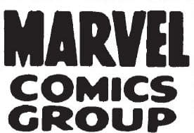
Then it got corporate and boring for the late sixties and early seventies

The letter R was clearly the radical of this group.
 And then they all leant in.
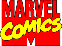
But this was their MTV logo and the one that we probably love the most. Eventually, they would just drop the bottom two-thirds and straighten that R as they just wanted to be MARVEL again, not just comics, but TV, games, cartoons, toys and films. But now? They are getting the COMICS back again. It's just… not in the right place, okay? Come on, bring back the MTV logo, okay? It's not nostalgia; it's… neostalgia! And I am coining that word!
Enjoyed this? Please share on social media!
Stay up-to-date and support the site by following Bleeding Cool on Google News today!