Posted in: Comics, Recent Updates | Tagged: Brian McCranie, ET Vollman, JM Ringuet, Omi Remalante Jr, Pierluigi Abbondanza, Venezia, Wolf Beaumont
Three Things About Venezia #2
Alasdair Stuart writes;
A little while ago, I reviewed Venezia issue 1 and really rather liked it. It's the story of a female vigilante's quest for venegance in 16th Century Venice and it manages to neatly combine the two elements really well. Now, the team have released the second issue and started a Kickstarter campaign for the third. Here are the three things that I especially liked:
1. The Sense of Place
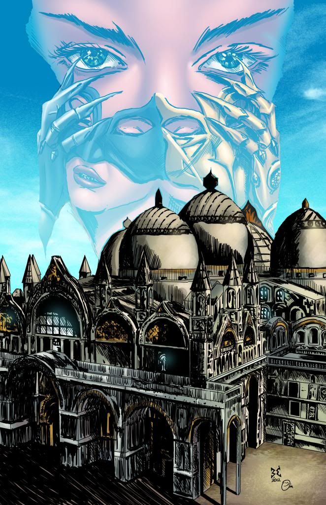
Brian McCranie's art has a tremendous sense of scale and place to it that instantly marks this out as a comic set somewhere very different. It's clearly very well researched but at the same time there's no sense of this being a Venice built from Google image search. It feels like a real place, somewhere with depth and scale. It's also a beautiful canvas for the gloriously nasty story to unfold against.
2. The Ambition
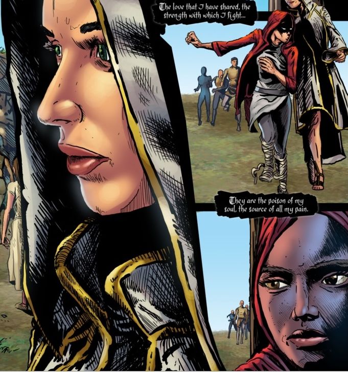
This is a book with precisely zero interest in resting on its laurels. The entire team are striving to do new things here, with McCranie and Wolf Beaumont, the writer, in particular pushing and pulling the shape of the comic into something new and different. That's especially apparent in issue two which deals with the collision between multiple cultures, the differing approaches to violence that each culture takes and scenes like this. Here, a splash page is used to frame and lead into a chase sequence in a way I've honestly not seen before. It works really well too, and I'm only sorry I can't show you the full sequence so you can see how well it flows.
The book is full of moments like this on every level from the thematic to the artistic. Not all of them land but there isn't a single page here where someone isn't pushing past their comfort zone and you have to admire that sort of drive. Plus, when it works it's genuinely great.
3. The Execution
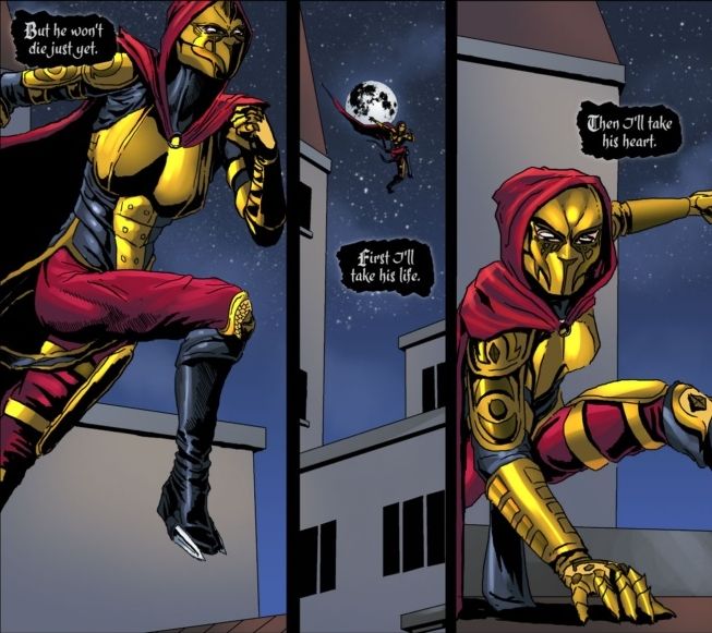
This, fundamentally, is a vigilante story. That means sooner or later, someone's going to get dressed for war and a whole lot of people are going to get very, very dead in a wide variety of creative ways. The fight here doesn't disappoint, and, interestingly, unfolds in near silence. That's impressive in and of itself but I wanted to make special mention of the costume here. There's equal parts practicality and theatricality there, and I love how it's clearly a compromise between ease of movement and striking fear into opponents. Plus, top marks for one of the only shaped female breastplates in recent comics history that can at least pass for functional. Even better, the entire end of the fight scene is wrapped up in what you see here; form versus function, fear versus freedom of movement. It's a really smart idea in a really smart book. I can't wait to see what they do next.
Venezia issues 1 and 2 are available now in print and online. Go here and they'll be able to help you out. It's 3rd issue is on Kickstarter now


