About
About 


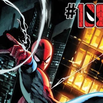
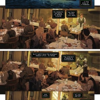
Marvel pulling the Amazing Spider-Man #1000 John Romita/Paolo Rivera cover was the most-read story on Bleeding Cool yesterday
Posted in: Comics, Digital, Recent Updates | Tagged: alex de campi, Comics, digital, digital comics, entertainment, uncanny valley girl
Uncanny Valleygirl by Alex De Campi #3 – Elves Of Death Metal
Uncanny Valleygirl by Alex De Campi #3 - Elves Of Death Metal
That's a shout-out to J M Ringuet, who created Stolen Suns, which he reckons was the first comic formatted specifically for iPhone. He also gives it away for free, proving he is a far nobler person than me, or possibly just lives someplace where the rent doesn't cost what it does in NYC. Anyway, this week, let's talk formatting, shall we?
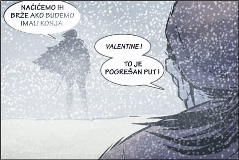
I know I promised you in the commentapalooza following last week's column that I'd tackle Kindle and EPUB this week, but kids, I just didn't get to it. I work two jobs, and am in the middle of editing a music video. Next week, promise. Next week you'll also get an actual picture of me rather than more Valentine art (this week, in Serbian!) but buying chalk so I could draw a word balloon next to my head on the wall of our loft that's painted with chalkboard paint: another casualty of the time bandits.
This week is all about basic formatting. To those tuning in late, I'm doing a monthly comic called Valentine, which will be sold for 99c an episode, and will be available as CBZ files for computer reading as well as on a range of wireless devices with different sized screens and formats: iPhone, Android, PSP, Kindle, Barnes & Noble and Sony e-Readers, etc.
One of the joys of electronic distribution is there's no extra cost to offer a book in several languages, other than my time in lettering. So, Valentine will launch in 12 languages (and counting): English, French, Spanish, Portuguese, Italian, German, Polish, Serbian/Croatian, Irish, Chinese, Japanese and Hebrew. If you don't see your native language there, well, it's because I hate you and I think your culture is worthless. No, just kidding. It's only because when I crowdsourced translators via Twitter and Facebook, nobody speaking that language put their hand up. I'd still love to have the book in some of the really major languages, such as Russian, Hindi, Arabic, and Urdu, so we hope to add those in time. (I can't letter any more languages this week; I'll die.)
This week, I lettered. And lettered. And lettered. It was pretty damn quick, actually. Once I did the English version and created all the balloons, and because I was using a font with "International" characters I could just copy-paste from the translated scripts. I sent out Word copies of the episode's script, including panel descriptions, to the translators, with the lines of dialogue to be translated highlighted in yellow. The translators just wrote their translations beneath.
This has worked really well, because even if I can't read a word of the language, I know what line of dialogue it represents. And it's easy for my translators, because they don't need to letter or have photoshop; they can just do it all in Word – this is important because only about half of them are comic book people. Valentine is being translated by a film composer, the Brazilian correspondent for Rolling Stone, a British pop star, a Colombian artist, a Serbian one, students, musicians, friends.
The lettering went really well for the first few languages. Flew by, in fact. And then I found out that by "international", Comicraft meant "Romance languages and German". Surprise! It does have full Cyrillic lettering, but no love for the rest of the ex-Warsaw Pact. No support for Scandinavian characters either. Luckily my Serbian translator had sent me a font with a full Slavic character set. So, Lesson One: you're going to need a lot of fonts. We will have used five in total: one for the latinate, one for the slavic, then Hebrew, Chinese and Japanese. Resetting fonts is very time-consuming, so using as few as possible will make things go much faster. One day, in the future, there will be a truly international Latinate font that handles Slavic and Scandinavian characters too.
Lesson Two: You're going to spend a lot of time re-formatting. Not, surprisingly, for the lettering. I needed to make very few adjustments to balloons to compensate for the different lengths of lines between different languages. The re-formatting is for all the different devices. In the future, which is lovely and perfect and fonts are international for real and WE FINALLY GET THE GODDAMN JETPACKS, obviously there will be a programme that will take care of all of this (and allow the lettering to be input automatically online into the balloons).
Here are the screen sizes for major wireless devices:
Colour devices:
iPhone: 480 x 320
Android: 480 x 320
PSP: 480 x 272
Nintendo DS: 2x 256×192
Black & white devices:
Kindle: 622×520
Sony e-Reader: 600×800
Barnes & Noble Nook: 600×800 (and English only)
(Lesson 3: Your letters are going to need to be pretty damn big. I'm using 60 and 72 point fonts.)
What this all means is I have about three separate formatting runs. First, the iPhone sizing. The first is for iPhone/Android, etc, and is colour at 480×320. This is the acid test – your comic, or the panel you are intending to display, should be legible at about 10-15% smaller than 480×320. I am totally biased. The iPhone/Android format is by far my favourite. First, it's in colour. Have you seen the colours in our comic? They're really fucking nice. Second, I can do all sorts of things with transitions in the iPhone format that enhance the reading experience.
For example, the first 5 screens of Episode 1 of Valentine are one massive great panorama across a snowy battlefield. On the iPhone, every time you tap to go to the next screen, the image scrolls right (…or left, if it's Chinese, Japanese or Hebrew), then you tap again, and the captions fade in atop the screen. (I got a bit caption-heavy in the first bit. Almost Jeph Loeb levels of captioning. It felt dirty, but good.) On the Kindle, or even as CBZ files I have to chop that five-panel panorama up into five separate screens, and the transitions are locked. No fancy stuff, just dissolves, or click for next page. Zzzzz.
Okay. So the iPhone stuff is exported as a series of tifs and FTP'd. Then, second, I do my other colour run, the CBZs, chopping all my magic fun double height and super-cinemascope extra-wide panels into separate, uniform-sized screens and export them at 800×600. Snif.
Then I cry a little bit more and, third, whack everything into grayscale, rotate it 90 degrees, and vastly reduce image quality (to <100kb per image, vs the circa 2MB per CBZ TIF). Why rotation? Kindle et al work in portrait format and my screens are in landscape format. So I don't get them trying to cram two panels per screen, I rotate the panels. It means people will have to hold their e-reader lengthways, but hopefully most folks can cope with that.
In theory, I can upload to Kindle at 600×800 and it will just resize automatically. You really, really want to do the conversion for grayscale yourself, and as much of the down-rez'ing as your sensitive soul can handle. Because however ham-handed you are, you'll be less ham-handed than the automatic conversion software Kindle and EPUB use. Kindle, you just sign up and publish it yourself. The mainstream e-readers, you need to go through a publisher such as Smashwords, which is really not that well set up for image-heavy stuff.
What this all means for people trying to adopt existing paper-style comics/manga to e-readers (as opposed to the infinitely more flexible iPhone & Android) is that you're going to need to make your baby grayscale and then chop your baby up into discrete images of 600×800 that still remain legible at 520×622. It's pretty darn hard to enlarge images on an e-Reader, so yeah, your page either works at 520×622 or it doesn't.
(And allegedly Kindle will just fill in black borders, like letterboxing, around any image that doesn't exactly fit their aspect ratio, hence why I am drawing comparatives between the 1.5:1 aspect ratio of the larger e-readers – and also iPhone/Android) and Kindle's 1.2:1 aspect ratio.)
In order to publish image-heavy stuff on Kindle, you need to do some basic HTML coding, creating a folder with all the images and then an HTML doc in Typepad – no wait, stay with me! Don't be afraid! Even a monkey can code images for Kindle! AND I AM THAT MONKEY. You just use a bunch of img src= and the Kindle custom code for hard page breaks after each image so it doesn't get any ideas about several images per screen. (Folks, there's a 50-50 chance next week's column will be me crying into my beer about how absolutely f'in impossible the Kindle and EPUB stuff is. Lay your bets!)
12 languages, three separate formats, four different "publishers"/uploads (iPhone/Android, Kindle, ePUB and CBZ). It's quite time-consuming, to say the least. (And in the future – when we'll also have int'l font, jetpacks, auto-lettering, etc – it will be easier. It better be, otherwise the future and I are going to have words.) But even so, the amount of control and reach a single person can have in getting their comic out to the world in convenient, handheld formats is just amazing.
As always, you may find me on twitter, facebook, and my music videos are on youtube.
Oh, and if you are currently publishing an e-comic, for heaven's sake, tell us about it in the comments! We support and encourage pimping.
Enjoyed this? Please share on social media!
Stay up-to-date and support the site by following Bleeding Cool on Google News today!