


 About
About 


Marvel Comics will publish Midnight X-Men #1, Midnight Fantastic Four #1 and Midnight Spider-Man #1 on the 7th of October. And nothing else.
Posted in: Comics | Tagged:
Harry Potter: 20 Years of Magic, Please Take All My SDCC Money
Erin Wilhelm writes from San Diego Comic-Con,
In an age where people are reading digital versions of books, comics, magazines, and newspapers in increasingly large numbers, one could question why Scholastic feels the need to put out two new versions of the epically famous Harry Potter books (on top of the 15th Anniversary paperback edition released in 2013). One hour in the Harry Potter: 20 Years of Magic panel answered that question, and convinced me that I need to own all three sets.
Moderated by Melissa Anelli (The Leaky Cauldron), and opened by a video message from original U.S. Harry Potter illustrator Mary GrandPré, the panel included the three illustrators of the most recent editions of Harry Potter, Kazu Kibuishi (15th Anniversary paperback edition), Jim Kay (illustrated edition), and Brian Selznick (20th Anniversary hardcover addition) as well as editor Arthur A. Levine and art director David Saylor.

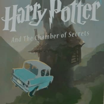
Each illustrator started by showing a slideshow of their work and their artistic process. Kibuishi went first, showing a series of slides that depicted various versions of his Harry Potter covers, culminating in the final product, as well as a gallery quality piece of art for the box the set was sold in. Kibuishi, who is primarily known as an author and illustrator of comics, took on the 15th Anniversary paperback edition cover project while recovering from a major illness. In fact, Kibuishi had suffered from bacterial meningitis that had resulted in him spending time in a coma, and the Harry Potter Anniversary project was his first foray back to work after his illness. As a result, the project acted as art therapy for Kibuishi and he brought his trademark animation-like style to the project and created a new look for the paperback books for a new generation of readers. Interestingly, all of Kazu's art was produced digitally.
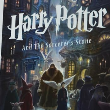
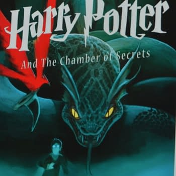
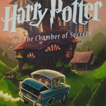
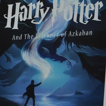
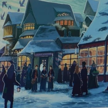
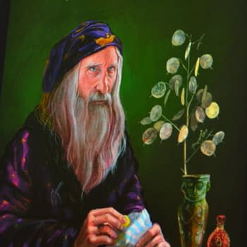
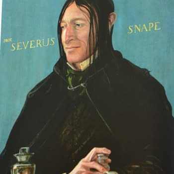
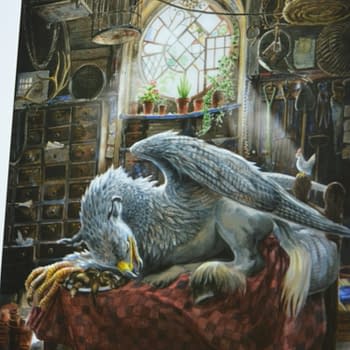
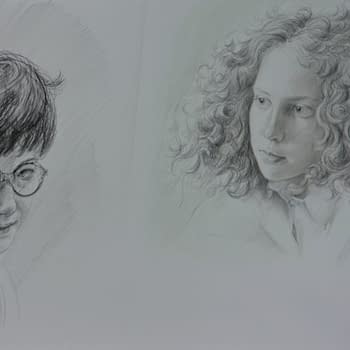
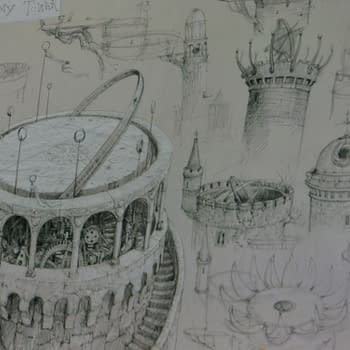
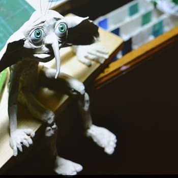
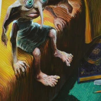
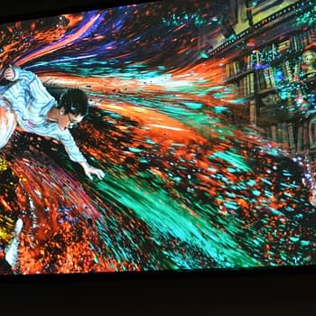
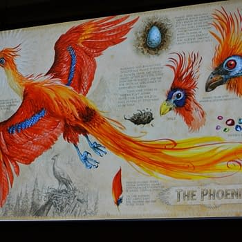
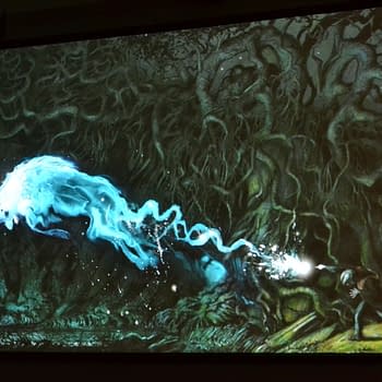
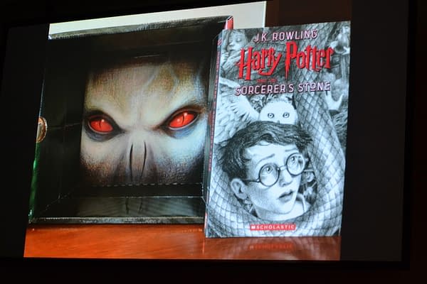
Jim Kay has one of the hardest jobs on the panel, he is fully illustrating the entire Harry Potter series one book at a time, with the first three illustrated volumes already released. Kay talked at length about being apprehensive about taking on the responsibility of illustrating one of the most beloved series of books in history. He also showed pictures of his process, which often started with building 3D dioramas with found objects in his home, and creating characters out of clay. Kay said that being able to manipulate these models helped him to illustrate the many different scenes throughout the books. In one particular photo he drew Buckbeak the hippogriff on Hagrid's giant-sized bed, but then realized that it just looked like a small hippogriff on a regular bed, so he added a chicken. His art was also completely stunning, with an ethereal, dreamy, magical quality to it. Honestly, there were many of his images that I would have paid to have framed and hung on my wall as independent artwork.
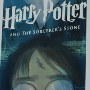
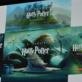
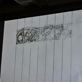
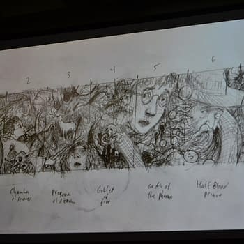
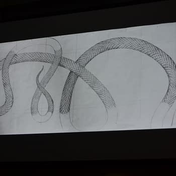
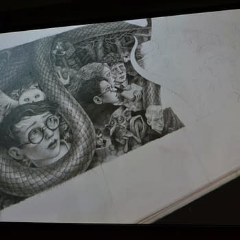
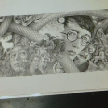
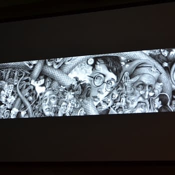
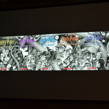
Brian Selznick did the cover illustrations for the 20th Anniversary Hardcover Edition of Harry Potter that will be released on August 28, 2018. He said that as soon as he got the call, he knew he wanted to design the seven book covers in such a way that when they are laid out next to each other, in order, they form one long mural that tells the Harry Potter story. He began to design the covers as one long piece of art with the tail of a snake intertwined and linking the seven covers. In fact, the final art was produced as one long piece of art and later divided as the seven covers (and it was all done by hand). The hidden details and small easter eggs that make up the art were impressive (he even used his husband as inspiration for the face of Dolores Umbridge). Selznick also did not shy away from completely diverging from the original series's colorful illustrations, instead doing all of his covers in black and white.
Finally, Levine and Saylor explained that they purposely chose very different illustrators with very different styles for the four different editions. They hand picked each illustrator with a particular aesthetic in mind for each individual edition. For example, for the first U.S. edition, Levine wanted readers to feel like they have picked up a "rare, beautiful, magical object" and consequently they used parchment like paper and detailed printing processes. Levine also took the opportunity to allay Kay's anxiety that he would "ruin" Harry Potter by saying that the story remains the same, so it is impossible to ruin Harry Potter, because the story has "the protection of love."
In response to a fan question about the iconic Harry Potter logo, Saylor shared that the logo was, in fact, also designed by GrandPré and that she hand lettered the first version before it was handed off to the printers.
The panel was packed (after the previous two panels had only been about ¾ full) and the audience was visibly and audibly in awe of the art that they were shown and the preview of the final products. As a longtime Harry Potter fan myself (and proud owner of first U.S. editions of all seven books) I am now considering buying the fully illustrated versions as well. For my kids, of course.
Enjoyed this? Please share on social media!
Stay up-to-date and support the site by following Bleeding Cool on Google News today!