About
About 


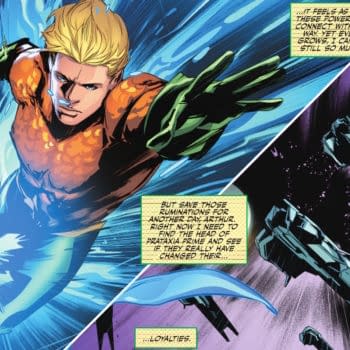
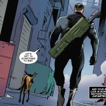
Aquaman "Doesn't Just Talk To Fish" Anymore, He's A God in Emperor Aquaman #18 by Jeremy Adams and Paolo Villanelli (Spoilers)
Posted in: Comics | Tagged: Comics, entertainment
Violent Love's Victor Santos –"I Need To Transform Myself Into The Artist This Story Needs"
 By Hannah Means-Shannon
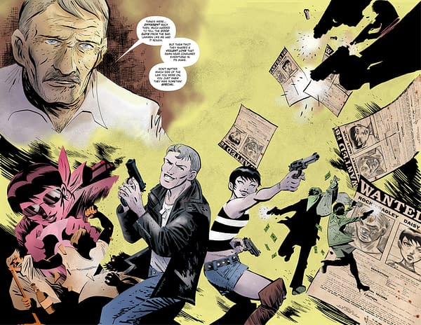
Violent Love is the collaboration of creators who share a fascination with crime stories and the ways in which they develop and define characters as no other type of story can. Forthcoming from Image Comics in November, the series is inspired by true crime stories and tracks the relationship and criminal career of Daisy Jane and Rock. Written by Frank Barbiere, illustrated by Victor Santos, with design work by Dylan Todd, the first issue immediately appears stylized, emotive, and suggestive of a period setting, all features I've come to expect from artist Victor Santos.
Santos is the creator of the Polar, a noir spy thriller trilogy of graphic novels from Dark Horse Comics, presented in a horizontal format and minimalist in spot-color choices. Already optioned for film, the series originally appeared as a webcomic, which Santos converted from "silent" comics to "speaking" comics for print. I inherited the role of editor on the third volume of Polar while working for Dark Horse, a highlight of 2016 for me.
Comics pros and fans alike have nothing but praise for Santos' experimental approach to the comics medium, and in reading the first issue of Violent Love, I saw even more development in his style and narrative choices. Not only is Santos an artist to watch, he's one who is already shaping the way we view comic art in the 21st century.
I talked to Santos about his new Image series Violent Love.
Hannah Means-Shannon: Hi, Victor! We meet again. We have ended up as partners in crime again—literarily speaking. But that does pose a fairly obvious question: what is it about gangsters and violent conflict that just keeps you coming back as an artist? Is it the stylish tradition of the genre?
Victor Santos: Hi, Hannah! We should meet up beyond these criminal matters! Some place without bullet casings everywhere…
Yes, sure, in the day-to-day work, as an artist, the most interesting part is how this tradition lets you play with elements like light and shadow. It's like the rules of the fantasy genre—nobody is scared if suddenly something magical happens…In this genre, cars, guns and fatale girls are cool, and you can use some graphic elements in very creative ways. Meanwhile, nobody will ask you about your light sources (laughs).
But I must say I became interested in the genre reading Dashiell Hammet's "Red Harvest" because a friend told me it was the origin of Kurosawa's Yojimbo. This was my first contact…and after that I fell in love with those stories. It was more the moral conflict than the violent conflict which attracted me.

HMS: I'm not letting you get out of explaining how you all came up with the logo for this series and the design of the final cover for #1. I know you're meticulous about this. Tell us about some of your choices and why the final version became the final version.
VS: When I face a new project, I work a lot on the "look" of the series. For me, the cover is the wrapper on the gift, and our first contact with the reader. I don't want to simply have characters running towards us with the title above them, I need to define a style for it all… The covers have their own sequence, and they are also a narrative. So I work a lot on concepts, and this time was no exception. But sometimes solutions come easily! This time the composition came about because we needed stuff to show off and to move the reader, but I had some doubts about the final design of the faces…so with the first issue cover, I tried out the idea of presenting the figures with their faces overlapped by the large white space. I think it was Frank who suggested that we maintain this structure while using a different color theme for every issue.
I proposed some ideas for the logo, but it was finally Dylan Todd who created the ultimate logo with that awesome papercut effect.

HMS: Is it an unusual challenge for you to try to capture the detail of a story inspired by real events? I noticed in the first issue that there's a level of texture to American life during different time periods that seems really specific. Coffee makers, clothing, architecture. Not to mention the story is set in locations where you may never have visited. Is the Internet your new best friend for photo research?
VS: God bless the Google search! Honestly, my computer's search history is really weird (laughs). You can find things like "Chinese style desk in colonial San Francisco" or "serviette ring of the 50s". Fiction is also a great element of documentation. As you say, little daily things are the most difficult, so the best way is simply searching movies–comedies or dramas of the years you are working on–and check those little things. Or look at advertising and comics from the right period. If I'm working in the earlies 70s, I'll search stuff produced during those years, things like Dog Day Afternoon or even Richard Donner´s Superman! I checked on the Daily Planet office workers there.
I will not check a modern movie made today that is set in the 70s, like American Hustler because this is a Disco Stu fantasy! (laughs)
Creating this kind of story is still a challenge because I'm a foreigner and even if we have a lot of common cultural elements, our sense of time is different. I was born in '77 and I can't use my parents as a reference, for example. There are a lot of things I thought were more recent because Spain was a country delayed in receiving outside culture during the 70s-80s (we just left behind a dictatorship that spanned 40 years). Luckily I rise above these problems through looking at those awesome movies and comic books…
HMS: Having worked with you on Polar, where introducing more than two colors was considered radical for volume 3, I look at Violent Love and I feel like you must have had some kind of massive breakthrough in your coloring perspective. What's going on with the color choices in this comic? They seem very specific to places, times, and attitudes.
VS: Yes, the approach is completely different. My inner penciler/inker constantly fights with my inner colorist because this book needed a different scope… Polar was cold and cool, made of pure visual contrast. All of it was over the top, so I played with minimalism in its artwork. This is not always an easy way to do things, usually I spend a lot of time simply choosing the color to be the single spot of color on the page (laughs). Violent Love needs graininess and sandiness, it's dusty and pavement-oriented. I think the color needs to transmit this atmosphere, so I began to play with textures and soft degrees.
This approach is a hard way to do things because sometimes I feel I start at zero, from scratch, on every project, but my rule is "I need to transform myself into the artist this story needs".

HMS: It's great to see you're still breaking out the double page spreads in this new series—what are the challenges and benefits of creating them so far?
VS: The spreads are a very useful storytelling element…Well, all the elements related to the size of panels are one of the strengths of the comic-book medium. You can't change the size of the movie screen. Yes, you can split the screen, but it's not the same effect as in comics. In comic books, you can drive the reader across little corridors and suddenly– blamf!–you change the rules, you open a double page spread. We have a lot of terrific resources for playing with in comics. We don't need to simply draw static storyboards. So the challenge is choosing where to be calm and where to place these punches.
HMS: What are some of your strategies as an artist to make readers believe that Rock and Daisy are "somethin' special"? How do you convey their relationship and how do you bring emotion to the page?
VS: Capturing emotion is the challenge of the challenges…A combination of different elements, from the acting of the character to the graphics, from the texture of the line to the color patterns…I´m constantly struggling to improve on this, and I try to learn every day. You can learn from different sources–classic artists like Will Eisner are good references. They're very "theatrical" but definitely the old style works.
And manga and anime. Maybe it isn't easy to perceive, but there are a lot of manga influences in Violent Love and how the manga artists reflect inner emotions with graphic elements and special performance elements from their characters.
And my own experience matters, of course. In the end, you're lending a lot little pieces of your life to every page.
Violent Love #1 reaches FOC from Image Comics on Monday, October 17th, and is currently listed in Previews World here [http://www.previewsworld.com/Catalog/SEP160635] with order code: SEP160635
Enjoyed this? Please share on social media!
Stay up-to-date and support the site by following Bleeding Cool on Google News today!