Posted in: Card Games, Games, Magic: The Gathering, Tabletop, Wizards of the Coast | Tagged: Duskmourn: House Of Horror, MTG
Interview: We Chat With Magic: The Gathering's Team About Duskmourn
We had a chance to chat with a couple of members from the Magic: The Gathering team about the new Duskmourn: House of Horror set
Article Summary
- Discover how Duskmourn: House of Horror captures the spirit of '70s-'00s horror films in Magic: The Gathering.
- Uncover the creative inspiration behind designing Duskmourn's thrilling artwork and card mechanics.
- Explore the iconic influences on Magic: The Gathering's latest horror-themed expansion.
- Learn about the challenges faced in creating a unique horror set within the Magic universe.
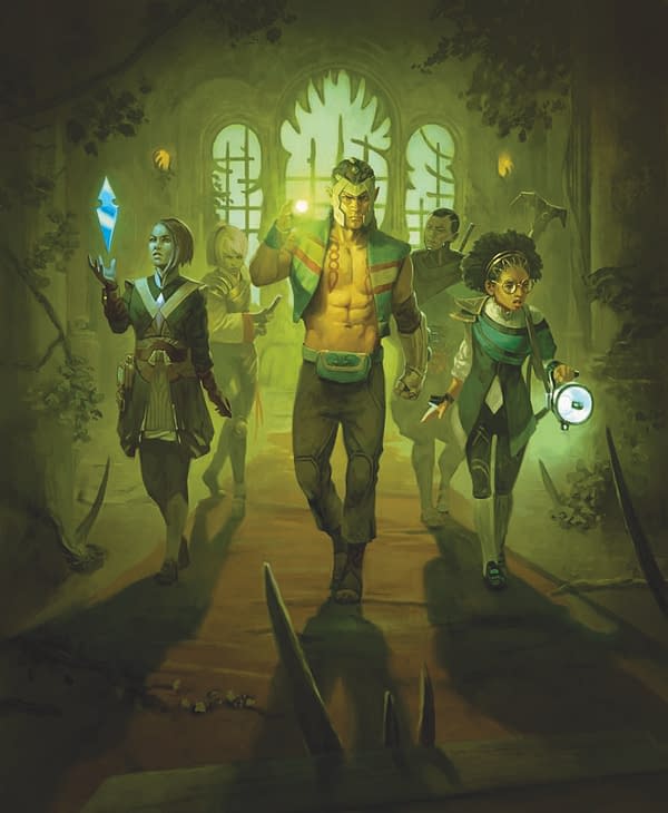
As part of the haunting season, Wizards of the Coast released a new haunting set for Magic: The Gathering, as players have been able to dive into Duskmourn: House of Horror. The latest expansion for the game brings out a ton of horrifying images and cards to the game, as you play in a dimension where terror has taken over the once normal landscape. We had a chance to chat with a couple of members of the team about the new set, as Senior Art Director Ovidio Cartagena and Senior Game Designer Annie Sardelis, chatted with us about the inspiration and work that went into this particular set.
BC: Hey Ovidio and Annie, how are the two of you doing?
OC: Doing great! I've had a lot of fun playing Duskmourn now that it's out. I'm also getting ready for the next batch of projects coming out in the next few years!
AS: I'm good! Busy with new projects but motivated by how much players liked both Bloomburrow and Duskmourn back-to-back. I still can't believe we did that!
How have things been going for MTG over the past year? What's the response been like to some of the newer sets?
OC: We've gone to some awesome places in the story and in the art. This year has pushed me outside my comfort zone as an art director. I loved the responses to Duskmourn! I've learned so much about horror from fans before and after this set. It's a year where Magic: The Gathering has something fun for a lot of niches and passions, and that's a cool place to be: I get to play Magic: The Gathering at my LGS with people who have a wide variety of interests, but this game brings us together!
A little on WotC, how's it been for you guys moving to a new HQ?
OC: I can't complain; today, I took a walk around the building, and on one side, we had a glorious view of Mount Rainier, and on the other, Lake Washington was shining on an unusually bright October morning. I love going on walks at the nearby park; I even have some meetings there! Today, actually, I had the chance to help a coworker set up all the concept art for an upcoming set on the wall. We have this gigantic wall full of beautiful art that's going to become an exciting new set. There are tons of opportunities here to think and share ideas, and I think an inspiring space makes that happen.
AS: Totally agree, it's a great location. "The Pit" (the nickname for where most of Magic: The Gathering design sits) is still going strong, with playtests and design chats filling up any time when meetings aren't happening. I sit close next to tables that are used for Commander, and sometimes I legit can't tell when folks are playing for fun or for work.
Getting to the subject at hand, how did the concept for Duskmourn: House of Horror first come about?
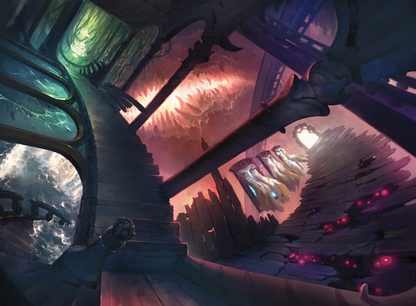
OC: We knew we wanted to do a horror set and a haunted one at that. There was this whole untapped space with the horror from a bit before and during our lifetimes: '70s to '00s horror movies. I love that era of media, and it was so seminal that it was solid ground for us to explore and add to. Then we made Duskmourn be a plane-sized haunted house, and it all clicked! The rest of the work was super hard, but it was also one of the most fun sets I've been a part of.
AS: I think a part of it started with our fondness for designing using the horror genre. Innistrad is a plane that is likewise dedicated to horror, though it leans more on gothic horror. We've been able to return to that plane many times just because of how many resonant concepts to explore with regard to the genre- something about it just makes for good Magic: The Gathering content. That same depth allowed us to invent an entirely new plane of Duskmourn to continue exploring.
I know a lot of the influences came from '80s and '90s horror tropes. Was there any particular influences on the story and the cards that came from that end of pop-culture?
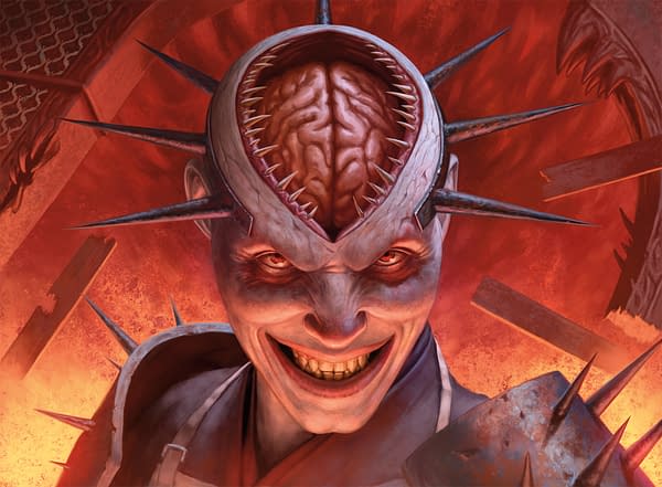
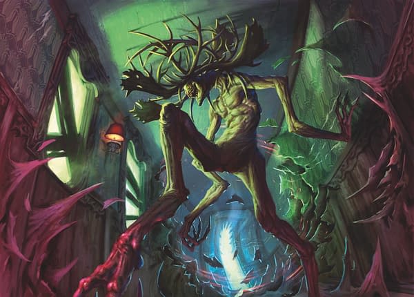
OC: The first thing I want to mention is that intense color palettes were something I wanted early on. Horror can get pretty drab if you don't keep an eye on color grading and cinematography. For that, Giallo was our friend! They had a great sense of color. Stuff in the 2000s all had a blue/green color grading. And the '80s had a vivid cinematography even with dark subjects, the color was "real world." Monsters had to look "practical" and obviously designed, so not like animals that would have evolved on an alien world… more like mad ravings of a sinister visionary, of which there were many in the '80s and '90s. Those creature designs were legendary! An overarching theme in aesthetics was a representation of intergenerational conflict: the house looks way older than the survivors because in real life we dread the evil past that predates our consciousness. This is a subtheme in a lot of movies that is particularly resonant in a world that moves ever faster forward.
AS: The concept for the set being entirely within a haunted house is the most prevalent influence from that era. The intimacy and often budget-consciousness of modern horror lends itself to exploring these familiar, contained spaces. The Room subtype went through the most changes during the development process, because we knew we had to put it in the forefront of the set to emphasize this specific setting. Many room names play in "the familiar made spooky" of horror movies- riffing on a carnival, a school, a hospital, or just a suburban single-family home. We spent a lot of time mapping Magic: The Gathering card effects to the different halves of rooms to match their flavor.
What challenges were there for you in crafting a horror set to fit within the world of MTG without feeling like a retread on anything horrific already created in the past?
OC: I've done horror before for Magic: The Gathering, and in cool ways too! This was different, and it's part of why we went for the era reflected in the art. I fully leaned on my horror fan history and my surrealism background for this set! The textures that you get to play with if you combine all those really created a unique-looking set: TV static, moths, hands, mold, etc.
AS: One thing we intentionally did in design was explore space that we didn't explore on Innistrad. For example: What card types can matter here that aren't a loud part of Innistrad? What different gameplay experiences can we craft? So, where you find creature-focused typal matters in Innistrad with Vampires or Zombies, on Duskmourn we leaned more into the abstract, leveraging enchantments, and nightmares made manifest. It was a challenge for sure! We like to say "restrictions breed creativity" on design, and I think it proved out with how different it feels to play Duskmourn, even with other horrific places like Phyrexia and Innistrad in our past.
Were there any guidelines or specific things you told the artists when making the artwork for this set? Or did you basically let them create whatever they wanted and have fun with it?
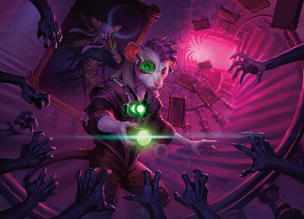
OC: Oh, I always need guidelines: the Duskmourn house had to have a late 19th century Victorian/Ottoman feel to it, Monsters had to look designed rather than evolved to evoke an evil artistic imagination, Gremlins are unaffected by the House's magic or evils, Ghosts should appear near a portal at all times either window, mirror or frame… That's to add to the other details like the 13 life land cycle has 13 open windows in each art. In some cases, I let artists have fun with the theme, but there's definitely a playground within which you can have that fun as an artist.
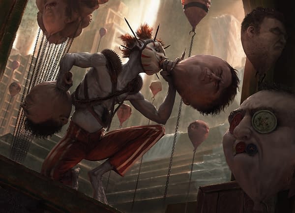
There's a set of cards that have a dark specter in the background for some of them. What was the inspiration for making those?
OC: Oh! Those are the lurking evil cards. That came from Emily Teng and me, we thought initially of having some cards that would have a scary creature in the background in some versions, and never acknowledging it. The idea was to see if Magic: The Gathering fans would find them and gauge what kind of chatter they got. We pitched this idea to Mike Turian, who thought it was a cool treatment, and it took the form it has now. It was a difficult execution, especially given that some magic artists are traditional painters, but we pulled it off.
Are there any particular cards from the set you really enjoy? Or ones you're looking forward to seeing and hearing reactions about?
AS: I'm a huge fan of both the Overlord and Enduring cycles of cards. I love how one expresses impending doom with huge nasty monsters, and the other expresses the resilience of those trying to survive the House, as a sort of mirror of one another, leveraging what it means to be an enchantment creature in different ways. I'll also shill for Haunted Screen, a card I put in the file very early on. I saw so many strong reactions about having the visuals of a television in Magic, but when players saw the design paired with the art, there were likewise a lot of positive reactions. And I think that's what good design is all about!
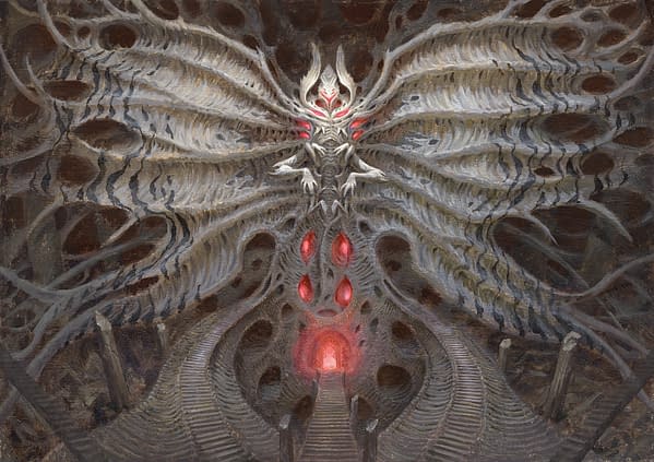
OC: I was keen on seeing who would spot my weird folk/cryptid references. The Shroudstomper had a small but fervent fandom! I insisted on putting a monster inspired by the Fresno nightcrawlers in the set. I had a grand time working on Fears, both as a concept artist and as an art director. I'm also having a lot of fun playing Fears in my latest deck. I am overjoyed at seeing the reception for Valgavoth. I can truly say that this was a tough puzzle to crack, and I was fortunate enough to have John and Jokubas on the team, who helped me flesh out what this giant demonic moth would look like. It was exciting to bring a character like this to life and also cathartic to purge one of the earliest powerful images in my life (a giant moth I witnessed as a kid). As with all my sets, there are several references to fine art (especially surrealism!) of the last couple of centuries; some have been spotted, some I've called out, and others are yet to be found.
I know Magic: The Gathering is planned out years in advance, but now that this set is made, do you have any thoughts on possibly revisiting it?
AS: Personally, I'd love to go back to Duskmourn! I feel like the new Room type has more space for new design, as long as Valgavoth is still in the business of renovating. Generally, if players are excited about a Plane, we consider a return.
OC: I'd love to come back, but I think Valgavoth would love it more if he were visiting the rest of the Multiverse.
Is there anything else you'd like to promote or plug?
AS: Try the Archenemy format at your next Commander game! It's a drama-free (mostly) way to team up on that one player at your table that stomps you every match. And you get to say fun Scheme names in an evil voice.
OC: I second Annie's motion! On the art side, I had way too much fun conceiving and commissioning the imagery that went into Archenemy. You could say that Archenemy is Duskmourn in its purest and most representative state, but folks who worked on the entire set really did an awful lot of awesome art. Please explore the art; the pieces have a lot of easter eggs and beautiful details that get even better when viewed in a large format.


