Posted in: eSports, Games, Video Games | Tagged: blizzard, Hangzhou Spark, overwatch, Overwatch League
Overwatch League's Next Expansion Team Revealed: Hangzhou Spark
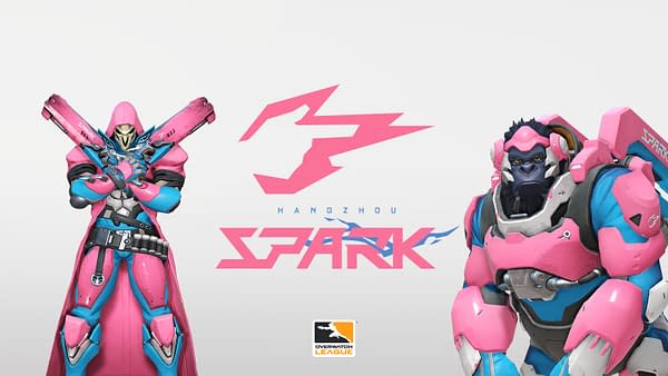
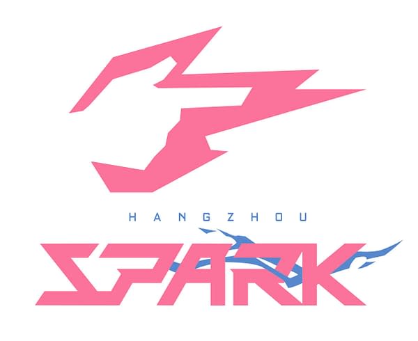
We got another logo and uniform reveal today from the Overwatch League, this time we're getting a look at the Hangzhou Spark. We're not gonna lie to you, this one is a little hard to look at. The entire theme of the logo is a finger gun surrounded in pink lightning. The same finger can be seen between the S and the P in the name using negative space, kinda like the FedEx logo with an arrow. This is just bad. It looks like the kind of logo you might see on the side of a can of a pink lemonade-flavored energy drink. Best we can tell from doing some research about the city, neither the name or the colors have anything to do with the hometown either.
The uniforms aren't looking that great, either. As you can see here, it kinda takes the wind out of Reaper's sails decked out in pink and light blue. If this getup was for breast cancer awareness, we could totally understand the choice. But as a set of team colors, it feels like everyone int he Overwatch League expansion teams got to pick two colors from a deck of swatches, and Hangzhou was the last to choose. It's gonna take a hell of a logo and color combo to top this as the worst team choice, but so far, the Spark is winning in that category.
