Posted in: Games, Nintendo, Retro Games, Video Games | Tagged: Game Boy Color, nintendo, nintendo switch, retro games
Someone Made A Nintendo Switch Look Like A Game Boy Color
It always amazes us to see the artwork people eventually do to their Nintendo Switch if they feel passionate enough to redesign it. People have broken open the console and played around with the case, buttons, and design in different ways over the past couple of years. Surprisingly, most players go back and do a redesign of the Game Cube controller, we're guessing mostly for a fondness of Super Smash Bros. Melee or The Legend of Zelda: The Wind Waker. But today's redesign we're showing you goes back over 20 years as someone transformed their Switch to look like a Game Boy Color. This look comes to us from TyDilla, who showed off the retro look on his Twitter feed as he recreated the iconic handheld portable gaming system's look and feel onto the current-gen system.
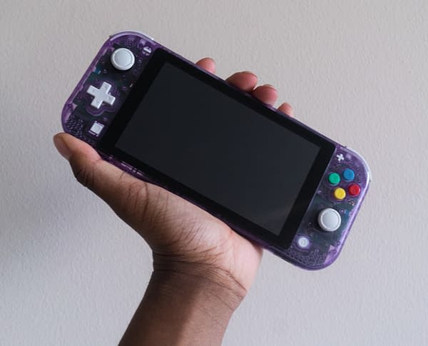
As someone who owned a Game Boy Color, this is a thing of beauty to me. While purists are going to argue that it doesn't have the "exact" look, we're going to ignore that opinion and just marvel at the way this is presented. First off, you got that clear light-purple shell showing off all the inner electronics of the system, which always made it a standout compared to other Game Boy products. From there, he takes a little bit of liberty as he went with gray for the D-Pad and thumbsticks, which is more from the Game Boy Advance but that's fine since the original was dark gray. Finally, you got the standard buttons in candy coloring matching that of the SNES look, which again, not on the Game Boy Color, but it's fine as it adds flavor. This is a mighty impressive design, and you can see how it all came together in the TikTok video below.
@tydilla_##nintendoswitch Custom ##alwayslearning ##fyp ##acnh ##gamingloop ##minitutorials ##learnfromhome ##retailtherapy


