Posted in: Comics, Dark Horse Comics | Tagged: american gods, american gods: my ainsel, dark horse comics, fantasy, jennifer t. lange, neil gaiman, p craig russell, Scott Hampton
American Gods: My Ainsel #3 Advance Review – Experientialism that Fails to Elicit Emotion
Shadow has trouble with the heating in Lakeview and meets his neighbor. Wednesday arrives not long after and takes Shadow to Las Vegas to meet up with another contact. They spend some time there, and Shadow returns to Lakeview and finds means of keeping himself occupied while waiting for Wednesday's next arrival.
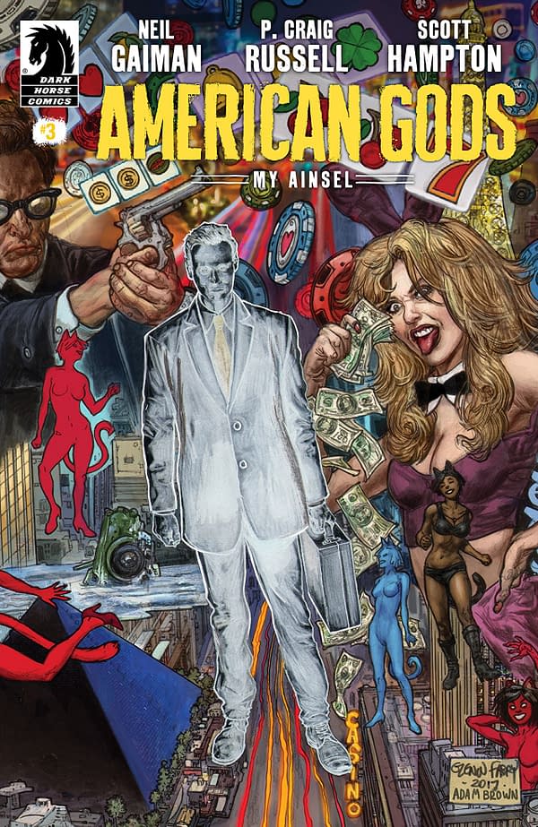
American Gods: My Ainsel #3 is very much an experiential comic. There is a plot, yes. It's beating away somewhere in the background of everything, but we are mostly meant to just follow the emotions, thoughts, and experiences of Mike Ainsel, or Shadow.
Perhaps, that is why this comic bored me to tears.
I will admit my subjectivity here. I'm not one for the Neil Gaiman style of experiential and existentialist comics. I like my comics structured and forward-moving. I'll admit this is my first excursion into American Gods, but this comic didn't sell me on the property.
Character pieces are important, but even Ainsel isn't exactly the focus of this comic. It's about what he does instead of who he is. While you can glean who he is from that, it's not the point, and I still don't feel like in know him that well.
These are the same reasons I didn't like Bucky Barnes: The Winter Soldier despite my well-documented love for Bucky. The character is not the focus of a book like this.
The set-dressing is played with in a creative manner in the Las Vegas section, with the scenery literally giving the narration. However, even this feels a token attempt at vague experimentation, and it comes off as cloying.
That's to say nothing of the tired nature of explaining Las Vegas to the audience. Every film, show, and comic thinks it has the Las Vegas take, and they almost never do.
There is a character who is obscured by the comic and narration, and he slips from people's minds once he disappears. The comic does handle this idea in a genuinely interesting manner.
Scott Hampton's artwork is well suited for the airy and meandering nature of the comic. You get a feel for the shapes and details, but they feel faint and fading. It leans on realism, but that reality feels vague. It's a nice aesthetic, and I do like it throughout most of the book.
Hampton is joined by Jennifer T. Lange on the color work, which is similarly faded and vague. This coincides well with the art, and it's also quite good.
Also, Wednesday looks ridiculously like Rip Torn circa 10 years ago.
American Gods: My Ainsel #3 is a dull comic. It aims to be an experiential comic, but it's not even a good one of those. It has good lines sprinkled without, but it has no meaning or character dissection to deliver to the reader. The art is good, but it doesn't save the book. This is one you can pass on this Wednesday.


