Posted in: Comic Show, Comics, Recent Updates | Tagged: Alison Sampson, Comics, entertainment, genesis, image comics, Nathan Edmondson
Genesis Is The Changing Face Of Image Comics – The Bleeding Cool Interview With Nathan Edmondson And Alison Sampson
Image Comics releases 64 page graphic novel Genesis this week and amid Image's trademark swath of very individualistic books, Genesis stands apart for a number of reasons. It may well be the most visually unorthodox Image book I've read in terms of panel layouts, and morphing, stream-of-consciousness spreads, and it's also a book that handles deeply psychological and somewhat religious themes without providing any easy answers. In Genesis, young Christian minister Adam finds himself amid a crisis of faith about whether he can really make any positive impact on the world, and as he wrestles with his demons, the reader follows him through increasingly unraveling landscapes that blur the line between internal and external reality.
At the heart of the comic seems to be the question: "What does it mean to change the world?" Other readers might suggest a modified version like "How does one change the world?" or "Should one try to change the world?", but I'll stick with my first, broader question because Genesis seems to be about one character's exploration of the self, and his overwhelming journey into the realms of mind and being. So, changing the world may have a lot to do with changing his own perception of things.
Writer Nathan Edmondson and artist Alison Sampson nudge what we might expect of comics from Image a little closer to the bande dessinee mark, and may well be opening doors for more creators to bring imaginative and experimental works to Image with a greater European influence in play. They've certainly planted their flag in unexplored territory, and made a bold push into the uncharted territories of psychological comics narratives.
Both Nathan Edmondson and Alison Sampson spoke to us here at Bleeding Cool about Genesis:
Hannah Means-Shannon: Ok, so we have the title Genesis and the main character's name, Adam, and he's a minister, and at one point he's possibly wrestling with a kind of angel like Jacob in the Old Testament. Why the religious names and themes, and why Christianity particularly?
Nathan Edmondson: I don't know that these themes are even necessarily Biblical, and the title, though apparently Old Testament, wasn't necessarily chosen to connect the story to scripture. I think the reference to Jacob and the Angel is intriguing, but it's not something I had in mind in crafting the story. There has turned out to be a kind of prismatic effect to the story, where there are so many themes and ideas that bounce around when you look closely at it; that's been true for me as a creator as well as, apparently, for the readers.
HMS: I know as a reader I can identify with people's parents telling them they are supposed to change the world, as Adam hears, and as a teacher, it's something I hear in classrooms and can't help but propagate. Do you think this widespread idea is too much pressure on people or just that people somehow don't fully understand what it means to try to change the world?
NE: Probably there's something to the latter; one the one hand, I think there's often a remarkable hubris and naivete among many people who set out to "change the world" in one way or the other, but on the other hand, there's something to the idea that no one can anticipate the effects that resonate from their actions and decisions.
HMS: Many stories, and often in comics particularly, deal with the consequences of unlimited power, almost always turning toward the sinister. What do you think makes Genesis unique in handling this idea?
NE: That's a little bit like asking "why is your kid more special than these other kids," to me. If in any way this book is distinct from other "boundless power" stories, I think it comes from how totally unaware I was of other stories like this when I had my fingers on the keyboard. So any unique quality, in other words, was a happy accident! As is usually the case whenever something good comes out of my story ideas.
A large part of what sets Genesis apart, though, from other comics that may be narratively or thematically similar is in the art. Alison's truly unique and undeniably interesting style and approach opens up the world and fantasy of this story in a way I have certainly never seen before.
HMS: Adam finds himself in fairly deep conversations with a Bear for a large part of the comic. I have to ask, why a Bear? What do you think that adds to the story?
NE: I'm not sure where the bear came from; in the original draft of the story there was no bear, actually; he came in as I recognized the necessity for Adam to interact with someone to discuss what he was going through. As I tinkered with the writing it suddenly made sense to me that there would be this bear there, talking with the lead character, forcing Adam to question his sanity and making the reader consider a more fantastic story world than even comes in the opening pages.
HMS: How did you go about writing a comic like this? It seems like it must have been difficult not to have way too much exposition and dialogue to try to tell a story that's essentially as big as the universe. Was this a heavily crossed out script?
NE: Not really; I did a second and maybe a third pass but much of the story that you see came naturally and quickly; the nature of this script was such that a great deal of the set pieces and story turns could be second guessed in a loop forever and I realized that early and just accepted and worked with whatever inspiration arose.
HMS: Alison, can you talk a little about how you and Nathan came to work together on this comic? And further, why you settled on a heavily realistic style of line-work even while dealing with such fantastic subject matter?
Alison Sampson: Nathan got in touch with me by email, out of the blue. I'd just had my first comic published in UK small press anthology Solipsistic Pop, a page of that had found its way online and Nathan had seen that. I was coming to the end of my current contract, and had read Who is Jake Ellis. It seemed like a good idea, at my stage of art experience to draw something someone else had written, so I would be stretched. Seduced by the description of ideas that the comic might involve, of the world and people being transformed, I put aside the mini-comic I'd just started, and decided to work on what would become Genesis.
The art evolved into how it now looks, through the course of the production process, but also, in architecture you are trained and work to depict the world as it is. Even if the art is abstract, you are working towards communicating some kind of truth, be it material, or otherwise. Defining what makes comic art look 'real' is a bit tricky and I'm more inclined to think abstract elements can be closer to reality than "accurate" anatomy. With figures the way of drawing comes from my previous experience of drawing children for practice, and wanting to draw from life. The contrast between this and everything else on the page makes a tension which grounds the story in reality, but also helps expose the interior life of our characters.
I might have drawn the figures differently, and initially did, and we certainly might have colored the work differently. Our first coloring sample, by Ian Herring, was rejected (part of his sample is included in the back matter, for readers to see for themselves). I was still keen to take as much of an art-based approach as was possible, but pursued that in a different way. Everything we have made in terms of art, be it lines, anatomy, composition, colour, layout or anything else is in pursuit of the story. Genesis is about the balance of interior life and reality, and to be honest, I have not worked on this so consciously as to choose an art style. This is how it turned out.
HMS: When you read the script, or had a clear idea of the full scope of the comic, did you think to yourself, "Wow, I have to be able to draw everything for this. Every kind of thing in the world?" It's a huge task! Did this range appeal to you?
AS: The project did not happen that way. I started drawing when I had two-fifths or so of the script, and didn't see all of it for more than a year (although I obviously didn't know that when I started). I was prepared for anything, though, which was just as well. I wanted very much to draw a "draw anything" book, and still do, that's my MO. If anything I would have liked to have drawn more different things, and was only curtailed by the length of the story.
HMS: Explain a little to us about your decisions regarding panel layouts and composition. In such a free-flowing story, how did you manage to keep a grip on guiding the reader through the comic narrative visually?
AS: It's good to hear that I have! I designed thumbnails, quick layouts at print size (best for composition), penciled the pages, inked them as bluelines, and kept reviewing the composition all the way through. The layouts are the best I could get to include what was in the script and tell the story. I chose not to make the layouts overtly unconventional, as my previous comic had been, as that was not what the script asked for, and the content of the panels would be challenging enough. Twenty five years of practice making sufficiently clear art for people to make colossally expensive structures from, for some other people, paid for some other people, within the public domain/ real world, might also have helped.
HMS: What was the most difficult page or panel to design and execute in the comic? Which are you most proud of?
AS: The page with the fishermen was the most difficult. It was just hard to lay out so as to get everything in, so it could be seen and it was also a hard page to finish inking. This was one of the pages I would like to have been two pages, but the page was like this for pacing reasons. Overload is not just the appearance, it is the story. I also had to invent a method of fishing, draw a four different crowd scenes, a light-house, our hero's palace in miniature, an airport and a fishing village, as well as several things transforming, and lots of different people. It also has to work with the opposite page. Here's the script:
Panel One
An airport crowd looking up at a TV with Adam on it as he builds something.
1)Caption: They called me a Messiah.
2)Caption: How could they not?
Panel Two
Adam is standing on the steps of a lighthouse; the ocean behind him is teeming
with fish and fisherman are all casting out nets to catch them. The fish are so many
they seem to be boiling out of the water. Adam is holding his hand up, explaining to a crowd a poor sea-town villagers.
3)Caption: Even when I told them that I was no god.
Panel Three
Adam, with Lily behind him, is trying to gesture to a begging group of pilgrims
and followers who are following him up the winding steps toward his palace.
4)Adam: Please, I'm sorry. I just need to go home.
5)Adam: Please.
Panel Four
He and Lilian are walking up the steps now, and we see that behind them is a
WALL that circles the hill now, and the followers are suddenly stopped behind it. But we're seeing the palace now, and it's growing every moment.
I'm proud of the whole book, every page almost equally, but I like page 15, posted here. It is relatively unusual in comics to see this kind of thing, especially in a book graded as teen. I was quite apprehensive as to how it would be made to work, as it is very particularly about *her* and needed to be graphic without being graphic. This is the big strength of comics- the viewer can infer as much, or as little, as they like, and I hope we have got a beautiful page out of it as well.
HMS: Is there an intentional nod to Chris Ware's Building Stories in the way Adam builds with blocks, or particularly in the "Starting Over" sequence where we see neighborhoods and childhood items like cut-outs to be assembled? Is there something meta going on here about the way we "construct" worlds in comics through surfaces?
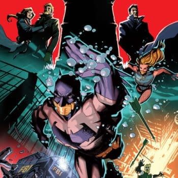
AS: No and No. I could never reference the work of another comic in terms of how things are represented, that's completely not where I'm coming from philosophically. It would make me really uncomfortable. I don't think about comics in a meta way, at all, as my very much more substantial experience is in architecture, where we construct different worlds differently, everything put together from scratch. There are nods in the comic to various other comics, places, things and people- a huge list, from Mazzuchelli's Batman Year One (the cover), through The Nao of Brown to Brandon Graham's whale, through Matt Southworth's light-house to Jock's studio. These things are there because this is my artwork and it is my choice. Mainly, though, I just think about what is on the page and what the viewer will make of it. In the instance of the cut-outs, it is a reason very specific to the story, where I was trying to suggest to the reader what was going on, by putting them in our protagonist's position.
HMS: How do you think Genesis fits into the context of your past work, and can you tell us about any of the other projects you're working on?
AS: Image Comics were fantastic to work with, not only for the work being creator-owned, but also because of their ethos towards quality, which suited me. I hope I'll be able to work with them again. This is the first time I've not only owned my own work, but have been personally credited for it, and this is quite an emotional experience. After all the years and years of work for hire, It would have to be that my first comics were creator owned and very personal, and the next ones will be as well. I've been very lucky in terms of collaborators and hopefully will be able to announce something quite soon.
At least one of these books is the "draw anything book" I've so much wanted to do.
Genesis arrives in comic shops on April 16th. Also, if you are in the London area, make sure to check out Alison Sampson's appearance at Forbidden Planet on April 19th to sign Genesis:
Hannah Means-Shannon is EIC at Bleeding Cool and @hannahmenzies on Twitter


