Posted in: Comics, Recent Updates | Tagged: abe sapien, Comics, dark horse, dave stewart, entertainment, hellboy, Max Fiumara, mike mignola, scott allie
Inside A Personal Apocalypse – Process On Abe Sapien #12 From Max Fiumara and Dave Stewart
Bleeding Cool spoke with co-writer on the series with Mike Mignola and EIC at Dark Horse, Scott Allie, last week about just how Abe Sapien #12, coming in May, is a very different book than readers might be expecting.
It's a close-up story of two people's experience of the beginning of the world-wide apocalypse in the Hellboy Universe, one a somewhat brain-washed orphan raised by a man with extreme Biblically-driven views on violence, and another, a young woman who is "rescued" by him having suffered extremes of loss in the apocalypse only to find herself captive under gruesome conditions. Enter Abe Sapien, who pits himself against the forces of oppression.This issue sets up a long arc of narrative featuring Abe, and plays into a wider storyline that will eventually be gathered under the trade collection name "Sacred Places". If issue #12 is any indication, this is going to be one of the most psychologically impacting stories yet told in the Hellboy Universe.
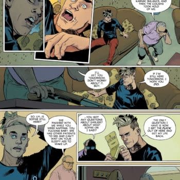
The tone of the comic, beat by beat mythological, and the artwork on the comic by Max Fiumara and Dave Stewart builds an increasingly unsettling mood as readers watch Abe's approach through a dangerous wasteland. When up against fanaticism bordering on madness, it's impossible to predict just how Abe will confront this explosive situation. It's an issue of Abe Sapien where every panel and every line of artwork carries extra weight to convey the intensity of the storyline. Max Fiumara provided us with the layouts, pencils, placements, and inking for the first 6 pages of the comic to give us a window on how he constructed this "personal apocalypse" for the characters, and Dave Stewart has also provided his notes on the colors for this "wasteland" set narrative of a broken world.
Layouts (Max Fiumara)
Max Fiumara: The story presented different locations and moments in time for each character, so we set "master" shots to guide us through the whole story. I planned these master shots from letters A to I in the layouts to keep track of the events and make it all clearer for me.
MF: For example: Master B repeated itself on pages 1 and 5 and set the central shot of the man on the roof of the house. Master E was the one with the woman on the bed in the dark room. Master F showed the scene with the monsters and the car on the streets, and so on.
MF: We'd been talking about doing three panels per story page for a while, since I have a great time drawing big panels. In this one, it was clear to me that all the panels had to be the same size. It helped me set the locations better if I had the room to draw big backgrounds and then use those same backgrounds in different panels to follow the sequences more organically, as in page 1, panel 3, having the same background as page 5, panel 1.
MF: Making all the panels the same size also helped give each character and moment the same level of importance.
MF: Having so much room to draw gave me space to do new stuff, and Scott [Allie] asked me to do the sound effects by hand, something that I don't usually do. But it was a lot of fun, as can be seen on page 6—that BAM across the room. It was great to play with the effects and integrate them into the drawing.
Placements (Max Fiumara)
Inks (Max Fiumara)
MF: In issue #12, I used more drawing tools than in any other Abe issue I've done so far. This was because of the different time frames we have for each character in this particular story. The way of inking, the style, and the tools used were changed to identify every scene.
MF: I opted to do all the woman and the man's flashback scenes using washes. Those scenes are the darkest, so I thought the washes would add that level of heaviness to them.
MF: For the scenes with the woman in the dark room, I used the brush, without gray tones, and hid everything in big spots of black. In there, the woman is having a really hard time, trying to repress some disturbing memories, so I used her body language and the shadows to emphasize her feelings.
Colors (Dave Stewart)
Dave Stewart: The time and location changes needed different color schemes. The colors were chosen not only to contrast with the other scenes, but also to give an emotional cue. The opening scene needed that pale, sunbaked feel.


