About
About 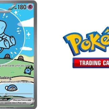
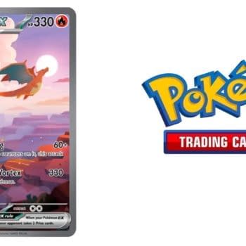
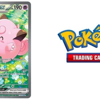
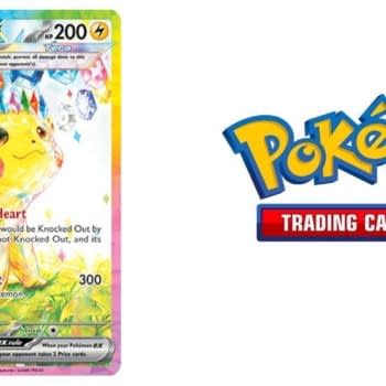
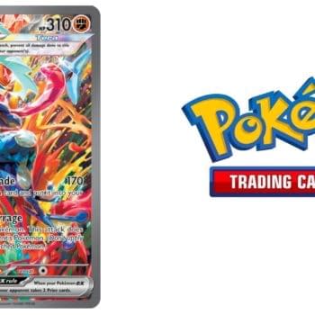
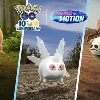
Our monthly Pokémon TCG Value Watch series observes the Shiny-themed cards of Scarlet & Violet - Paldean Fates in March 2026.
Posted in: Comics, Comics Publishers, Marvel Comics, Review | Tagged: marvel, Marvel Comics, shang chi, shangchi
Shang-Chi #1 Review: An Impossibly Corny Debut Issue
Ahead of the upcoming Marvel Cinematic Universe film, the House of Ideas kicked off a new Shang-Chi series by writer Gene Luen Yang, artist Dike Ruan, flashback artist Philip Tan, colorist Sebastian Cheng, and letterer Travis Lanham. Will Shang-Chi get unfamiliar readers excited about this superhero before he hits the big screen?

Shang-Chi #1 is a weird one. While it's not totally unenjoyable, it does feel as if the script was found by someone sorting through a filing cabinet from the 1980s. The narrative is choppy, starting with a flashback, cutting to the villains of the book, and finally introducing Shang-Chi's personal life and the way it collides with his former gig as an Avenger. While the book transitions gracelessly from scene to scene, coming off as a patchwork of scenes rather than a building narrative, the book still has everything it would need to deliver a fun, light superhero story. Thing is, it's ceaselessly, impossibly corny.
The way Shang-Chi shakes his boss's daughter's hands and marks, upon noticing that her callouses are earned from holding a pen rather than hard labor, how her "normalness makes (his) heart skip a beat" is impossibly corny.
The way he is warned by Leiko Wu about his father's organization being active again, prompting him to ask, "Are you sure?" only for them to burst, as if choreographed, through his window to Leiko's cry of "Pretty sure!" is impossibly corny.
One of his assailants, criticizing her society's weapons by saying, "Agreed, brother. Sticks are the stupidest" is… I don't even have to say it.
The art in the flashback from Philip Tan is a fluid, hyper-detailed style that would've been nice to see through the whole book. While there are a few panels where the action is visually confusing, it's an attractive style. Ruan's artwork on the main story is decent but without real flair, though the final splash page is well-done. Overall, there's nothing in the art that is going to make people marvel at the look of this comic, which Yang's lackluster story badly needed.
Shang-Chi is off to a rough start with this clunky first issue riddled with corny dialogue. If Marvel was hoping to cash in on the hype of the upcoming movie, this is unfortunately not going to convince many people who weren't already dedicated fans of the character.
Enjoyed this? Please share on social media!
Stay up-to-date and support the site by following Bleeding Cool on Google News today!