Posted in: Comics, Review | Tagged: china mieville, Comics, dc, dial h, image, robert kirkman, thief of thieves, vertigo
Sunday Reviews: Thief Of Thieves #5 And Dial H #2
Eliot Cole reviews Thief Of Thieves #5 by Nick Spencer and Shawn Martinbrough for Bleeding Cool
This is like a new issue one. The thing is, that they really didn't need to have one as it's been going pretty well. It feels like the beginning of a good caper film. The setup of a crew, the introduction to the characters and a brief backstory to cement the whole thing.
This is done in a slim package, too. At just twenty story pages long, it's a slim volume. Which is testamount to the storytelling on show here. Spencer is fitting in a perfect amount of information in, and only using one splash page for effect. The almost exclusively wide-angle panels that Martinbrough and Serrano cultivate in these issues are perfect fodder for this type of story, playing in to every genre tick you can think of. It even has the Clooney/Lopez sexual tension at a bar in Out Of Sight.
The chapter titles feel fresh, too:
- Some Years Back: The Thief & His Ghost
- The Key
- The Slip
- The Distraction
- The Heavy
- The Worm
- The Fireman
- Meet Me At 9. Or, That's What Friends Are For.
- Talked About The Job. 10 Minutes Later
It's fantastically well realised as a concept. For this I guess Kirkman deserves a fair bit of credit.
The colouring and line-work on show here are a wonderful advertisement for comic books. If this ever makes its way to television (they have the deal) any follow through readers will get a beautiful introduction to the form. It's not quite the flat colouring that's popular in a lot of books at the moment but it uses a similar blocky style. The backgrounds are not huge on detail, and any scene that isn't talking heads is a simply done thing. Whilst I'm never crazy about that, I understand the focus, and I might have spoken about it in reviews before. For something relying on the characters so much it's important.
No breakdown of a scene page (or pages) in this review, because it's a short issue. I'm not beyond putting spoilers in a review, but I feel that this issue is so strong that it doesn't need pimping. Take a look at a couple of the abstract panels dotted around. I wasn't sure about this as a series at first, but the third issue was one of the best of the year so far. This one is quite close behind that.
If you're not already on board, I'd get on board now. Brilliant issue, four out of five.
Eliot Cole reviews Dial H For Hero #2 by China Miéville and Mateus Santolouco
Comic book of the week.
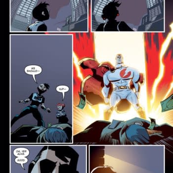
Dial H had a five star first issue, and Miéville & Santolouco have created a devilishly funny, modern, clusterfuck of a comic.
Going to dive right in with that first page, here. This will not work unless you've actually read the first issue, but by the end of the second page of this one you'll be good:
Beat 1 – BWAHAH!
Beat 2 – Huh? Sure!
BAM! BAM! BAM!
OK, that's not my most incisive analysis ever. I do think, however, that this rather exemplifies the wry humour that fills this book. One can *only* implore* you to pick it up. It's like an Image comic, but without the super disconnect that comes along with being in an unconnected world like that.
The tragedy of a fat, out of shape, addict is intentional (I hope) and works so well. It's also nice to have someone fat in a comic book, even if they are juxtaposed with a heroic, alter ego (or two). It'd be interesting to know whether this was born out of concept by Miéville, or came as a purely comic book decision.
In this issue we get the gentle evolution of Nelson, yet a swift progression of his reasons to carry on. If you were to think that motivation typical I might take issue, as I think Nelson isn't quite your average "vengeful warrior" type. We're looking at a friend purely concerned with the welfare of another friend, and it's actually kind of touching. I think moving the protagonist's motivations along faster is ideal here because you need to get to a point where you can bring meaningfulness in stories with new characters, and that point needs reaching fast. This is because every reader is new, here, and you have to keep them. For denser books such as Dial H, that means a fast plot or fast character development (ideally both) and a solid conceptual basis.
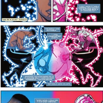
Santolouco's line work, along with the Hories on colour, provide a dark (enough), detailed, complete world in which it's not necessary to realise that this is part of a greater world (at DC). Miéville, who is studied in creating disturbing worlds for disturbing characters to have their story within (Perdido Street Station), iscomplimented strongly by this style. Which actually makes this a good find as Santoluoco is relatively new to the North American market (despite some 'cameos' in Marvel and DC stuff). Although a quick browse of his work on his website (santolouco.com) shows a keen eye for the abnormal.
Overall my favourite thing about Mr. Santoluoco's art here are the faces, and this is without talking heads exploding over the pages, too. He manages to get such reaction within the eyes of his characters (and indeed uses the eye quite specifically in this issue) that it really brings you in to the character so much more. After I read what he said in Érico's interview with him (see below), it strikes me that the hyper normality of the characters (specifically the main one) in their non-heroic status is assisted by the skewed visions that are presented here to create that connection that they want the reader to have. It's a complement when I say that I could see this guy doing great work for 2000AD.
For an interview with Manuel, please check out Bleeding Cool's tête à tête on the 26 May:
The creative team have produced an almost the perfect piss-take of modern comic books. Whilst still having pseudo super heroes in it to "legitimise" the whole affair. This issue is a five out of five. Buy this, buy the hell out of it.


