About
About 


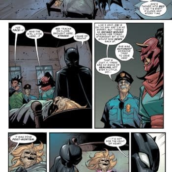
For Your Consideration: Who's campaigning for The Eisner Awards 2026? And who should I be voting for?
Posted in: Comics | Tagged: black beetle, Comics, dark horse
When The Black Beetle Went From Super-Noir To Glam-Noir
 By Hannah Means-Shannon
The wild success of Francesco Francavilla's four-part Dark Horse mini series Black Beetle: "No Way Out", has led to a returning mini series in the autumn entitled "Necrologue". Dark Horse branded Francavilla's work "Super-Noir" in advertising and that's definitely an accurate description. Black Beetle goes back to the original pulp foundations of heroes like Batman via characters like The Black Bat, but this is no reboot, however entertaining late 30's reboots might be in this explosive era for genre comics. To call Black Beetle "Super-Noir", though, hints at the new energy applied to noir themes and imagery in the series, without really doing justice to the visual impact of Francavilla's work and the ways in which it might change the way we see noir comics forever.
Francavilla would probably be the last to say that his ideas come purely from his own brain. He seems to conjure up a riptide of 20th century influences to fuel his nearly psychedelic noir, and plenty of that influence comes from film, perhaps even more than from comics. Comics have always been influenced by film and TV. Even the great Will Eisner was a fan steeped in noir films when he began working on his legendary strip The Spirit. And as every good fan knows, Batman used to be even more of a detective than most comics make him out to be, though a few creators return to that well, to their credit. Detective fiction and crime comics have been with us since the early days of comics, and Francavilla could have found plenty in that tradition to work with. The result would have been beautiful, no doubt, and could have even been quite a page-turner, given his instincts for pacing. But visually, especially, Francavilla has chosen to embrace the film influences of the 60's, 70's, and 80's, and shown that this move doesn't make his work any less of a comic to strengthen the medium. By bringing in these influences, particularly in terms of color choices, full-page spreads, and panel layouts, Francavilla has invented something we really haven't seen on this scale before, particularly in comics: "Glam-Noir".
 It's not a perfect term to use, and probably suggests there's something ephemeral in what Francavilla is doing, which is not the case. Something can be glamorous in good ways, and not just in a superficial sense. One of the covers for Black Beetle #1, for instance, that has plenty of noir written all over it. We have a masked, black-clad hero with a handgun, in profile against a dark building. That's plenty of noir. It's "super" as Dark Horse suggests, because he's wearing a cape, has night-vision goggles, and a cowl. But it's glam because he's offset by a wall of red etched with a descent into a labyrinth.
The popping colors of the cover are too dominant to be really noir, and the pattern and idea is not visually resonant of superhero comics. It's something new, and has a vague whiff of film posters for Alfred Hitcock's Vertigo. The visual influence is coming over from film, and in particular, film posters. Francavilla is known for his cover art and poster-like compositions, so that's no shock, but the shocking thing is what he's doing without any announcements or fan-fare; he's turning comics into the kind of visually glamorous artwork that's iconic of past decades, especially films that are suspense, detective, or spy-based. These are all things that form part of the mix when characterizing Black Beetle and his adventures. Purple-blue and red continue to form the color themes for issue #1, providing more luminous contrast than you'll see in other noir comics, which may use these colors more sparingly. But Francavilla balances the splashy colors with densely brushed inking that makes the comic feel painterly and even elevates the noir elements of his late 30's roadsters, fedoras, and his sci-fi heli-packs.
As impressive as Black Beetle #1 is, the series actually becomes bolder as it progresses and more fully pays homage to psychedelic influence. In issue #2, perhaps because of the stealthy night-time escapes and investigations of the Black Beetle, the art sticks more closely to what comics fans might traditionally expect from noir, though Francavilla's tendency to present full-page or even double-page spreads of a poster-like variety at key moments is not something that's very common to behold in detective fiction. Noir stories in both fiction and comics tend to be created as a composite of small moments, gathered together like clues and assembled as a progression or pieced together by the detective. Francavilla hits more emphatic moments with these often heroic spreads, turning Black Beetle into an adventure and mystery story, rather than simply a detective story. But what really seems to vault the Black Beetle series into "Glam-Noir" is the full involvement of the vigilante Labyrinto. Firstly, his yellow-orange, skin-tight, labyrinth-etched costume is totally outrageous in its confidence and iconography. But Labyrinto is not the only thing that inspires these more glamorous moments. Coco's club also seems to demand a more visually innovative approach.
 When the Black Beetle, disguised as an average Joe, turns up to the Coco club hunting down a lead on Labyrinto, an introduction to the club is presented in a page with a rigid grid layout, each containing a detailed close-up of club images, and all the grids are framed by lines of sheet music with lyrics. This approach has comics precedent, and even David Lloyd in V for Vendetta uses it for some of the musical numbers, but what Francavilla does that hints at greater surprises to come is to set them off in increasingly pastel hues. The double-page splash that opens issue #3 is in many ways the most impressive set of pages in the comic up to that point (among impressive pages) because it feels like it totally breaks with comic conventions established in previous issues. It's an image of pure mood as disguised Beetle watches an angelic African American singer dominate the club with her performance.
Hot pink notes stream across the page and the open space of the club and its relaxed denizens would feel noir, if it was presented in more muted tones and a little less grand in the use of open space, but for the color themes, which are orange, pink, purple, blue, and yellow. Some of the club scenes presented later are more shadowy, but the real glam potential of the style and color combination comes out during the Beetle's fight scene with mobster bouncers. In two one-page segments and two double-page layouts Francavilla develops radically on his own style in the Beetle series so far. The colors used are borderline psychedelic, roped in to a more mild tone only to harmonize better with the noir inkwork, and the layouts are remarkably ambitious. Some panels are presented as close-ups while others are interlocking segments of a wider image and the distribution of these panels hop-scotches around the page like the famous sliding color panels in 60's and 70's film trailers and the segmented design of posters from the era. This kind of intuitive layout is explosive in terms of the energy depicted and brought to the story as the Beetle grapples with multiple opponents against orange, purple, and pink backdrops with the occasional full-panel sound effect. There may have never been a fight scene presented in genre comics this glamorously before, though I'm sure that superhero comics fans would argue that they have plenty of glamorous fight-scenes build upon their own heroic aesthetics.
The final issue of the "No Way Out" miniseries was bound to be an escalation of some of the visual risks and experiments taken in issues 1-3, and also an issue that had some surprises in store for readers in terms of storyline as the "mystery" of the story wraps up. At this point we should probably address the use of yellow as a third color element on the covers of issues #3 and #4, a very pulp color for novel covers of the 50's through 70's, particularly in Europe, but also a staple of 70's film posters. The glam is breaking through even more firmly on the covers of these issues. From the splash-page onward, issue #4 seems to have found its more daring glam voice, with a map of Colt City depicting a blood-red sky and a purple river. About the first half of the comic takes place in necessary darkness and purple or blue-tinged shadows, but things really break loose when the Black Beetle comes upon Labyrinto once again.
Two double-page spreads step out of the realm of traditional comics storytelling and seem to establish a different symbolic language of their own. It's not a subtle symbolism, but more like an open acknowledgement of the type of story we have been reading and what that typing would translate into visually. Both spreads depict the Beetle's half-face on one side and Labyrinto's half-face on the other, and the space of the two pages between them is filled with interlocking puzzle-piece shaped panels depicting first, the Beetle's investigations, and then Labyrinto's story. Here again, both the colors and the format come together to really build up a "Glam-Noir" world. Green, orange, yellow, and red backgrounds frame the narrative, but it's the puzzle layout combination which really raises the level of visual statement made by the comic.
Black Beetle: "No Way Out" is a comic that seems to evolve through its four issues from heavy noir with hints of the nostalgia with which we now view noir stories and characters, to a more electrifying and riveting interpretation of noir as part of crime fiction, mystery fiction, and adventure fiction. This means that the comic is thrown open to wider possible visual influences, and Francavilla carefully selects the traditions he feels are most appropriate in color and design to create something both familiar and new in genre comics. Nostalgia can get cloying, particularly if you read a lot of homage because you enjoy it, but Francavilla isn't satisfied with simply making a tribute comic. He's crafting a new hero, and a new world, and when it suits Francavilla, he's prepared to show us just how glamorous and exciting that world can be through radical experiments in a more glam form of noir.
Hannah Means-Shannon writes and blogs about comics for TRIP CITY and Sequart.org and is currently working on books about Neil Gaiman and Alan Moore for Sequart. She is @hannahmenzies on Twitter and hannahmenziesblog on WordPress. Find her bio here.
Enjoyed this? Please share on social media!
Stay up-to-date and support the site by following Bleeding Cool on Google News today!