Posted in: Comics, Image, Review | Tagged: fantasy, image comics, jamie mckelvie, kieron gillen, matthew wilson, The Wicked + the Divine
The Wicked + The Divine #36 Advance Review: Too Cute for Its Own Good
We see the history of Ananke/Minerva's stealing of god heads throughout time, and, in the present, Persephone comes to terms with the Baal's revelations.
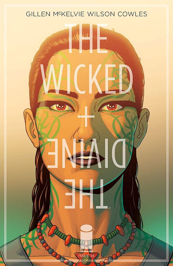
This issue leaves me feeling a bit dumb, because this week on my Comics for Your Pull Box entry (up yesterday, read it here), I slavishly endorsed Wicked + Divine as a must read. In fairness, this comic is usually excellent and among Image's best releases.
In any case, this comic is taking gallons of 100% pure and undistilled piss.
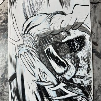
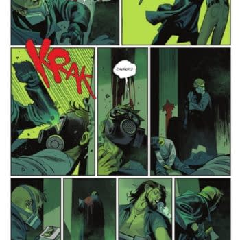
Instead of advancing the story in any meaningful way, Wicked + Divine #36 opts to give you 12 straight pages of one god taking off heads throughout the millennia on repeat in a manner which seems like it's aiming for humor. There is some variance in that her victim occasionally dodges, fights back, or embraces Ananke. However, there's no sense of flow or progression. A cycle of misery can be conveyed in far less than 12 pages, and, in fact, one could argue Wicked + Divine has been conveying that idea well throughout its run.
It doesn't line up well with the dramatic and painful confessions of a character delivers in the final eight pages. Plus, the comic opts to make three of its pages pure red with a line of text in the middle. That could have worked, but this comic already felt like enough of a piss-take and using another three pages for pure red with a single line of text is a bit galling.
Jamie McKelvie can at least successfully make all this gorgeous and tries to spice up some of these repeated panels with little details to add variance. It doesn't change the fact that much of the comic is wasted page space, but it is something. Matthew Wilson's color art once more impresses with its wild but balanced palette.
The Wicked + The Divine #36 feels like it's trying quite hard to be cute. It tries to be what I assume is experimental, but it doesn't click and feels like a waste of an issue as a result. The art holds up well, but it doesn't fix the problems. This is an issue you can pass on this week.


