Posted in: Comics | Tagged: Comics, dynamite, entertainment, flash gordon, Jesse Hamm, Kings Cross
Creator's Commentary – Jesse Hamm Talks Flash Gordon: Kings Cross #1
Creator Commentary: Jesse Hamm talks Flash Gordon: Kings Cross #1, now on sale from Dynamite. Cover by Roger Langridge and interiors by Hamm and Grace Allison.

We wanted most of the action to occur on Ming's turf, which is more alien and adventure-friendly than familiar Earth-bound locations. For this first issue, though, we needed to first meet the characters and set up the story, moving from familiar ground to (eventually) the more unfamiliar world of Mongo.
PAGE 1
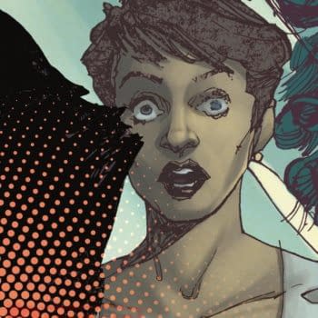
I had envisioned this scene in warm colors, like yellow and orange, but I'm pleased that Grace Allison, our colorist, went with these cool turquoise colors. It gives the scene an eerie quality.
PAGE 2
I drew this issue months in advance, but I wanted the cinema marquee to feel contemporary, so I looked up what movies would be released this fall, and picked THE MAGNIFICENT SEVEN. That one has the advantage of being both current (the remake is now in theaters) and timeless, since the '60s original still plays occasionally at art house cinemas. The title also has the advantage of being short enough to fit easily on a marquee!
PAGE 3
Our hero-shot of the Phantoms! Jen has worn a sort of hood in prior appearances, but for this series I chose to keep her cowl similar to Lothar's, to match the classic Phantom "look." I gave her a ponytail, though, to easily distinguish her from Lothar in long shots, or from behind.
Here, I was pleased by the chance to show Jen leaving THE MARK OF THE PHANTOM on a bad guy!
I drew all of this issue's linework in pencil, darkened in Photoshop to read clearly.
PAGE 5
You might notice that the Phantoms have dragged their unconscious foe from the crumbling theater. They'll risk their lives to spare even a villain's life, if they can!
We also meet Mandrake. I drew him on a separate layer, to make it easier for Grace to achieve his nifty transparent glow.
PAGE 6
Xanadu! The privacy of Mandrake's hideout offered a welcome chance to see the Phantoms without their cowls, which I think adds visual variety and underscores their humanity. I kept them in their domino masks, though; don't want things to get TOO prosaic.
I like to give locations stairs; they add spatial variety. Too bad I don't enjoy drawing them!
This issue had to establish a lot of plot elements before we could get to the adventure, per se. Fortunately, Jeff is great at finding fun ways to convey information. Mandrake's hideout, with its flaming bowl and the tidal wave, the Phantoms' confrontation with the crook at the cinema, and the action we'll see in the subsequent pages, all reveal story info while providing action and spectacle. MUCH better than having the heroes call a meeting and discuss what's happening for 20 pages.
PAGES 10-13
Enter Flash and Zarkov! Jeff left the choreography of this fight scene up to me, and I added the gag of Zarkov pouring himself a drink and making a toast in Russian.
The action here is much more violent than we ended up with in the rest of the series. My thinking was that, if Flash had to take on nine mercs, merely punching them out would stretch credulity too far. These guys are armed and would play for keeps, so Flash would need to be as lethal as possible.
I forwent background detail here to keep the action clear. I love Grace's choice to make the background increasingly red as the battle wears on, finishing smartly with a mild pink as the mood lightens at the end. Grace colored my work beautifully on a Sherlock Holmes story earlier this year, and it was great having her aboard again on this project.
Aaand a big entrance for Dale! It's no accident that each major character's first appearance in this issue is striking. Jeff wisely built that into the script. The reader should immediately understand each character's importance and identity — not just through verbal description, but by the situation we first see them in.
PAGE 16
The ship they're riding in here actually appeared in Alex Raymond's Flash Gordon newspaper strip, back on February 26th, 1939. I tried where possible to stick to Raymond's original designs. If it ain't broke, why fix it?
PAGES 17-18
Monsters killing warships! I'm usually not a fan of double-page splashes, because they often waste space that could be spent on narrative beats…but when there's a kraken eating an aircraft carrier, you gotta go big.
Hats off to letterer Simon Bowland, here and elsewhere, for the great sound effects!
I like that Jeff teases us with Ming's dialogue before revealing who the speaker is. It makes us curious about who's speaking, then eager to see him once we've figured that out. Ramps up nicely to the big payoff of Ming's introduction on the final page.
As with Mandrake's intro, earlier, I drew Ming here on a separate layer so that we could more easily control his holographic transparency.
I like how Grace colored the rockets here: JUST enough fire to justify the smoke, yet they still appear too weak to power the ship.
And that's a wrap! I hope you'll check out the gang's ensuing adventures!


