Posted in: Games, Video Games | Tagged: Command & Conquer, Command & Conquer Remastered, Electronic Arts
Command & Conquer Remastered Shows Off New Assets
Electronic Arts gave us a rare image today and showed a little bit of a preview of things to come for their work on Command & Conquer Remastered. The image and the text below came from their Reddit as they showed off one of the newly remastered images of the Construction Yard, and let fans know they were moving out of the pre-production phase. People have been asking for a new Command & Conquer game for years and the closest we've come is a mobile version. So I guess if we're going to get one that plays like a classic, it might as well be one of the classics. The game is being planned for a 2020 release as part of the franchise's 25th anniversary.
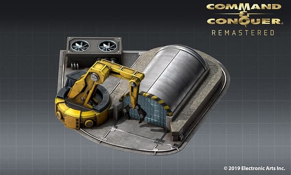
We are approaching the conclusion of our pre-production phase, having achieved several of our key milestones since our last Reddit post. During March we delivered our first playable campaign mission (GDI Mission 1), which included multiple samples of the remastered art running at 4k. This was accompanied by a more complete Visual Target image, which helps the dev team align around our goals for the artistic fidelity. We are now in the middle of getting Multiplayer up and running for the first time, along with dozens of art assets iterating towards their finalized look. Last week we showed many of these items to the Community Council, and continue to receive fantastic feedback via their contributions.
With that in mind, today we wanted to share a glimpse of the pre-production work with all of you here in the C&C community. And this is the first time anyone outside of EA or the Community Council has seen work from the Remaster. In this spirit, we felt it appropriate to start with one of the first assets you see in Command & Conquer – the classic Construction Yard.
Now, if you've been reading our previous posts, our primary goal with the visual approach is to maintain the authenticity of the original in-game asset. It's worth calling out that if there's a conflict between the in-game asset, cinematic asset, or UI portrait, we're always going to side with the in-game asset. That being said, if there are opportunities to pull in details from the cinematic footage to enhance an asset, we'll do our best to incorporate those details. A good example here would be the blue pattern / texturing on the Con Yard door (Inspired by the classic Con Yard unpacking cinematic).
As always, we are eager to hear your thoughts in the comments, and looking forward to sharing more details about the visual approach down the line.


