About
About 


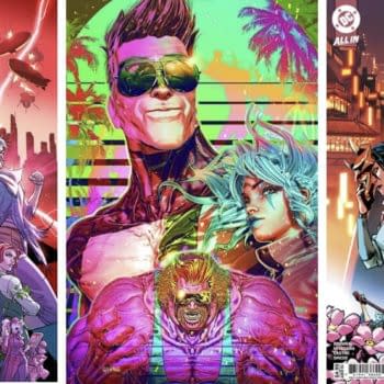
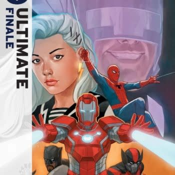
Marvel to publish an X-Men '97 Season Two Prelude in June 2026 with Steve Foxe and Salva Espin
Posted in: Comics, Comics Publishers, Current News, IDW | Tagged: logo, mark waid
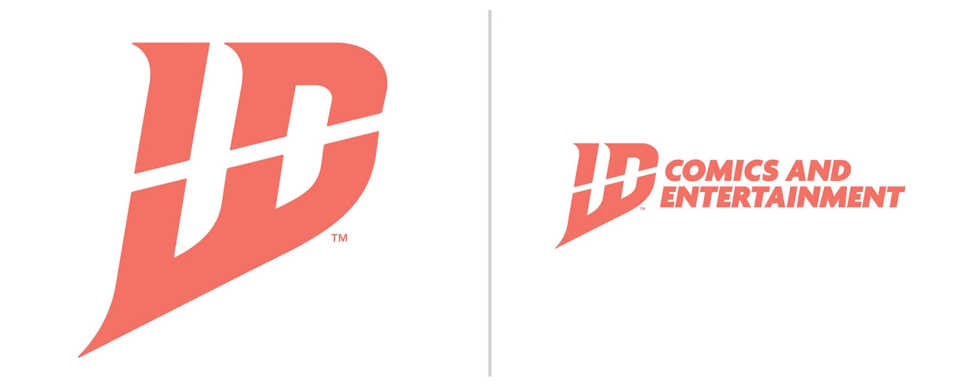
Comics Industry Tells IDW To Change Their Stupid New Logo
Consider this an intervention, for IDW Publishing over their new logo, announced yesterday to almost universal disdain.
Consider this an intervention, IDW Publishing; we love your chutzpah, your pizzazz, and your willingness to commit and swing for the bleachers. But when it comes to this new logo of yours? No. In your press release, Nathan Widick, your Director of Design, said, "During the process, we went through hundreds of different designs, concepts, and ideas, including a big push to retool our classic lightbulb logo. Ultimately, we decided that rather than looking back, it was time for us to look forward and show the world the new and bold direction of IDW with a dynamic and innovative identity."
It feels like Nathan was saying, "Don't blame me; I tried to bring back the light bulb; they made me do hundreds of ideas, and by the end, I was going with anything, and this is the one they picked." When I worked in advertising, we had a phrase for "psychic clients" who, when presented with the fifteen ideas they had requested, had the uncanny ability to pick the worst, the one you had added just to make up the numbers, but that no one in their right mind would choose. And soon learned never to present one of those.
Either way, if IDW were to say, "Okay, we've listened to all your feedback, and we have decided that we'll pick one of Nathan's many other ideas, including possibly one that people can read as IDW, "then there would be no embarrassment, no lack of saved face, and we'd all be incredibly supportive, right? Right?" because this is what the comics industry is currently saying on social media…
Katie Cook: Oh.
Mark Waid: Whoever approved IDW's new logo should have this thing Scarlet Lettered onto their forehead for all eternity.
Paul Grist: I see that IDW comics have revealed a new logo. Did we learn nothing from DC comics?
Michael T. Gilbert: ID Comics? Aimed at the psychology audience?
Jonah Weiland: IDW Publishing had a great, simple logo. Bold, simple, effective. This rebrand is truly one of the worst logo changes I've ever seen, along the lines of the GAP logo fiasco.I seriously hope they reconsider this change.
Neil Kleid: Don't worry, you guys. I fixed the new IDW logo
David Campiti: Wow. The logo designers on my team would have rejected that out of hand. Who knew obfuscation was a corporate goal?
Jill Thompson: I thought it was some weird new DC comics logo at first. I literally didn't see IDW at all..
Cliff Galbraith: I've been staring at it for a few minutes and the only word the comes to me is: Why? IDW was a recognizable brand in the comics world. Why would someone destroy that?
Jason Snyder: Can't tell if someone didn't think this through at all or tried to be too clever with the design.
Marc Lombardi: lD? LD? What I definitely don't see is "IDW"
Ben Templesmith: Oh my gods the new IDW logo is the most amateurish terrible piece of design I've seen in a long time. But it really does match the share price. Give me my rights back to wormwood freely please. & don't let creators find out their involvement in media projects via press release
Sam Lowe: Wow this logo is awful, IDW Go to the corner and think about what you've done
Raffaele Ienco "IDW -you've got a bad logo there. Re-think your choices. All I see is "UD".
Paul McInnes: If you didn't know that it was meant to read as IDW, you'd have never imagined the W at all. All this does is signals a struggling organisation that has no idea what good, clear communication is – so by that metric, maybe it is the right logo for the new regime…
Duane Murray: Look, I've published through IDW (indirectly with Top Shelf), and probably will (hope to) again, but as an 80's hockey kid, when I see their new logo, all I see is this:

Luna Nunez: This is A really bad logo. The W in IDW isn't clear and the color is so boring . IDW dose need A new logo but this ain't it.
Jeff Harris: I get what IDW is trying to do with its new logo, but… *sigh* My graphic designer brain nags at me. I know I'm supposed to see IDW, but my brain goes "LD" or "UD." Not really a good design.
Len O'Grady: I wish IDW and everyone who works there only the best, but this has me completely nonplussed. I mean, I get it- you've just gone through a restructuring and all, and want a reboot. But this? Does it scream Indie Comic Publisher? Yeah, sure, I guess, if you wanted to resemble a small press from the 90s, then mission accomplished. This has the look of just trying to be too clever by half while also smothering whatever logo idea / sleight of hand was going on in stylistic flourishes. The qualification of Comics and Entertainment just betrays a lack of confidence in whatever is going on on the left. Even the color choice, a dull terracotta, seems odd. How is any of this going to sit on a variety of covers? It all just feels really out of step, and not in a good, iconoclastic kind of way.
I see it's not on the website yet, so there's still time to walk this back and put a better foot forward.
But not everyone felt this way. Just most of everyone…
Comic Tropes: New IDW logo. Clever.
Ricky Lima:Interesting logo for IDW. At first I was like where's the W? Then I saw it. I think it's clever and will look nice on books. I also appreciate the words comics being first. Comics baby!
But seriously, IDW, change that logo. At least you have hundreds of different designs from Nathan Widick to choose from.
Enjoyed this? Please share on social media!
Stay up-to-date and support the site by following Bleeding Cool on Google News today!