Posted in: Comics, Image, Review | Tagged: horror, image comics, Jason Shawn Alexander, Lee Loughridge, magic, spawn, superheroes, Todd MacFarlane
Spawn #285 Review: Interesting Allegory Buried in Text
Spawn is captured by the United States government. He's not speaking to them, and his status as an unidentifiable individual sparks a media and federal firestorm as the U.S scrambles to find out what to do with Al Simmons.
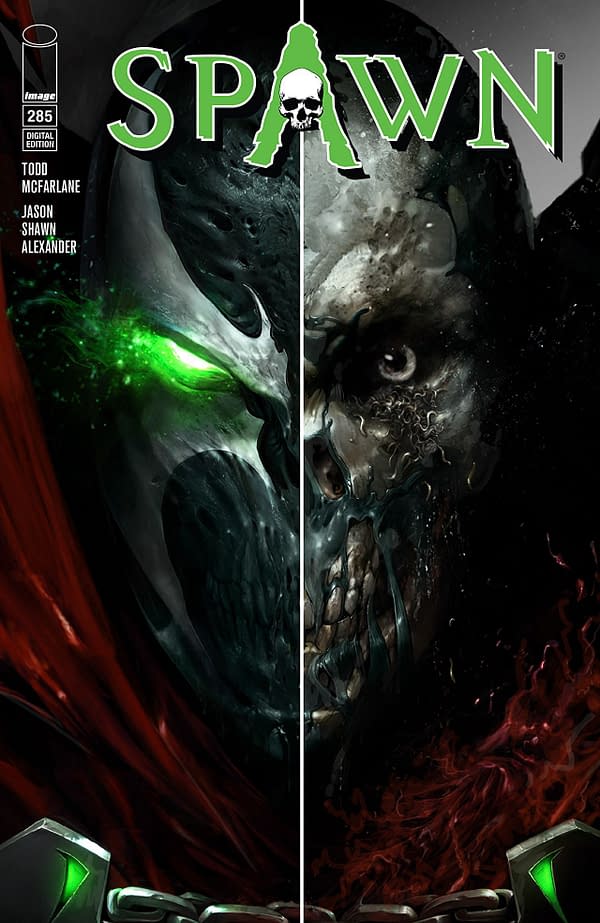
Disclaimer time: I'm not especially familiar with Spawn. This is the first comic about the character I've ever read. I know him mostly by reputation and as a 1990's creation of Todd Macfarlane.
So, if the comic is known for being really wordy, then I wasn't privy to this information before now. Boy howdy, is it a really damn wordy comic.
To its credit, this comic is trying to do something clever. It's framing this situation as an indictment on the current administration and how we treat immigrants, especially immigrants of color, in this country. It takes Guantanamo Bay and "enhanced interrogation" (torture) to task. It's somewhat undercut by this being an intentional effort on the part of Spawn, and it is bizarre to see this narrative carried out through this particular character—however that last detail isn't that big of a deal to me.
This comic could have accomplished this in half the pages and a quarter of the word count, though. It is a daunting, frustrating, and, at times, dull excursion as Spawn #285 absolutely belabors its point to the degree that said point should probably join a labor union.
Shut up. That was funny.
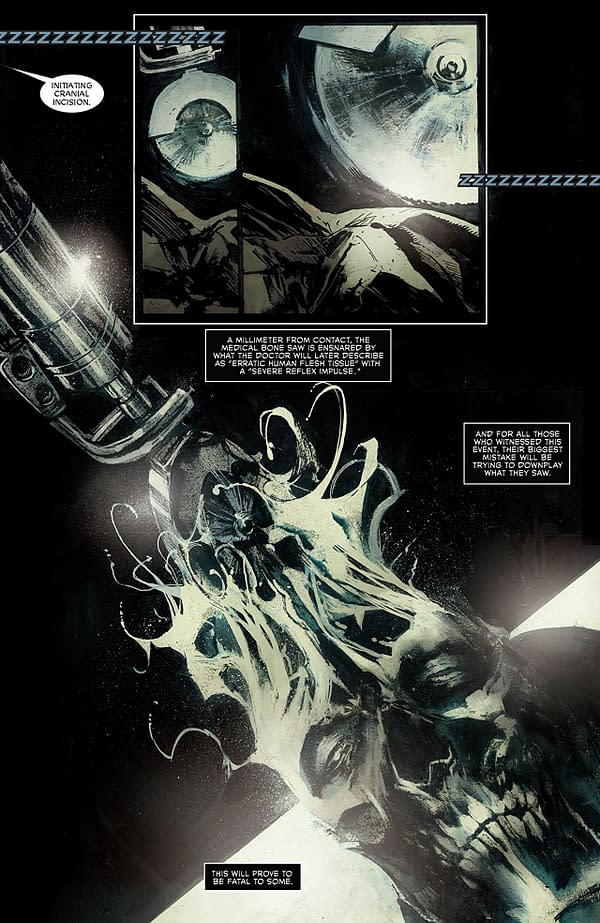
If nothing else, Jason Shawn Alexander's artwork is frigging gorgeous. It plays with shading in an incredible fashion, the texturing and detail is stunning, and Spawn himself looks awesome. The colors of Lee Loughridge are subtle and fits Alexander's artwork very well.
Spawn #285 has some interesting ideas that are put well at times, but it does not understand that brevity is the soul of wit. This comic is text wall after text wall, and they obscure the excellent artwork of Alexander and Loughridge. It's a tedious graphic experience, and I can't recommend it. Give this one a pass.


