About
About 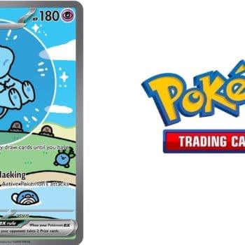
Our monthly Pokémon TCG Value Watch series observes the Shiny-themed cards of Scarlet & Violet - Paldean Fates in March 2026.
Posted in: Comics, Comics Publishers, Image, Review | Tagged: commanders in crisis, davide tinto, image, image comics, steve orlando
Commanders in Crisis #1 Review: An Event With Unknown Heroes
Commanders in Crisis #1 sets out to tell an epic superhero crossover event story with brand new characters. While this elevator pitch sounds more like a writer's challenge to themself than an actionable premise, let's see how this new Image Comics debut from writer Steve Orlando, artist Davide Tinto, colorist Francesca Carotenuto, letterer Fabio Amelia, and designer Fabrizio Verrocchi reads.

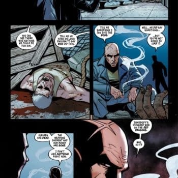
The challenge with the concept behind Commanders in Crisis is pretty obvious: readers are already invested in the characters with big superhero events. There is a familiarity established, so the creators can cut right to the chase without having to explain why Tony Stark flies around in a Coke can and why Captain America remembers punching Hitler decades ago but is now still a young thiccboi. So that's the first hurdle this comic has to get over for the concept to work, and it, unfortunately, doesn't succeed at this even a little bit. The heroes introduced are done so in the clunkiest of ways, with one-off scenes following a big fight that seeks to establish who these characters are. The set-up of the scenes themselves aren't bad and pack some intrigue, especially Sawbones' bit, but it's hard to get over how unbelievably ham-fisted the dialogue is.
The characters speak in pure exposition, introducing their powers and explaining what they're doing aloud in every scene. For as much as these new heroes want to make sure everyone around them knows about their powers, there is little actual character development… and it all feels like it could have been avoided because the first issue ends with a two-page sequence focusing on the characters with a "reveal" about where they came from and what role each character had in their place of origin. This reveal is unnecessary because there's no one who will be invested in these characters yet, so putting this scene way earlier and adding light exposition about their powers would free up the entire rest of Commanders in Crisis #1 for the characters to actually be characters rather than information dispensers.
The artwork from Davide Tinto is decent, with dynamic action and character design that sets some characters apart in a positive way (Nina and the time-travelers trying to… uh, literally steal hope because their timeline lost it), while the rest look like standard superhero fare. Oddly, the coloring from Carotenuto is at its creative best on the first page, where we see a unique style that looks almost like animation cells, rendering the linework thin with the colors doing more heavy lifting. That looks great, and yet that style is inexplicably gone on the second page and all through the rest of the comic.
Commanders in Crisis #1 feels like a superhero comic event with characters you don't know and aren't invested in, so it does follow through on that premise… but that unfortunately still holds true after reading the issue as well.
Enjoyed this? Please share on social media!
Stay up-to-date and support the site by following Bleeding Cool on Google News today!