Posted in: Comics, DC Comics, Review | Tagged: barry allen, Christian Duce, dc comics, Eobard Thawne, flash, hi fi, howard porter, Iris West, Joshua Williamson, justice league, Kid Flash, reverse flash, superheroes, wally west
The Flash Annual #1 Review: Underwhelming and Overly Padded
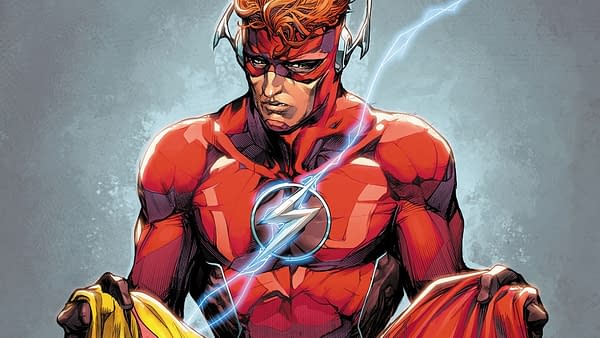
In the future, the murder of Eobard Thawne, aka the Reverse-Flash, is being investigated. In the present, Flashes Barry Allen and Wally West as well as the Kid Flash Wally West have reunited to bring down the villainous Top.
After the fight, Barry and young Wally let it slip that Iris killed the Reverse-Flash, but they hadn't told older Wally. This infuriates older Wally, and he goes off to look up some other old connections.
So, Flash Annual #1 brings us the prelude to a big event for the comic later this year: "Flash War." How much does it set up? Well, that remains to be seen. I'm not entirely sure what "Flash War" will consist of yet. Potentially, almost the entire comic is setting up the story. It's also possible that as little as one page is is truly relevant to the arc.
Beyond that, a lot of this comic suffers from the same problems that plague this series right now. A lot of the dialogue is weak and cheesy. Characters have extreme emotional shifts, going from zero to flipping out in a single panel.
The thrust of the story is older Wally West reminding an old connection of his existence. This encounter is also plagued by sudden and extreme emotions, and it's hard to really care about. It's played like it's at least partially older Wally's fault for reminding this person that he exists, but it's a situation far removed from reality. The characters behave in such an inhuman manner, and any chance of engagement evaporates.
The comic is also painfully padded. Very little of note actually happens, and this could have easily been fitted into a comic of normal length. In fact, it's a little disappointing that this is an Annual. The story doesn't feel particularly special beyond focusing on older Wally as opposed to Barry or young Wally.
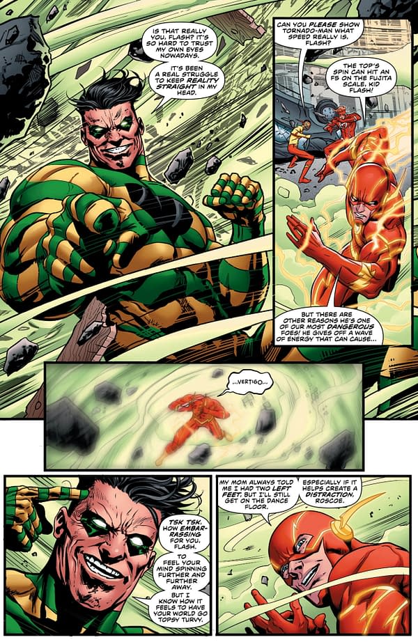
The art is far and away the high point of the comic. Howard Porter and Christian Duce's art brings a gravitas and weight to the visuals. The characters look especially imposing and regal in this book. Hi-Fi's color is bright and appealing, too, and the overall comic looks great.
Flash Annual #1 is a very underwhelming entry. While it is nice to see the book turn its attention to the elder Wally West, the flaws of the series, namely excessive padding, corny dialogue, and overly dramatic characters, weigh down the positives. Duce, Porter, and Hi-Fi's art is very good, but it doesn't salvage the book. Give it a pass.


