About
About 


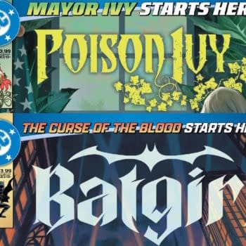
The Batman-related titles get new title heads as Poison Ivy becomes the new Gotham City Mayor and Cassandra Cain gains blood-related superpowers
Posted in: Comics, Comics Publishers, Current News, Image, Valiant | Tagged: design, rian hughes
It's Time To Design Your Comic Books Better, And Here's How
It's Time To Design Your Comic Books Better, And Here's How -The Commandments and/or Guidelines of Rian Hughes
Article Summary
- Start with a Good Idea—let content guide your comic book design from the inside out for true originality.
- Limit fonts, sizes, and effects for clarity and professionalism; avoid clutter and inelegant tricks.
- Design should lead the process, providing templates and consistency before art is commissioned.
- Maintain logical grids, negative space, and alignment for visual unity across pages and volumes.
The following ran in a recent issue of Power Fantasy published by Image Comics. The author, Rian Hughes of Dare, I Am A Number, XX, Logo-A-Go-Go and Forbidden Planet logo design fame, has generously allowed Bleeding Cool to run it below.
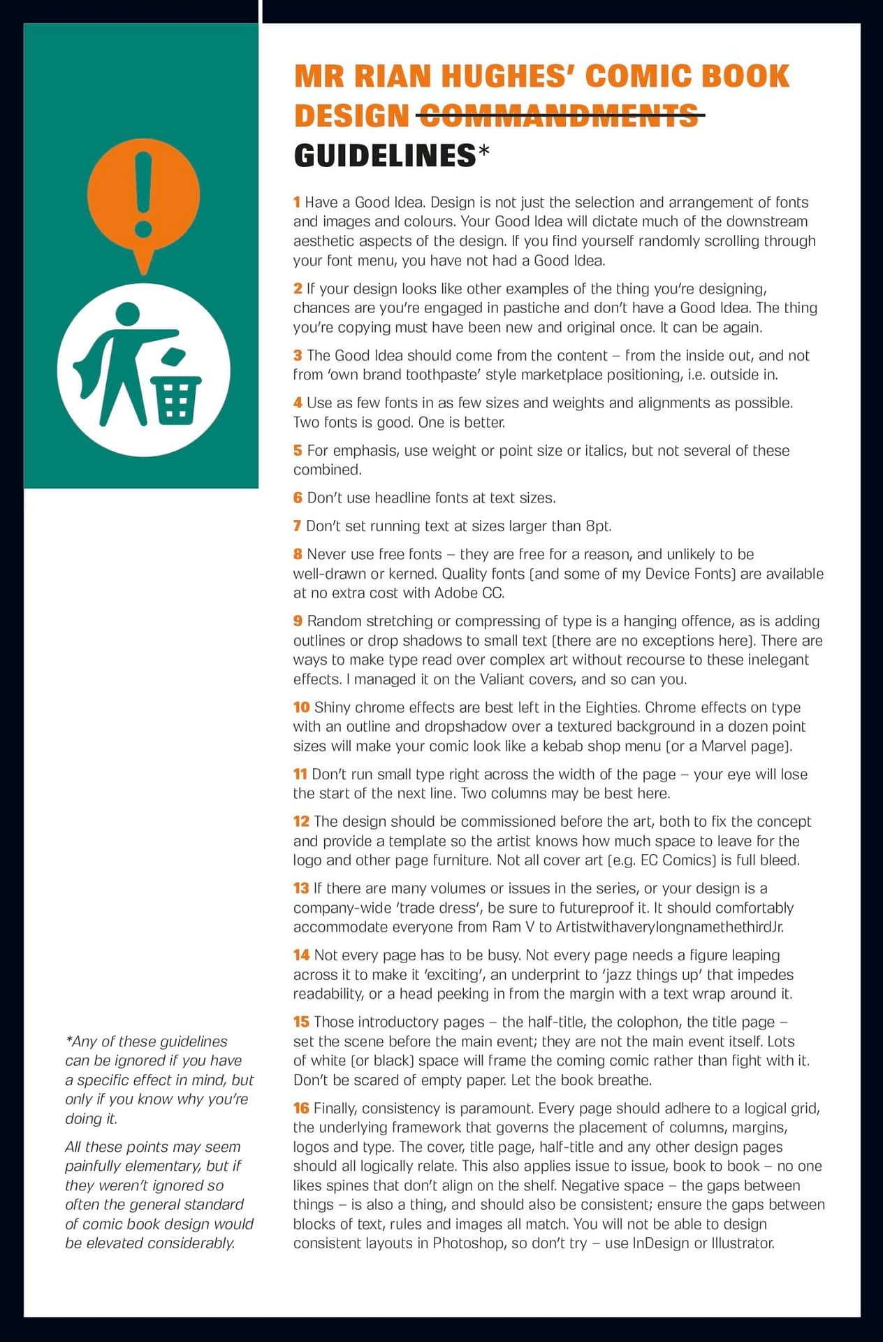
Mr Rian Hughes' Comic Book Design Commandments Guidelines*
- Have a Good Idea. Design is not just the selection and arrangement of fonts, images, and colours. Your Good Idea will dictate much of the downstream aesthetic aspects of the design. If you find yourself randomly scrolling through your font menu, you have not had a Good Idea.
- If your design looks like other examples of the thing you're designing, chances are you're engaged in pastiche and don't have a Good Idea. The thing you copied must have been new and original once. It can be a good idea.
- The Good Idea should come from the content—from the inside out—and not from 'own brand toothpaste boy' marketplace positioning, i.e., from the outside in.
- Use as few fonts in as few sizes, weights, and alignments as possible. Two fonts are good; one is better.
- For emphasis, use weight or point size or italics, but not several of these combined.
- Don't use headline fonts at text sizes.
- Don't set running text at sizes larger than 8pt.
- Never use free fonts – they are free for a reason, and unlikely to be well-drawn or kerned. Quality fonts (and some of my Device Fonts) are available at no extra cost with Adobe CC.
- Random stretching or compressing of type is a hanging offence, as is adding outlines or drop shadows to small text (there are no exceptions here). There are ways to make type read over complex art without recourse to these inelegant effects. I managed it on the Valiant covers, and you can too.
- Shiny chrome effects are best left in the Eighties. Chrome effects on type with an outline and drop shadow over a textured background in a dozen point sizes will make your comic look like a kebab shop menu (or a Marvel page).
- Don't run small type right across the width of the page – your eye will lose the start of the next line. Two columns may be best here.
- The design should be commissioned before the art, both to fix the concept and provide a template so the artist knows how much space to leave for the logo and other page furniture. Not all cover art [e.g. EC Comics] is full bleed.
- If there are many volumes or issues in the series, or your design is a company-wide trade dress, be sure to futureproof it. It should comfortably accommodate everyone from Ram V to ArtistwithaverylongnamethethirdJr.
- Not every page has to be busy. Not every page needs a figure leaping across it to make it 'exciting', an underprint to 'jazz things up' that impedes readability, or a head peeking in from the margin with a text wrap around it.
- Those introductory pages – the half-title, the colophon, the title page – set the scene before the main event; they are not the main event itself. Lots of white (or black) space will frame the coming comic rather than fight with it. Don't be scared of empty paper. Let the book breathe.
- Finally, consistency is paramount. Every page should adhere to a logical grid, the underlying framework that governs the placement of columns, margins, logos and type. The cover, title page, half-title and any other design pages should all logically relate. This also applies issue to issue, book to book – no one likes spines that don't align on the shelf. Negative space – the gaps between things – is also a thing, and should also be consistent; ensure the gaps between blocks of text, rules and images all match. You will not be able to design consistent layouts in Photoshop – don't try – use InDesign or Illustrator.
*Any of these guidelines can be ignored if you have a specific effect in mind, but only if you know why you're doing it. All these points may seem painfully elementary, but if they weren't ignored so often, the general standard of comic book design would be elevated considerably.
This essay initially ran in The Power Fantasy #9. Previous Rian Hughes coverage on Bleeding Cool can be found here, and current work can be bought here.
Enjoyed this? Please share on social media!
Stay up-to-date and support the site by following Bleeding Cool on Google News today!