Posted in: Comics | Tagged: A Clash of Kings, Comics, dynamite, entertainment, Landry Q Walker, Mel Rubi
Writer's Commentary: Landry Q. Walker Talks A Clash of Kings #10
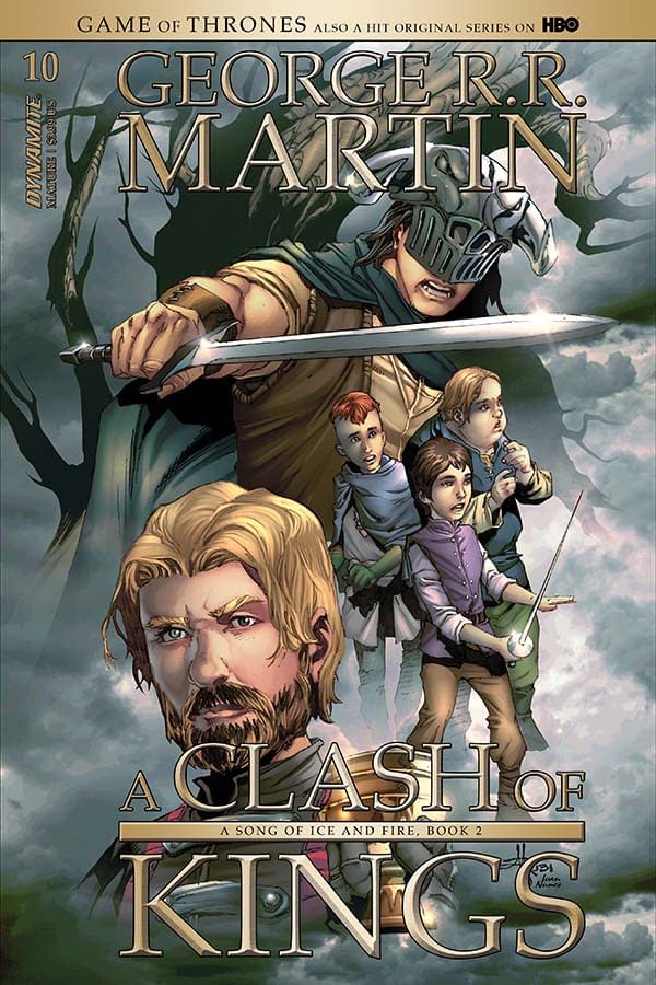
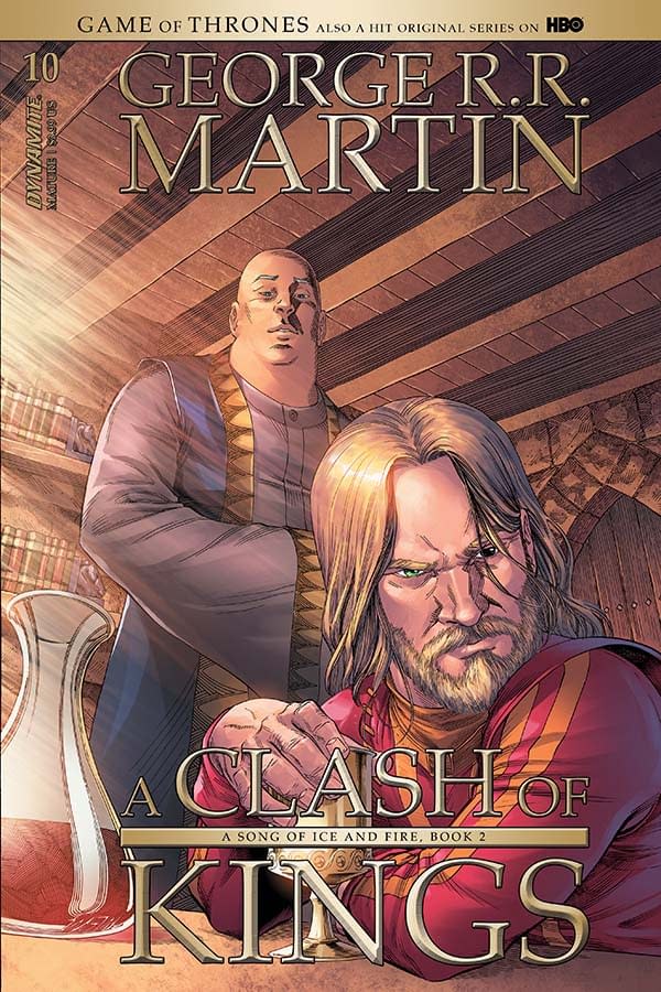
Dynamite has sent us a new writer's commentary by Landry Q. Walker for George R. R. Martin's A Clash of Kings #10. Mel Rubi did the interiors and one cover while Mike Miller did the other.
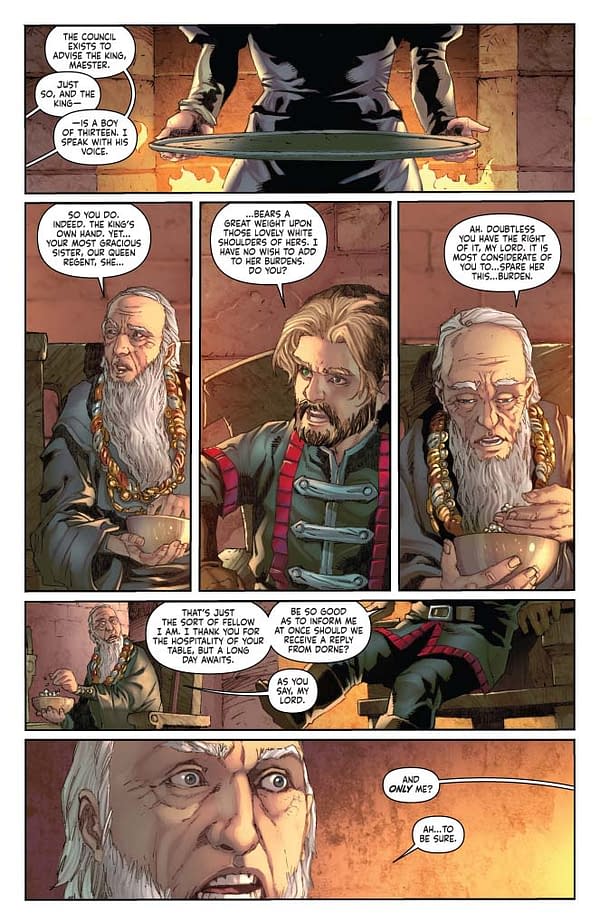
Pages 1-3:
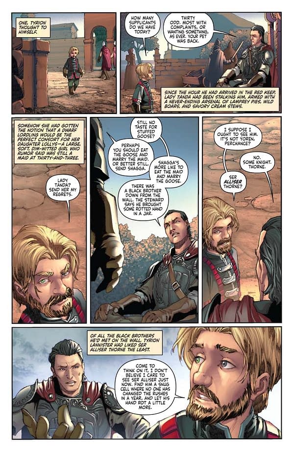
We once again showcase a scene where Tyrion sits and talks with someone. In comics, we usually avoid weighing so heavily with this sort of "talking heads" material. However, not only is it essential to the adaptation of the source material here, but it's been an interesting reminder for me that it is only the quality of writing that matters. George R. R. Martin has built a world and characters where the slow build of tension replaces traditional action. It's still a careful dance, figuring out how to balance all that text and search for things for the characters to do during their scenes.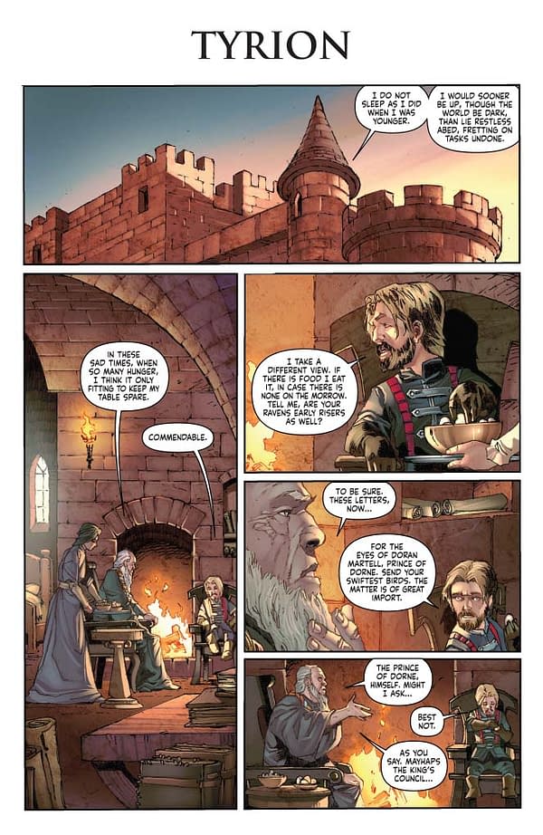
Pages 4-5:
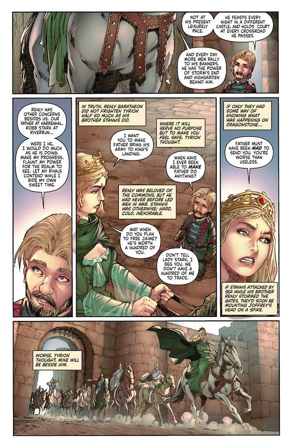
As I've been adapting this book, the relationship between Cersei and Tyrion has become of increasing interest. Beneath their mutual contempt is a strange family bond. Cersei hates Tyrion, but he is still her brother. It takes much more than the petty tensions displayed in these early issues to break that bond completely, as readers of the novels and viewers of the TV show know.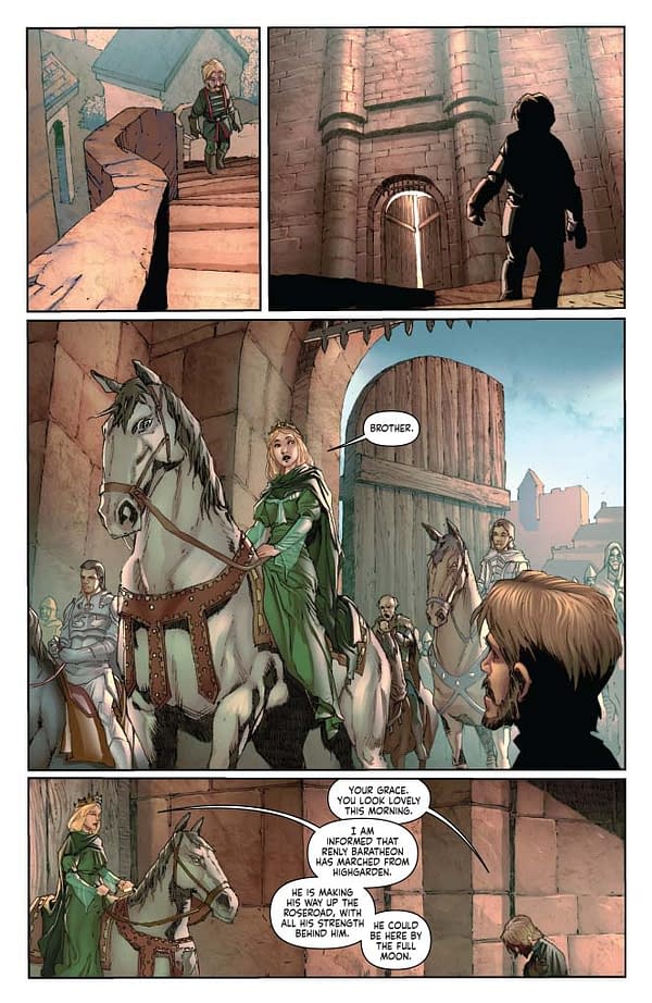
Pages 6-9:
We had to cut heavily in this issue. Tyrion has five (or more) distinct scenes in distinct locations. Culling a bit is the only way to make the material work in the allotted space. So we lost, to my great regret, the bit where Joffrey is trying out his new crossbow. We got as far as Tyrion looking out the window, presumably viewing the chaos below. But without completely rewriting, which is outside the ideal scope of this type of adaptation, there was little choice but to lose it.
Each one of these conversations is filled with information that is fairly vital. Tyrion's chapters run very close to the main artery of the story. Cutting here can have disastrous consequences. Because of this, this issue took me around four times as long as previous issues.
Page 11:
PANEL 2: I wish I had suggested we break this panel up with faux borders, a static image carved into three segments. Unchanged, otherwise. Would have helped pace this out a bit.
It would have been nice to have a panel showing the swans. I wanted that. No room. Then at the end, we could show them flying away. Very last panel. Could have framed the chapter nicely.
Pages 12-14:
Again, tricky. Two characters enter the forest, and have a lengthy conversation. Then continue walking. A lot of silent panels in this sequence, but it's much better to let the art do the talking when possible. A challenge with this particular book. I know I've repeated this in these commentaries before, but we could easily do double pages for every issue. I think my first breakdown for issue #10 of this series came close to … 300 pages? Maybe it was a bit less. I don't remember. The point is, there is a surplus of material. Every time you have a scene transition, you eat of real estate of the comics page.
Page 15:
Again, almost completely silent. I wanted a two-page splash for that first panel. We should have done a borderless bleed with it, and the rest of the panels inset. Large panels that bleed off the edge like that, followed by small panels inset, is one more way to help show a sense of time and scope, even if it only resonates on a subconscious level. Anything that makes the eye linger an bit, even if just a fraction of a second, helps give that impression.
Pages 16-17:
My original draft altered the sequence a bit so Arya didn't run back, but instead is caught and forced to lead the soldiers back on her own. As Anne, the series editor, pointed out, Arya wouldn't do that. Hot Pie needs to be there so he can break and rat out Lommy. She was right, but it's hard to get a sense of time when she keeps zipping back and forth. What works in a novel very well here really underscores the difference in mediums, as having Arya leave and come back slows the tension way down at the wrong moment. But the character truth here, that Arya wouldn't break, had to come first. Anne is right.
Pages 18-19:
And we finally get a bit of proper combat in this issue. I like writing in the combat sequences. I try and give reasonable directives, but you can really see Mel Rubi wanting to break free and draw the exciting stuff. Can't blame him. We will get there, though. Down the road, as each issue gets closer and closer to the climax of this book, it will get very focused on action.
Page 21:
We get the swans shot here, but imagine if this was book-ended properly. Ah well.


