About
About 


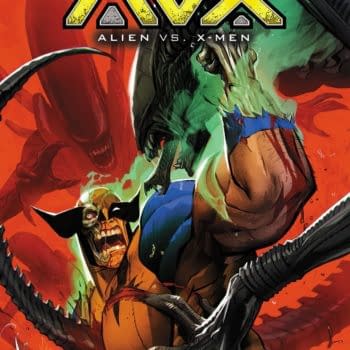
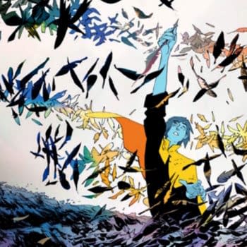
Alien Vs X-Men by Kieron Gillen, Chris Claremont and Geraldo Borges from Marvel Comics later this year as AVX
Posted in: Comics | Tagged:
Countdown To The Eisners – Covers, Colouring, Lettering
Cameron Hatheway writes for Bleeding Cool
As of today, you only have until midnight PST to vote for the Eisners if you're eligible and haven't done so already. So while I still have a few more categories to cover, I've already covered most of the major ones, methinks. Besides, it's not like those who are eligible to vote were indecisive and were following these columns to reach a final decision (if you were, then feel free to mail me cash)! This week we'll be looking at Best Cover Artist, Best Coloring, and Best Lettering. If you need a reminder of what's been nominated, you can find the entire list right here, and see what I chose last week right here.
Who is not eligible to vote?
- Comics press or reviewers (unless they are nominees)
- Non-creative publisher staff members (PR, marketing, assistants, etc.)
- Fans
Before I grovel, grovel, cringe, bow, stoop, fall, worship, worship, beg, kneel, sponge, crawl to try and become eligible to vote next year, let us return to the nominees!
Best Cover Artist
Michael Allred, iZombie (Vertigo/DC)
Francesco Francavilla, Black Panther (Marvel); Lone Ranger, Lone Ranger/Zorro, Dark Shadows, Warlord of Mars (Dynamite); Archie Meets Kiss (Archie)
Victor Kalvachev, Blue Estate (Image)
Marcos Martin, Daredevil, Amazing Spider-Man (Marvel)
Sean Phillips, Criminal: The Last of the Innocent (Marvel Icon)
Yuko Shimizu, The Unwritten (Vertigo/DC)
 Who I think should win:
Francesco Francavilla, Black Panther (Marvel); Lone Ranger, Lone Ranger/Zorro, Dark Shadows, Warlord of Mars (Dynamite); Archie Meets Kiss (Archie)
I write a weekly column on my own site covering the comic book covers that came out that week, and the one name that regularly present almost every time is Francesco Francavilla. I almost feel like I should induct him into a hall of fame of some sort, because I'm fairly certain I've praised him in every way one possibly can.
You're able to instantly recognize a Francavilla cover from the pulpy style, reminiscent of those old sci-fi and fantasy book covers from decades past. It's hardwired into his DNA, and every stroke of his brush brings that wonderful look and feel back to life. The covers of his that are listed are about only a fraction of what he was producing last year, but if the Eisners were to list them all, the other nominees would have tossed the towel into the ring before the list was even finished. The man is a Psychedelic Pulp Machine, producing an endless supply of beautiful covers for every publisher in town. Not once have I ever questioned his dedication to a cover, for he seriously gives 110% every single time.
If there was a Hardest Working Person In Comics Eisner, I would nominate Francesco Francavilla for it every year. Consistently awesome, incredibly detailed, Francavilla blows the competition away in my opinion.
Who could win: Yuko Shimizu, The Unwritten (Vertigo/DC)
Who I think should have been nominated: Joao Ruas, Fables (Vertigo/DC)
Best Coloring
 Laura Allred, iZombie (Vertigo/DC); Madman All-New Giant-Size Super–Ginchy Special (Image)
Bill Crabtree, The Sixth Gun (Oni)
Ian Herring and Ramón K. Pérez, Jim Henson's Tale of Sand (Archaia)
Victor Kalvachev, Blue Estate (Image)
Cris Peter, Casanova: Avaritia, Casanova: Gula (Marvel Icon)
Who I think should win:
Cris Peter, Casanova: Avaritia, Casanova: Gula (Marvel Icon)
When I started reading the Casanova series, one thing that would constantly jump out at me were the colors, and how radically wonderful they could get at times. Peter does this one technique that I constantly enjoy, where she'll have polygons of color slightly offset the character's outline, making a still harmonious pairing. It's not only the perfect pairings of the perfect color selections, it's the way they're constantly changing every few pages, keeping you on your toes. I thought for the longest time that only Dave Stewart was skilled enough to color Bá& Moon's art, but Cris Peter executes coloring duties with extraordinary precision.
The cherry on top with Peter are her gorgeous watercolor covers, where it's like you're getting a hearty appetizer of what to expect in the interior pages. Peter constantly dazzles me every issue, making me crave more colors like the ones in Casanova in my life.
Who could win: Ian Herring and Ramón K. Pérez, Jim Henson's Tale of Sand (Archaia)
Who I think should have been nominated: Jose Villarrubia, Captain Atom, Frankenstein, Agent of S.H.A.D.E. (DC), Osborn (Marvel), King Conan: The Scarlett Citadel (Dark Horse), Sweet Tooth (Vertigo)
Best Lettering
Deron Bennett, Billy Fog, Jim Henson's Dark Crystal, Jim Henson's Tale of Sand, Mr. Murder Is Dead (Archaia); Helldorado, Puss N Boots,Richie Rich (APE Entertainment)
Jimmy Gownley, Amelia Rules! The Meaning of Life … And Other Stuff (Atheneum)
Laura Lee Gulledge, Page by Paige (Amulet Books/Abrams)
Tom Orzechowski, Manara Library, with L. Lois Buholis (Dark Horse); Manga Man (Houghton Mifflin); Savage Dragon (Image)
Stan Sakai, Usagi Yojimbo (Dark Horse)
 Who I think should win:
Deron Bennett, Billy Fog, Jim Henson's Dark Crystal, Jim Henson's Tale of Sand, Mr. Murder Is Dead (Archaia); Helldorado, Puss N Boots,Richie Rich (APE Entertainment)
Okay so this is a notoriously tricky category, in my opinion. A majority of the time I don't notice the lettering in a comic, unless it stands out to me in a bad way; why did they use that font? Why didn't they use all the space in the word balloon? Why are all the letters smushed together like that?
However, when going through the nominees, the one letterer I was impressed with the most was Deron Bennett, and the multiple titles he's been working on in the past year. Like snowflakes, no two titles have the same lettering, and if anything they help enhance the tone and flow in each series. My favorite example of his lettering was in Mr. Murder Is Dead, where he would flip-flop the style when going between present day, and the flashbacks with the Dick Tracy-esque Golden Age lettering. Moving on to the Richie Riche series, it smoothly conveys action and adventure, and in Jim Henson's Tale of Sand, it's slightly mysterious and magical, fitting perfectly with the graphic novel as a whole.
Has Deron Bennett helped open my eyes to the world of lettering? Yes. Every letterer has their own style, and I plan on starting to test my knowledge for the rest of the year. Prior to writing these columns, my only experience was taking a typography class a few years ago, but that was just the basics. I still think Helvetica is the perfect font because of that semester, for instance.
Who could win: Tom Orzechowski, Manara Library, with L. Lois Buholis (Dark Horse); Manga Man (Houghton Mifflin); Savage Dragon (Image)
Who I think should have been nominated: Craig Thompson, Habibi (Pantheon)
Who do you think should win / been nominated?
Cameron Hatheway is the host of Cammy's Comic Corner, a weekly audio podcast. You can whisper sweet nothings into his ear on Twitter @CamComicCorner.
Enjoyed this? Please share on social media!
Stay up-to-date and support the site by following Bleeding Cool on Google News today!