Posted in: Comics, Recent Updates | Tagged: Camp Weedonwantcha, comic scripting, Comics, entertainment, indie Comics, Katie Rice, webcomics
From Strip To Script – The Webcomic Camp Weedonwantcha
By Josh Hechinger
As ever, as always (well, I mean, this is only the fourth installment), the plan here is that I'll take a finished page of comics by someone else, and try to reverse engineer the script for it, either in my preferred style, or in a different script style (full-script, plot-first, etc.). Right now, I'm chipping at the tip of the iceberg in terms of various types of comics, before I start getting weird with the various scripting styles.
So let's see: I've done American superhero comics, American independent comics, Japanese adventure comics…let's do my personal favorite comics delivery system: webcomics.
Why are webcomics my favorite?
As a reader: hey, free comics. Beyond that, I personally get a lot of out seeing creators evolve in real time over a series of steady updates.
As a creator: to me, it's the purest form of creating comics for other people to read. There are no production obstacles beyond being able to make a page of comics and replicate it in a digital format. There are no distribution obstacles beyond learning how to post an image online. There aren't even any physical media restrictions; depending how you work; a webcomic can be an unprintable infinite canvas, as Scott McCloud has pointed out in the past.
And look, I love book design and print production and marketing, but I'll also never not love the idea of just being able to make any kind of comic you want and put it up where basically anyone can read it, for free.
So, to that end:
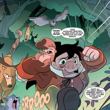
Let's look at a page from one of the webcomics that I got into this year: Camp Weedonwantcha, by Katie Rice (creator).
PAGE ONE (EIGHT PANELS)
P1. In the Mess Hall, BRIAN eats a sandwich while SEVENTEEN eyes him with caution, her hand creeping towards the scraps on her plate.
P2. SEVENTEEN, still keeping an eye on BRIAN, brushes her scraps into a bucket she's hidden under the table. It's full of scraps, bones, etc. Less "leftovers", more "rubbish".
– SFX swipe
P3. SEVENTEEN traipses through the woods with her bucket of rubbish, making…well, if not actual music, at least a string of nonsensical musical notes.
P4. Wide. SEVENTEEN stands in a Disney-esque forest clearing, the light dappling in through the canopy of leaves above her…as she gleefully tosses great handfuls of rubbish into the clearing, while wide-eyed animals just barely pop their heads up to watch her from the surrounding bushes.
– SEVENTEEN Come to me, animal friends!!
P5. SEVENTEEN reaches into her rubbish bucket, satisfied and serene.
P6. As she scatters the latest handful of bones and meat scraps, her eyes pop open. Something is Wrong.
P7. She clutches the bucket with both hands, enraged.
– SEVENTEEN HEY!!
P8. Same angle as P4, only now we see that the "animal friends" are actually feral kids wearing animal pelts on their heads and backs. They're scattering out of the clearing, some with scraps of meat in their jaws, while SEVENTEEN shakes both fists in the air and curses them out.
– SEVENTEEN !@#$%&
So, What'd We Learn?
– For P3, I dig that in-page transition to a new location. You could just cut from Seventeen swiping the scraps to her distributing them to the clearing without losing any story clarity, but that transition panel, besides setting up a one-two-three-wide, one-two-three-wide "beat" to the page, gives you a little bit more characterization to Seventeen. There's a difference between someone who'll sneak spare food to animals, and someone who la-la-la's their way to throwing handfuls of table rubbish to their animal friends.
– Going back to the one-two-three-wide page composition; that's something you can spell out to the artist up front, if it's in your head. Don't tell anyone, but I've been known to use "rat-a-tat-tat" for tight panel sequences like the first three panels, because I went through a Rat Pack phase in high school.
– Or, as above…just write the panels, then call a panel shape in P4, and call back to that in P8. It won't lock the artist into how panels 1-3 and 5-7 are structured, but it'll suggest the two bits to build the page around.
– Things for me to keep in mind, going forward: there's nothing in my script that indicates Brian is oblivious in P1. Also: I'm not sure that "serene" in P5 and "eyes pop open" in P6 expresses that panel action. It intimates it, ala the two wide panels, but it could maybe be clearer.
As I never know how to end these things, I'll just take this opportunity to highlight some other webcomics I enjoy:
– FreakAngels (yeah, no, I know, I'm re-reading it)
Philly-based comic writer Josh Hechinger is a Cancer, and his blood type is A+. He enjoys sleeping indoors, hot running water, and basically just not camping, at all. He really, really hopes none of his animal friends are just feral children in cunning (?) disguises.


