Posted in: Comics | Tagged: Comics, convergence, dc comics, entertainment, image comics, Marvel Comics, Minimum Wage: So Many Bad Decisions, Secret Wars
Thor's Comic Review Column – Convergence: Week 5, Minimum Wage: So Many Bad Decisions #1, Arcadia #1, Secret Wars #1
This Week's Reviews:
Convergence #5
Convergence: Superman #2
Convergence: Speed Force #2
Convergence: The Question #2
Convergence: Nightwing #2
Convergence: Harley Quinn #2
Convergence: Batgirl #2
Minimum Wage: So Many Bad Decisions #1
Arcadia #1
Secret Wars #1
Convergence Week 5
By Graig Kent

There's a reveal about Telos that, in some small way, helps explain the nebulously defined powerset the character has, but it still seems like writer Jeff King is retconning the character each issue as he comes to grips with who or what he is. At this stage we learn he's not the "living planet" that we were told he was in the zero issue, or at least he has not always been a living planet. There's still so much muddy waters around Telos, he's a real "Beyonder" figure, a bit of a lame duck as far as villains are concerned. At this point Deimos is proving to be the most formidable (and interesting) villain of the series.
Also surprising this issue is Andy Kubert on pencils. He seems to be in fill-in mode however, and it feels like inker Sandra Hope is doing a lot of heavy lifting. Her vast experience of embellishing Jim Lee is reflected here, as the lines feel so much more like Lee's work than Kubert's. That said, for every dodgy image there's a really stellar one (Warlord busting through a wall on a triceratops, Kool-Aid man style totally makes up for that terribly awkward getting-run-through-with-a-sword panel a few pages earlier (shocking as it was, it looks like the character's skin's made of paper). There are definite moments, good and bad, but overall it's average work for Kubert, servicing the story just fine.
—
The events of this week's story aren't reflected in this week's tie-ins, although each one of them mentions at their end the "tremors" that hit the city (which is told, not shown, in Convergence #5 in only one panel in a chat between Warlord and Tara, where they're supposed to be at the epicenter). With the second issue of the tie-ins commencing, each book features the hero(es) engaging their opponent from another city (in some cases decreed by Telos, in others just by happenstance). They all end, I can say straight out, the same way: as happily as possible while shrouded by uncertainty of the future.
It's a problem with these books concluding before the Convergence mini-series does. Even if the writers were privy to the resolution of the event, they're not allowed to use it to deliver an honest ending to their story. Instead we get soft-ending after soft ending, with the characters' true fates (endings or new beginnings?) likely coming with Convergence #8 in three weeks. It means that none of the Week 1/Week 5 books end with much satisfaction. Even the "bloodsport" elimination conceit doesn't play out in any of the books I read, which is either honorable that none of our heroes wind up killing anyone, or a complete cop out of editorial not enforcing rules they set up.
—

It should also be noted this week's tie-ins each have an 8-page back-up featuring an all-new story highlighting a new series or new direction for an ongoing series debuting in June. In Convergence: Superman #2 we get a peek at the new Doomed series from Scott Lobdell and Javi Fernandez. It's basically a Hulk/Spider-Man mash-up (complete with ladyfriend Jayne and an elderly beloved Aunt) where a young man tries to use his new superpowers to help, unfortunately they turn him into an inarticulate monster and he has no control over them, so he appears to be a villain. It looks quite fun actually, well illustrated, well written.
—

Like I said with the first issue, Tom Grummett is the perfect illustrator for this story. Grummet doesn't use a lot of hard edges or superfluous lines in his art so theres a softer, rounded, more open feel to his work. It's able to bridge the classic DC Comics heroic feel, the darker tinges of Flashpoint, and the outright cartoonishness of Captain Carrot naturally without anyone feeling out of place on the page. His fight orchestration is actually quite fun, showing the characters using their vast power sets resourcefully. Grummet also stages the final panel not with the characters facing the uncertainty that the script relates, but instead posing with a sense of triumph and resolve, as if to say "the Flash will continue…" which no other book this week even comes close to achieving.
It may not be the best illustrated or best written book of the week, nor the most adventurous or innovative, but I genuinely liked it a lot. It felt exactly like the DC Universe that I once knew so well.
The 8-page backup here is for the new Green Arrow creative team of Benjamin Percy and Patrick Zircher. The story here is a placeholder, finding Oliver Queen a rambling man, searching for some sense of self, only to wind up learning he had already found it. It's a decently written tale (save for the serial killer sub-plot which gets all the attention of an afterthought) and Zircher is a great artist, doling out densely constructed pages, some with 15 panels but I'm not certain it establishes Green Arrow's new status quo well, unless Oliver's going to be incredibly mopey and slutting around a lot. Emiko, his young sister introduced in Jeff Lemire's run that ended last year, gets the focus of the last page and looks to be having a far more interesting time. If she were the Green Arrow, that would be an interesting lede into the new run.
—

It's a heavy book, Montoya dealing with death (and her inability to control it), yet it frequently put a big dumb smile on my face. From the Question using her hat as a distraction to Two-Face facing off against an alternate version of himself, to Batwoman's misunderstanding of Renee and Huntress' relationship to…well, a half dozen more moments. Rucka and Hamner work completely in synch and deliver a book that manages the weighty themes, the wry dialogue, the clever action, and the intense showdown with deceptive ease. I hope there's more opportunity for Rucka and Hamner to write and draw this character again, because there's not just affection here, but ownership.
The back-up here is a preview of Jimmy Palmiotti, Amanda Conner, and Emanuela Lupacchino's upcoming Starfire series. Here Starfire is looking to get out of the hero game and find a place on Earth where she, a statuesque orange alien whose hair turns to fire when she flies, can fit in and and find a normal Earth life. She seeks the advice of friends and acquaintances, including Superman, to help her make her choice. It's a very chat-heavy eight pages that allows Palmiotti and Connor to find Starfire's voice quickly, juxtaposing immodesty with her sweet and trusting nature. Naturally Starfire's a fish-out-of-water as she lands in her new home, and a genuine superhero sit-com scenario is surely born.
—

With the Hawks distracted by her plan, Babs heads out to the desert to help Nightwing, who's holding his own, but having a difficult time with the winged warriors. Barbara arrives just in time to square off against Hawkwoman, which, I'm sorry, is ridiculous. I love Oracle, I do. I love that she's still so capable of self-defence, but there's no way that she's taking down Hawkwoman, not in her wheelchair in the middle of a desert… not in the way Jan Duursema illustrates it anyway. Duursema's characters look fantastic, even better than last issue (there's less background detail to draw in the desert, I suppose, so more time to focus on the figures) but the fight choreography between Babs and Shayera is atrocious. Her earlier sequences of Nightwing fighting the Hawks fare a lot better, but it's like she can't believably conceive how someone in a wheelchair holding escrima sticks would fight a flying woman armed with a mace.
The book ends as you might anticipate from the cover image, with the final page dedicated to Babs and Dick's wedding. Like Convergence: Superman this tries to go for the happy ending, but the spectre of finality looms too large to make it at all satisfying. In fact, the wedding seems even disingenuous. Lois and Clark couldn't postpone having a baby, but I highly doubt that Dick and Barbara would get married while their city is on an alien planet. I was quite looking forward to this issue, and while it had its moments, it's more awkward than enjoyable.
The back-up feature is a preview of the new Midnighter series from Steve Orlando and ACO. I'm impressed by ACO's design sense, not just characters, vehicles, tech, wardrobes, hairstyles, etc, but the page layouts are very distinctive. There are many panels per page, overlapping or even sitting on top of each other, but all clearly defined with white borders, like polaroids laid out on a table. It's rather striking. Beyond that, ACO's artwork (with lavish colours from Romulo Fajardo, Jr.) is loaded with kinetic energy, dramatic angles and a radical sense of movement. It's spectacle. Orlando's script benefits greatly from such a strong artistic turn, and it would be easy to dismiss the story, but he delivers a cracking 8-pages that introduce a stupidly cool idea (the "church gun" which, when fired, turns people into demons) and a character who's hard-living and hard-fighting…oh, and gay (and Orlando is definitely not shy about it). It's ultra-violent, but amusingly so ("I have a hobby for violent citizen's arrests," he tells his lover), going big and bold. Midnighter's a bit of a cocky prick, like a combo of Constantine and Deadpool, but it works. It's a damn entertaining introduction to the new series..
—

The only letdown is, as reported last month, Phil Winslade's inability to draw cartoony. He's a detail and anatomy guy. He doesn't do cartoon rabbits or metal anthropomorphic pigs…well he does, just not well. Kind of horrifying actually. His Captain Carrot looks like a human wearing a big rabbit mascot head, while his Pig Iron just looks like a full mascot costume. They don't look like creatures from a cartoon planet. Compare Winslade's Carrot to Ivan Reis' from Multiversity or even Tom Grummet's Fastback in Convergence: Speed Force and you'll see how it's done. Otherwise, Winslade does tell the story well, he gets the physicality and the setting perfect, so it's not a total loss. It's still a really fun read, just his Zoo Crew is unfortunately funny looking instead of intentionally funny looking.
The Section 8 back-up feature…well, I don't know what to say about this. It seems a little late to be doing a follow-up/spinoff to Garth Ennis' Hitman series starring minor characters who were actually killed off thus maybe not starring them…? At the same time, Hitman stood out from DC's publishing line-up even back then (it had a great Superman guest spot-but otherwise distanced itself from the larger DCU) so there's really no real continuity-related reason why Ennis and John McCrea can't just carry on with their bizarro weirdness and weld some dogs to some people ( even if one of those people is just a bunch of internal organs living outside a body). These 8-pages are, I guess, an introduction. But rather than introducing characters or setting up any real story, it sets a tone, a tone of weirdness and grossness and goofiness. Even if I wasn't a fan of Hitman, I'd be in. This is just madness.
—

I said my piece about Rick Leonardi's art last month. It's not as rough this month, but it's not very pleasing either.
The 8-page back-up introduces the new Prez series, and had the opposite effect on me of what's intended. Where Prez was going to be one of the new DC books I picked up next month, after reading this preview, I'm not so sure. There's nothing ostensibly wrong with it, but the story of the 19-year-old president living in an alternate reality to ours didn't captivate me in the least, and the little nuggets detailing the curious differences of this new world didn't intrigue me all that much. I enjoyed Ben Caldwell's work on Convergence: Infinity Inc. but it just doesn't look the same here. His character's wardrobe and style isn't as thoughtful, and the coloring is a lot more simplified.
—
This week, in total, I'm actually more pleased with the back-up features than with the main titles. DC's shot at diversifying the types of stories they tell, and the characters they tell them with certainly stand out compared to the sort of oneness of the Convergence tie-ins.
Next week will be a small week, covering the main Convergence series and two tie-ins at most.
When Graig Kent isn't spending hours thinking of things to say about the Convergence event each week, he's listening to the great Star Wars Minute podcast, reading Star Wars comics, buying his kids Star Wars toys, watching Star Wars animated series and thinking waaay too much about Star Wars. He's bowing out of any coverage of Secret Wars for his own sanity.
Minimum Wage: So Many Bad Decisions #1 (Image, $3.99)
By Cat Taylor
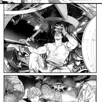
I make no secret of my love for the old Hate comic book series from Peter Bagge. It was like a slice of the culture that I knew personally, in four-color (or black and white, early on) form, and told with a sense of humor that helped make those stories come alive. So, when I saw the cover of Minimum Wage: So Many Bad Decisions #1 and read the synopsis, I thought that I might have found something that was carrying on in that spirit. What I didn't realize was that while So Many Bad Decisions is a new series, it's only the latest arc in the overall Minimum Wage title. Therefore, I have missed a LOT of back story. What I did gather from this issue is that, as a writer, Bob Fingerman is similar in style to Bagge and that therefore, I should probably like this comic. Despite that, personal taste is a funny thing and I just couldn't find the same kind of love for this that I have for Hate!
Like Hate and similar "slice of life" comics with a lighter edge, Minimum Wage delivers a story and characters that don't feel too far off from some people you may know. In addition, the humor seems to come naturally from events and character reactions rather than forced slapstick and one-liners that come with standard television sit-coms. The reasons for this may be because Fingerman has previously stated that the original Minimum Wage series was semi-autobiographical.
Although I may be doing a disservice to this book by comparing it to Hate, it's difficult to ignore the similarities. However, one of the ways Hate succeeded was through the ability of Bagge to put the characters in numerous scenarios and make them all identifiable. On the other hand, this issue of Minimum Wage, is largely dealing with situations that have no relevance to me. For instance, the main characters work for a porno mag that specializes in nude male models. Our lead character is one of the models and his girlfriend is the art director. They spend a lot of time just sitting around talking with each other and with other people about their work, their relationship, and former relationships. Very little of this is written in a way that is familiar to me. The conversations and situations are believable, but they are the kind of believable that I imagine other people experience rather than the way my friends and I have conversations, relationships, etc. Furthermore, a whole comic with people sitting around talking needs to be REALLY funny and engaging, as opposed to mildly so. Consequently, I found this issue to be kind of boring.
Beyond the story itself, I was a bit turned off by the lead character being drawn like a modern-day hipster douchebag, complete with bad facial hair and dorky glasses, but that's probably because I'm too old to identify with today's youth culture. Regardless of the lead character's fashion sense, Fingerman's art style is a conglomerate of influences from various underground artists. Overall, his art would fit in really well in Mad magazine, but the way he draws females looks straight out of an R. Crumb sketchbook. Fingerman also made an unusual and interesting choice with his use of color. The entire issue is colored with black, white, and one shade of light blue except for a dream sequence which is in bright, full color. I've seen comics that are mostly in color with black-and-white dream sequences but never one like this that takes the opposite approach.
On on hand, I feel like I should read the original Minimum Wage series to see what I missed. Perhaps with more background on the characters and hopefully some more interesting stories, I would appreciate how they led to the current series. On the other hand, I'm not really inspired to go out of my way to find out more. I think there is something here for the right audience. After all, the series and writer have been around for a long time, have won awards, and have a cult following. Despite all that and for whatever other reasons, this issue just didn't grab me. I'm probably wrong for that.
Cat Taylor has been reading comics since the 1970s. Some of his favorite writers are Alan Moore, Neil Gaiman, Peter Bagge, and Kurt Busiek. Prior to writing about comics, Taylor performed in punk rock bands and on the outlaw professional wrestling circuit. During that time he also wrote for music and pro wrestling fanzines. He also owns a cell phone. You can e-mail Cat at cizattaylor@hotmail.com.
Arcadia #1 (Boom! Studios)
By Bart Bishop

Set in a nicely vague seven years from "now", the world has been devastated by a global papillomavirus pandemic. Seven billion people died in the early 21st century, and yet they live, their minds uploaded into a computer simulation that must be kept up in data centers all around the world. There's "the meat", Arcadia Base Station 1 situated in Alaska where the minds are housed, with Lee Pepper minding the store and receiving a visit from the newly appointed Madam President Gomez. And then there's Arcadia itself, the massive computer-generated world where Coral is a member of the upper class. She's fully rendered and can even do such elite things as fly. Others are not so lucky: they don't even get faces or skin, reduced to globular avatars. The class systems are intact, but even those at the top are in a state of malaise. Pain and sensations aren't quite what they used to be, as people can't die (although it takes hours to heal from massive damage). As Lee plots espionage, Coral attempts to contact an old friend out in the real world. There's also a stinger at the end with a shaman of some sort seeming to summon a demon, because why not?
So if I'm not mistaken, a quick perusal of Google shows Paknadel as a doctor with a PhD in English Literature. If I'm eyeballing the right guy it certainly shows through in his writing. This is heavy stuff, with criticisms of 1%ers and a feeling of "that's how it would be." It would be too easy to have only the rich be saved, but having everyone be saved and still underprivileged is so rife with juicy possibilities. A Hispanic, female president just gives the whole thing a feeling of the now. The characters are a bit loosely sketched at the moment, with Coral as the quintessential angsty teenage that as I've gotten older I'm drifting farther and farther away from being able to relate to, but the added layer of forced athanasia certainly justifies her feelings. The imagery, with death-bed promises, also harkens to debates about the opposite, euthanasia, making for a quadrant-checking experience. I picture this comic translating into an AMC television series in the future, because it has the hook.
Pfeiffer is called upon to do much in the art department and it shines through. Aside from a confusing opening having to do with viscera sludge, a tendrilly orb and a wolf that, even after having glanced over it a few times, I still can't get a bead on, he shows an eclectic handling of many different environments and people. There's the snow, the American southwest, a futuristic city, a fantastical Pandora-esque floating land, suburbia and a Mongolian desert, all brought to life in great detail. There's some great opportunities for not just science fictiony concepts but monsters, as the aforementioned demon manifests with a shark ripping into reality behind it. Most cleverly is the simple motifs Pfeiffer injects, such as the recurring presence of fish and flying creatures, all giving the background a puzzle piece sense of minutiae that is mesmerizing to stare at.
So definitely worth a look, this is bound to be a divisive book in how politicized it is. Every allegorical element feels linked back to some image or hot-button topic from today, and that's great because good science fiction is always about something.
Editor and teacher by day, comic book enthusiast by night, Bart has a background in journalism and is not afraid to use it. His first loves were movies and comic books, and although he grew up a Marvel Zombie he's been known to read another company or two. Married and with a newborn baby girl, he sure hopes this whole writing thing makes him independently wealthy someday. Bart can be reached at bishop@mcwoodpub.com.
Secret Wars #1 (Marvel, $4.99)
By Jeb D.

And the payoff is unclear: presumably, the strategy behind it is to entice movie audiences to seek out the print versions of their favorite characters' adventures, but evidence that it provides a dramatic sales boost sales has been, shall we say, scant. The only comic series that seems to have received much of a sales push from its video version is The Walking Dead, whose TV series has been veering off-model since its very first season, demonstrating that it's possible for comics and their adaptations to thrive, even when different from each other.
But what is clear is that the plan is for the Downey-Evans-Hemsworth triumvirate to be set apart from the Fox apostates like the Fantastic Four and X-Men, and thus, the latest Secret Wars, creating the multifaceted Marvel U of the future. I have to admit that I got a headache trying to parse out the Battleworld map, but I'd assume that it's designed to allow us to have a place for both male and female Thors; to allow Steve Rogers and Sam Wilson to simultaneously spangle their stars across the planet; and making distinct locales for a burgeoning assortment of Spider-persons. And, of course, to have a set of Avengers that are always appropriately branded for the MCU (I look forward to a small slice of the map devoted to "Marvel Universe Live!", focused largely on motorcycle stunts).
This, of course, was the greatest potential of the Ultimate comics line (which Marvel long denied constituted a "universe" sharing any sort of space-time with the "616" Marvel U): allowing variations on familiar characters to flourish, while still letting the marketing department exploit the originals. This is the second time that Marvel has seemed to deep-six the Ultimate universe (see: "Cataclysm"); it's ironic that its destruction will actually reinforce its basic concept: allowing Marvel's stable of characters to grow and change in one comic, while simultaneously remaining in virtual stasis in another, depending on the individual consumer's preference.
Quite apart from its marketing and logistical considerations, in a world (so to speak) where the epic crossover has become the standard superhero playbook, the question is whether Secret Wars, as a comic series, delivers more than predecessors like, say, Dark Reign, or Siege or Everything Burns or Original Sin or…
Early days, obviously, but at this point, Secret Wars is mostly a series of bold ideas, devious schemes, and senses-shaking punch-ups, set to Jonathan Hickman's familiar, elegant rhythm (which is not a complaint: I sympathize with those who find his superhero work slow and talky, but it works for me). Hickman deserves full credit for crafting an epic, layered story over the past few years of Avengers comics, building up to what we see here, but some of that complexity is inevitably going to be lost in the headlong rush to blow shit up.
The basic premise is compellingly straightforward: the traditional and Ultimate versions of the Marvel Universe Earths are about to collide; heroes and villains from both universes will meet and fight to their last breath to save theirs. That's all you need to know to get into the main story: unfortunately, getting the details (such as the backstory to several members of Thanos' Cabal, or why the good Doctors Doom and Strange are hanging together) requires a familiarity with not only Hickman's runs on Avengers and New Avengers, but his Fantastic Four, FF: Future Foundation, and his Ultimate Universe work; grace notes that may enrich the experience for Hickman's regular readers might be more of a distraction for those who are here for the super-powered throwdowns.
There's also a plan, spearheaded by 616 Reed Richards to save key members of humanity in a "space ark" if the worst comes to the worst, though most readers will immediately realize the impossibility of a couple dozen scientists on an interstellar raft repopulating a commercially viable Marvel Universe, so we're mostly just waiting for that one to go south. There are some fun bits of characterization, and a couple of good jokes, sprinkled here and there, which I won't spoil, except to say that Rocket offers a cynical bit of commentary, and that Frank Castle's decision about how to spend his last hours, and ammo clips, in a world where everyone's about to die, is rather existentially funny (particularly for those with fond memories of Garth Ennis' The Punisher Kills The Marvel Universe). There are a couple of spots where the headlong quality of the storytelling make it feel as though a poignant moment got steamrollered in the process, though.
Esad Ribic's experience, both cosmic and Asgardian, makes him a natural go-to artist for this sort of epic, and he doesn't disappoint: what might be lacking in texture and mood (and, in places, detail) compared to his work on stuff like Loki or Silver Surfer: Requiem is made up for by his ability to effectively distinguish and characterize a mulitiverse (duoverse?) full of characters, even the doppelgangers, as they zip in and around entire fleets of helicarriers, sentinels, and the like. Colorist Ive Scorvina contrasts the heated reds of battle with the cool blues of the behind-the-scenes planners (notably both Universes' Reed Richards). One nice touch of clarity from Chris Eliopolous: the Ultimate characters retain their distinctive use of mixed-case lettering, while the 616 characters stick to their familiar all-caps.
Secret Wars #1 reads like the ultimate (so to speak) reward for comics fans who have followed Hickman's measured journey through the two Marvel universes up to this point, seeing it all come together. For those who haven't, it might just be more satisfying to wait a few months and see how it all shakes out, since one presumes that the whole point of the exercise is to leave Hickman's grand multi-series-spanning storyline behind, and start anew.
It's interesting to wonder how something like this might have played out in the days of the original Secret Wars: i.e., pre-Internet. Two fully-vested versions of the Marvel Universe facing off against each other, at a time when readers would not have seen previews of the upcoming publishing schedule, absorbed the marketing plan, and pored over assorted advanced leaks… in other words, wouldn't it have been cool to read this series when you really had no idea what the result might be, or what the Marvel Universe would look like when it was done?
Probably.
Jeb D. is glad that we'll get more of "Agent Carter," but is still waiting for that "Galavant" comic.


