About
About 
Iceman and Bishop team up to investigate a new attempted mutant massacre of the Morlocks in the tunnels under New York. Is it a good read?
Posted in: Comics, Marvel Comics, Review | Tagged: black panther, evan narcisse, fantastic four, iron man, paul renaud, rise of the black panther, S.H.I.E.L.D, shuri, stephane paitreau, superheroes, T'Challa, Ta-Nehisi Coates, winter soldier
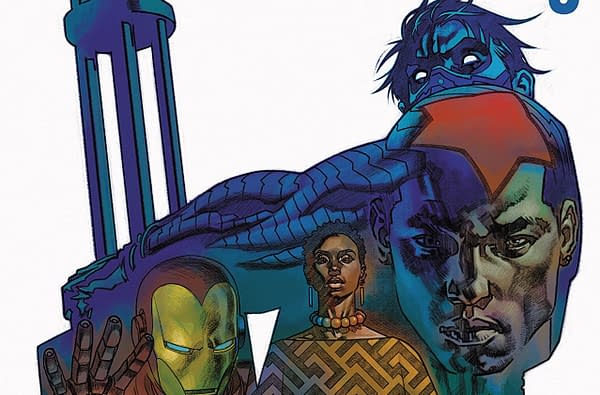
Rise of the Black Panther #3 Review: Good Ideas Drowned Out by Text Walls
Rise of the Black Panther #3 takes place shortly after Black Panther invited the Fantastic Four to Wakanda in the classic Fantastic Four #52-53. The world is reeling from the revelation of a new nation that is far more advanced than any other state on the planet. The UN Security Council is invited to Wakanda by King T'Challa. Unfortunately, an assassin is detected by T'Challa during the meeting with the Security Council, and the Black Panther decides to face this assassin alone.
Yes, I bought this one because the cover promised the presence of the Winter Soldier.
With Rise of the Black Panther #1, I was under the impression that the appalling pacing and endless walls of text were a result of the comic attempting to condense years of Wakandan backstory into a single issue while still trying to retell the death of T'Chaka at the hands of the Klaw.
I skipped Rise of the Black Panther #2, but I returned for this issue (see reason above). Here, I learned that the litany of text that absolutely demolishes the pacing is just how this series works.
The endless text is truly the alpha and omega of what goes wrong in this book. The premise is sound. Learning how the world reacted to the revelation of Wakanda's existence should be a solid premise for a book like this. I'd even go so far as to say that it conveys that idea in interesting ways scattered throughout the book. The battle between the Black Panther and the Winter Soldier is cool. The reaction of Wakanda's tribal leaders to T'Challa's revelation to the world adds some nice background tension.
It's all just weighed down by the slog this comic presents in the form of endless text walls.
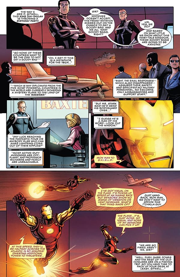
Paul Renaud's artwork is good. The world has nice texturing, and the detailing is excellent. The action scenes look solid. Stephane Paitreau's color work is dynamic and eye-catching throughout.
I do wish that I could recommend this one, but the appalling about of text and the massive damage it does to the pacing is unforgivable. Give this a hard pass. Even the presence of the Winter Soldier can't save it.
Enjoyed this? Please share on social media!
Stay up-to-date and support the site by following Bleeding Cool on Google News today!