Posted in: Comics, Marvel Comics, Review, Spider-Man | Tagged: amazing spider-man, avengers, Cliff Rathburn, fantasy, laura martin, Marvel Comics, mary jane watson, nick spencer, peter parker, ryan ottley, sci-fi, sentinel, spider-man, spider-man no more, superheroes, the lizard
Amazing Spider-Man #3 Review: Spider-Man Two More
Peter Parker is enjoying a night of bowling with his girlfriend, Mary Jane Watson, and friends, Randy Robertson and Norah Winters. The Tri-Sentinel appears from nowhere and attacks New York. Thankfully, the Amazing Spider-Man arrives to fight the Tri-Sentinel. However, Peter Parker hasn't left the bowling alley. How did this happen? No, it's not Miles Morales. Peter Parker and the Amazing Spider-Man have been split into two people, and things are also looking up for Peter Parker.
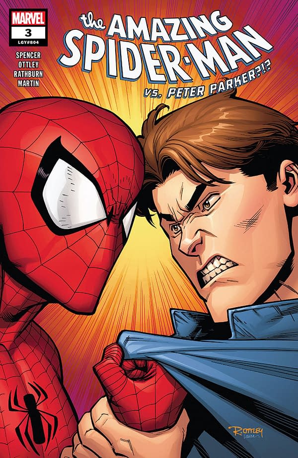
Amazing Spider-Man #3 brings a different twist on "Spider-Man No More!" Don't worry, it also makes a line reference to "Spider-Man No More!"
This issue spends a lot of time on the Peter Parker side of things, with the fight between Spider-Man and the Tri-Sentinel pushed far into the background. That's not bad, but what we read isn't especially interesting. It's mostly the comic explaining how there is both Peter Parker and Spider-Man running around and the "rules" of this particular situation.
I get that to a point. You need to explain how one man became two and how/why they will need to rejoin. It could have used more action between Spidey and the Tri-Sentinel to split that up. This much of an info dump can get exasperating.
I can't say this is an outright bad comic though. I like that we've gone back to Parker not especially wanting to be Spider-Man and taking this situation as something of a boon. It feels classic in that regard. Plus, there are some genuinely funny lines spread through the book.
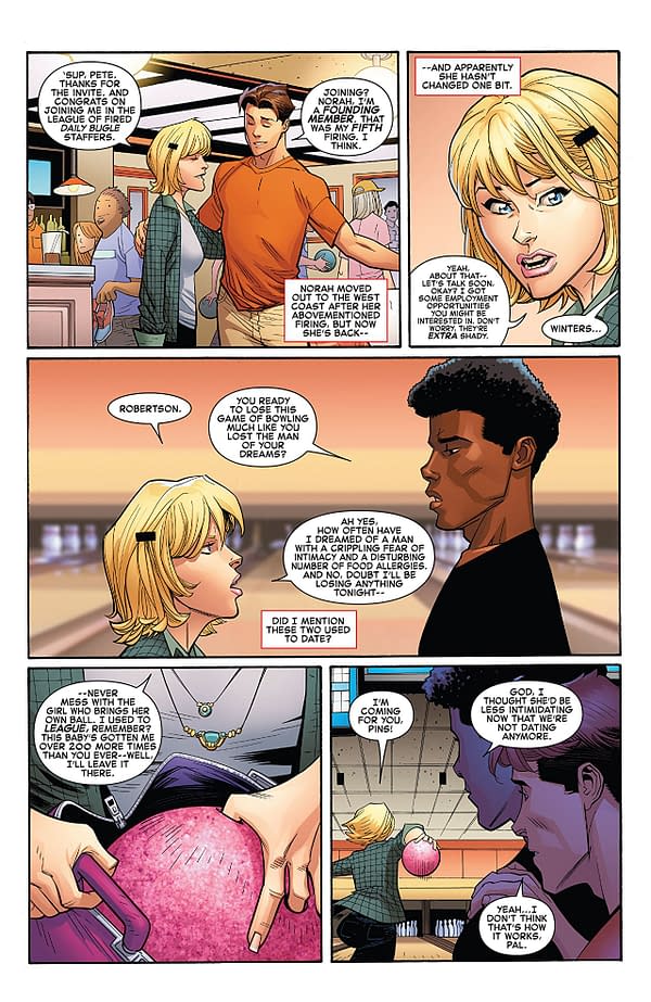
I keep going back and forth on Ryan Ottley's artwork. The cartoonish style and its pragmatist approach to detail isn't bad and kind of fits Amazing Spider-Man. However, there are some panels that look so stark that it's distracting. The suit itself always look good, and the comic flourishes in action scenes. However, there aren't a lot of those in this issue. I don't hate it, but I don't love it either. Laura Martin's color work is mostly quite good, but there are stretches of monochromatic panels that aren't especially appealing to the eye.
Amazing Spider-Man #3 is a decent comic. It has a myriad of flaws and isn't the most exciting comic you'll read this week. That said, it does have its charms, and I can recommend it to the Spider-enthusiast. Feel free to give it a read.


