About
About 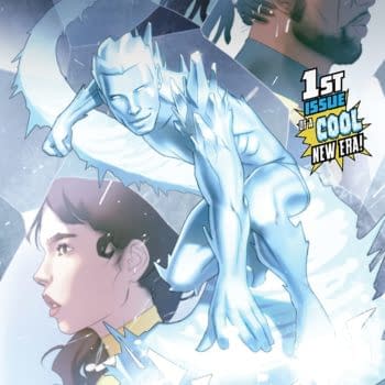
Iceman and Bishop team up to investigate a new attempted mutant massacre of the Morlocks in the tunnels under New York. Is it a good read?
Posted in: Comics, DC Comics, Review | Tagged: Batman, catwoman, comedy, dc comics, harley quinn, harley quinn vs. the joker, Jessica Kholinne, joker, otto schmidt, prelude to the wedding, Sami Basri, suicide squad, superheroes, the wedding, tim seeley
Harley Quinn vs. the Joker #1 Review: Deflated Stakes and an Indecisive Tone
Harley Quinn isn't willing allow the Joker to ruin Catwoman and Batman's wedding. Harley has set up a series of elaborate deathtraps to keep the Clown Prince preoccupied until she is ready to end his life once and for all. From a silo of teeth to a vat of tapioca pudding, Harley has a big day planned for Mr. J.
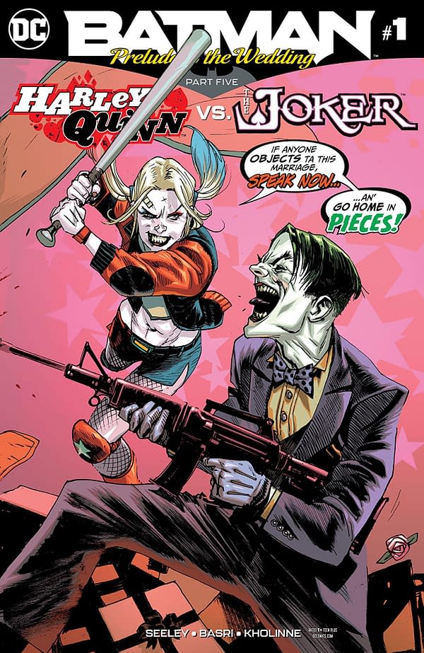
This comic is kind of dumb, but that's half of the point. It's going for a mixture of cartoonish and macabre as Harley and Joker outwit one another's ironic deathtraps. The nature of the comic and its place in a wider continuity means you know that neither one will die, so the stakes become whether Harley can maintain agency over the Joker. The subtext of their relationship becomes the plain text.
In that regard, the comic isn't especially satisfying.
Not to spoil the ending, but… you know how this is going to end. The Joker must be at Batman's wedding. That's what we're building towards. That means that Harley doesn't get her victory over the Joker, but you knew that couldn't be the case anyway. She wants him dead, and we can't let him die.
Predictable plot wrapped in predictable plot isn't inherently bad, but the comic leans too hard on the goofy to be compelling. Bad one-liners, costume changes, and pretty stupid deathtraps heavily undercut the severity of the situation. So, when the Joker gets his inevitable victory, the comic can't really pull off the nihilistic ending.
This is a smaller complaint considering, but the comic never mentions Harley and Catwoman's friendship. As such, you never get a reason that Harley wants to save the wedding.
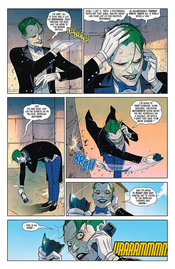
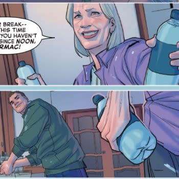
What doesn't help is the art style. It only supports the comical half of the story. The darker themes feel out of place, even when it attempts to make the Joker look menacing. It doesn't look inherently bad; Sami Basri draws upon manga and anime art principles to create a clean and simple aesthetic that has plenty of appealing panels. It just doesn't support the tone balance very well, and Jessica Kholinne's bright colors don't help.
Otto Schmidt's epilogue looks solid though, and it does manage the visual tone well.
Harley Quinn vs. the Joker #1 is easily the weakest of the Prelude to the Wedding one-shots. The tone is all over the place, the art doesn't support the macabre elements, and plot feels more predetermined than even most offerings from the Big Two. It's not awful, but I can't recommend it.
Enjoyed this? Please share on social media!
Stay up-to-date and support the site by following Bleeding Cool on Google News today!