Posted in: Board Games, Card Games, eSports, Figures, Games, Miniatures, Retro Games, Role Playing Games, Tabletop, Video Games | Tagged: board games, card games, eSports, figures, games, gamestop, Gamestop 2.0, miniatures, retro games, Role Playing Games, rpgs, Tabletop, video games
"Gamestop 2.0": A Retail Renaissance! Pt. 4
Hey there! By now, I hope you've seen my earlier article concerning an overview of Gamestop's experimental revitalization and rebranding project in Tulsa, Oklahoma, known there as "Gamestop 2.0". If not, this can be found here. I'd highly recommend you give it a look if you want an overview of what marvelous things await the gaming and game merchandise company, and through their unveiling, the consumers. Additionally, check out one of my latest articles for detailed information about my trip to the larger Gamestop 2.0 store.
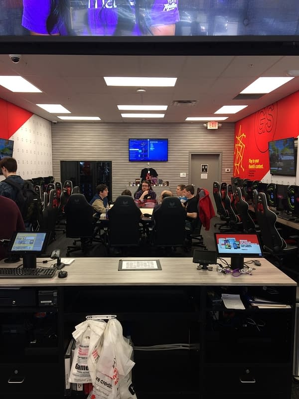
For the second official part of our tour of Gamestop 2.0's store models (being that the Collectibles store model wasn't on our schedule – look here if you want to see my overview of that trip), Michael Delgado with Public Relations took the press to see a smaller Gamestop 2.0, located also in Tulsa. These stores are much like the first Gamestop 2.0 model we saw (if you want to read more on that one, please click the second link in the first paragraph). However, it is compact enough to be able to fit in a standard-sized Gamestop.
This to me is an impressive feat. Sure, there is some degree of downsizing here (such as the 36 monitors and such being truncated to only twelve, and Mission Control only having three panes of consoles rather than nine) but that's necessary. A Gamestop isn't a TARDIS, you know? Nor is Gamestop 2.0 – nobody has that kind of technology… yet.
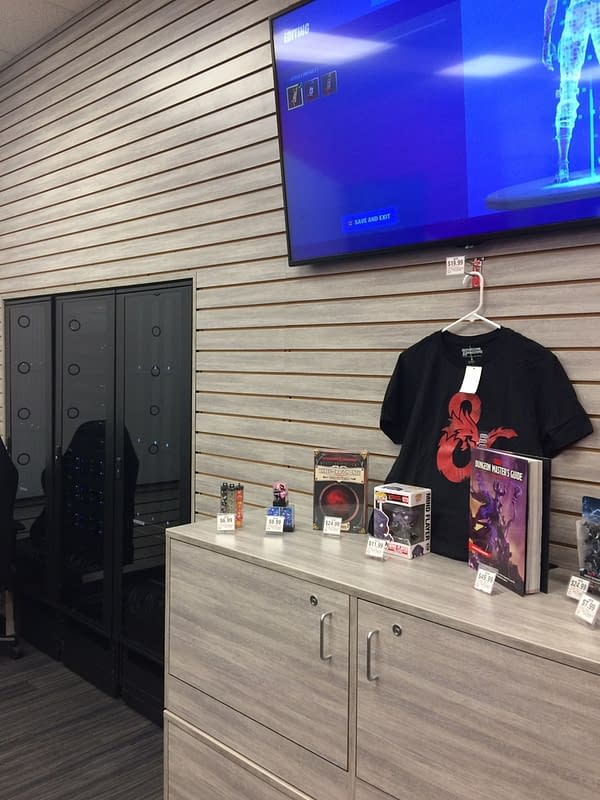
Another thing I appreciated about this model is its placement of the tabletop gaming table. This seems to be the way for the smaller stores to make this aspect of gaming work for them, as opposed to the larger "Social" model's clunky, out-of-place table. This particular change made me want to play Dungeons & Dragons at some point while here (and I did but off the record).
One other thing you'll notice is that the posters have been removed from the walls of these stores and in their place
Gamestop 2.0 has propped up larger television displays. These have good qualities to them but also some issues:
- The good is that the store looks far less cluttered and the overstimulation that people get from a typical Gamestop is quelled with the displays from Gamestop 2.0.
- The bad is that people have to wait to get specific information on a game through these displays, as they cycle through the advertisements and all. It's hard, for example, when a mother walks to an employee looking for a price on a Playstation 4, and the adverts don't show it like before.
Ultimately I do really appreciate this space the most out of all the store models I've seen in Tulsa (on the record and off). It felt the least cluttered, the most thought-out (as it should be since most Gamestop stores are this size!), and to top it all off, everything feels in its proper place. Kudos to the team who designed this store!
What do you think about this store? Is a typical Gamestop a good candidate for this kind of rework? Is the Gamestop team in too far over their heads? Let us know what your thoughts are!
If you want to visit Gamestop 2.0 in Tulsa, OK, it's located at: 7386 S. Olympia Ave., Tulsa, OK 74132


