About
About 
Hello BC readers, it’s been a while. I’ve been off working on comics (The Freeze Vol 1 trade from Image Comics/Top Cow is in stores now…) but after
Posted in: Comics | Tagged: Comics, Dan Watters, dynamite, entertainment, HRL, si spurrier, the shadow
Writer's Commentary: Dan Watters Talks The Shadow Vol. 3 #4
Dynamite has sent us a writer's commentary from Dan Watters on The Shadow #4 that he co-wrote with Si Spurrier. Cover by Lee Weeks with interiors by Ricardo Jaime.

Page 1:
This issue we're joined by Ricardo Jaime on art. Daniel will be back next issue, but it's immediately evident that we're in very good hands. Love the detail on the Shadow's costume, on the gloves and the buckles.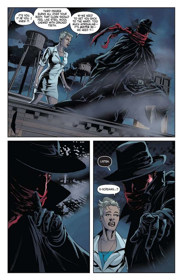
Page 2:
A tight eight panel page for a tightly uncomfortable scene.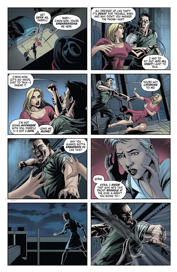
Page 3:
Another Shadow copycat; one that might be a little familiar round the eyes.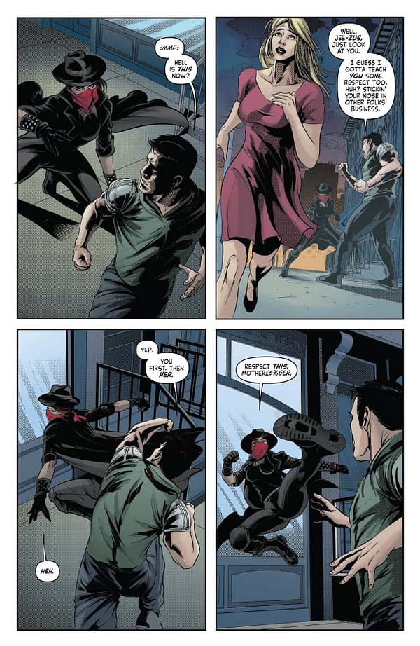
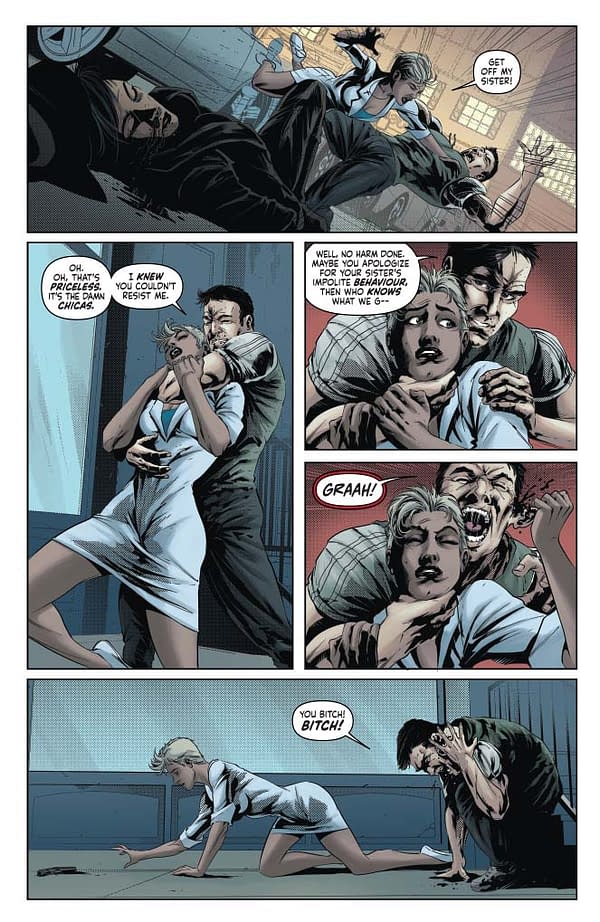
Page 4-5:
Another action scene, in which once again we've done our best to veer away from the superheroics in our depiction of violence. If a guy grabs you from behind, pulling his ear half off is probably going to get you further than a backflip, as Mary here demonstrates. That said, her dropping from that fire escape at the bottom of page 4 shows us that she can dole out the parkour when need be.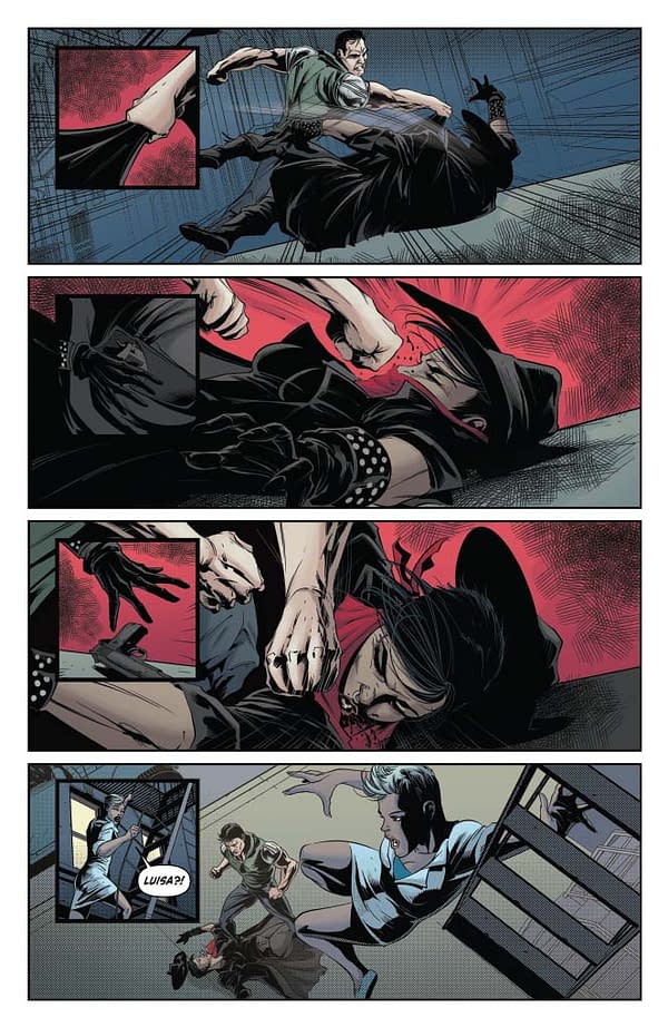
Page 6:
The Shadow taking that mortal decision out of Mary's hands is most likely the kindest act we've seen him perform in this book to date. As Mary teeters on the brink of deciding which path she should walk — the light or the shadow — he delays her having to step across this line just yet.
Page 7:
Luisa, on the other hand, appears to have made a decision pretty quickly.
Page 8:
The Shadow's surgeon metaphor here, of the scalpel and the hand which wields it, is probably worth paying attention to, as it's one we'll be coming back to plenty before this story wraps. At the bottom of the page here we start shifting into flashback, and as it has each issue, our eight-panel grid fragments down into something even tighter — here we're all the way up to a 16-panel grids, and our scripts to the artists start getting extremely apologetic.
Page 9:
And here's this issue's flashback, set in 1969. I wanted the Charles Manson reference in there to note that this was the year in which the hippie dream was shattering, and it's kind of odd that as I sit here and write this, my phone has just pinged with the news of his death. Another deadly and broken symbol — another memetic figure — that we may hope has now been laid to rest.
Page 10:
The Fair Housing Act was introduced in 1968, to prevent exactly this type of racial discrimination. Here we're keeping our 16 panel grid primarily down to a six panel grid, which it folds into nicely, so that you don't have to read the issue with a magnifying glass. But honestly, seeing the work that Ricardo's done with the smaller panels, we probably could have used a lot more of them without him breaking a sweat.
Page 11:
Worthy Delaney — staying close to the Wyatt family here as he has throughout the 20th century, and remaining equally pleasant.
Page 12-13:
We've started pushing the visuals here further than we have previously, as Worthy gets a glimpse into the inner workings of the mysticisms cast by the Shadow. I love that panel of the Shadow gouging his disguise off from the eyes, peeling back the shroud of deception he's been wearing.
Page 14:
Another throwback to James Burnham and his Managerial Revolution, and I think a shift in dynamic between Worthy and the Shadow. For the first time the Shadow ends up on the backfoot, unable to understand that indenturing Worthy into his service may have messed the kid up.
Page 15:
As Leviathan turns, the Shadow remains on that backfoot. He's going through motions he's performed for decades, but his systems — his approach — to justice are no longer functioning the way that they're supposed to.
Page 16:
The rest of this issue works on an inverted 8 panel grid, which will follow us into the very start of issue #5. When using all the panels in the page, it creates a similarly claustrophobic aura to our usual grid, but allows us to fold and repeat images differently by placing them side by side.
Page 17:
The Shadow fading out of the spotlight on the bottom of this page is beautiful, and uses this layout to the full.
Page 18-19:
Mary's sense of powerlessness I think runs pretty close to how most of us feel watching the news these days.
Page 20:
Atumbra…
Enjoyed this? Please share on social media!
Stay up-to-date and support the site by following Bleeding Cool on Google News today!