Posted in: Comics | Tagged: A Clash of Kings, Comics, dynamite, entertainment, game of thrones, george r r martin, Landry Q Walker
Writer's Commentary: Landry Q. Walker on George R. R. Martin's A Clash of Kings #8
Dynamite has sent us a writer's commentary by Landry Q. Walker for George R.R. Martin's A Clash of Kings #8. It has covers by Mike Miller and Mel Rubi, who also does the interiors.
* * * * *
Ohmighod. It's this issue. As soon as I found out I was going to adapt this book, I was looking forward to this issue. Because it has a genuine castle assault in it, and I love castle assaults.
Okay, so…
COVER:
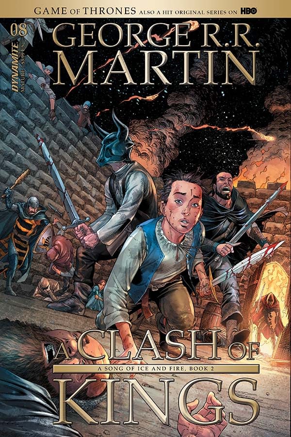
There are several covers for this book, as usual. The one I'm looking at as I type this text has Arya center in the cover, with Gendry and Yoren flanking her. The soldiers are pouring over the walls, bursting through the gate. Smoke and fire everywhere. Yes, I am just describing things you can already see. But I am amazed at how well this cover works. It's basically box, with us inside. The colors are just vibrant enough while still muted – this is important. If the colors are too saturated, it weakens the tone of the world. Everything has to be a bit washed out.
PAGE 1:
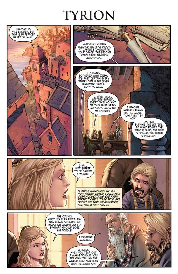
Mel Rubi kills it on the establishing shots. We need so many of these in an issue of Clash of Kings. One chapter might have three or four. Without a solid establishing shot, readers would be adrift in this story – especially when you consider how much we have to truncate.
PAGE 2:
It's all in the performance. Go through these issues, you will notice Tyrion is almost always pouring or drinking wine. It's rare anyone ever sits perfectly still – especially in a meeting of this nature. Tyrion is under a huge amount of pressure. Not only is the wine a pleasure, but it's an escape – and it gives him something to do with his hands, while deflecting away from the devious side of his behavior. So, the script almost always asks for Tyrion to be doing something with wine.
Also on this page, the glance between Cersei and Littlefinger. They are in the middle of a little co-conspiracy, delighting each other (and themselves) with their own wickedness.
PAGE 3:
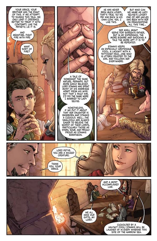
Panel 1: We cut a line of dialog from Tyrion here at the very last minute. As hard as you might try, the verbose dance of dialog in these novels, combined with the realities of staging the visuals, sometimes overwhelms.
PAGE 4:
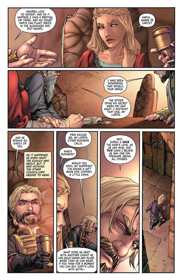
Got to have that exit beat. Without it, the scenes have less atmosphere and the cuts between scenes runs weird. Just like the establishing panel, we lose a beat just for logistics. I think I probably mention this in every one of these I write, but it is a crucial part of the process, and it is ever-present – here more than most titles.
Panel 1: I think this panel was originally one whole page. But cuts must be made.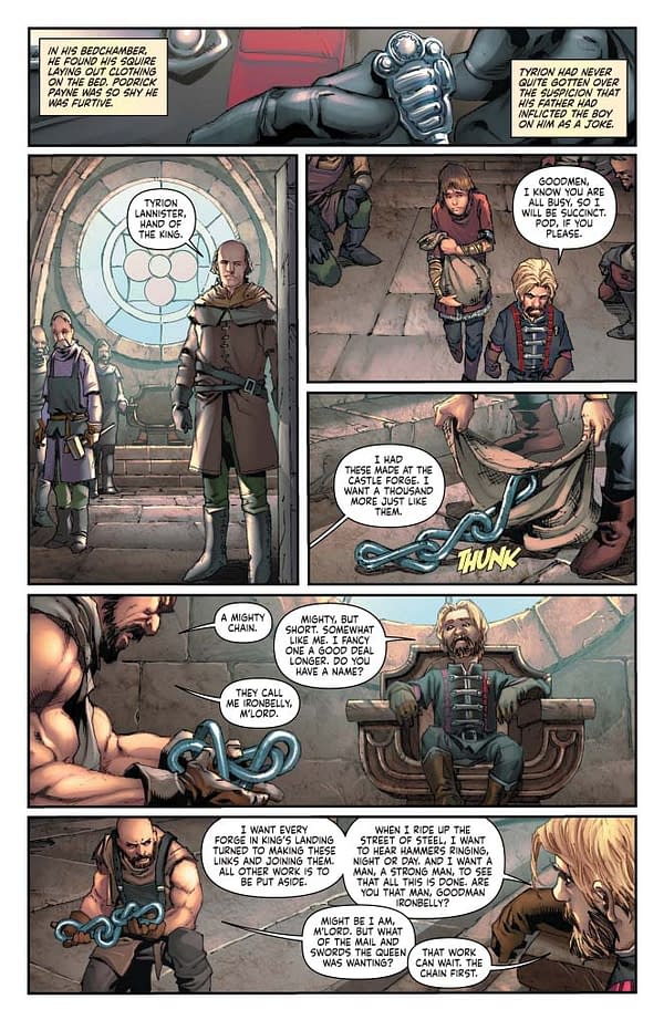
PAGES 6-7:
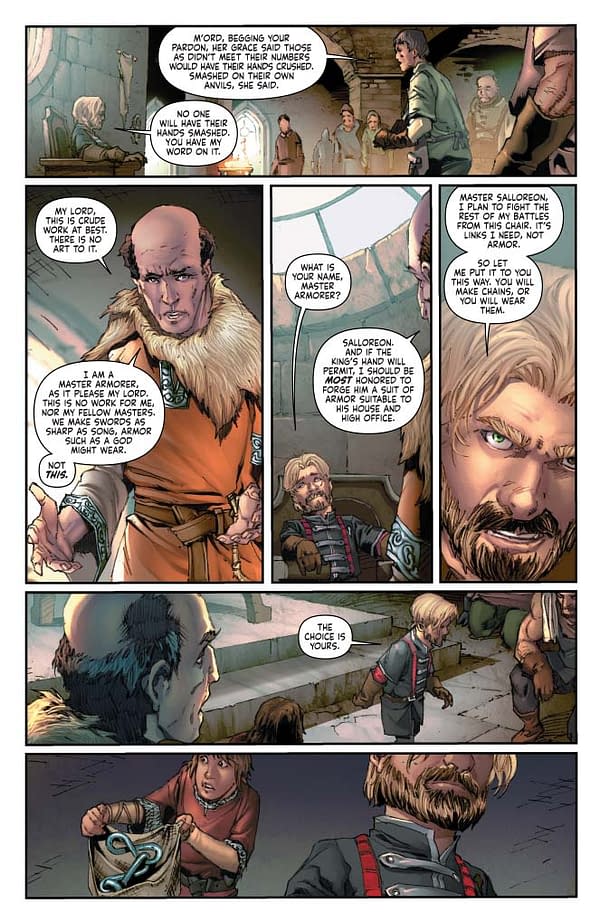
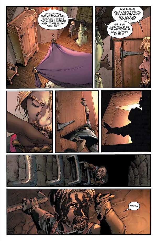
Two pages to establish Tyrion's journey through the city, arrival at a brothel, the introduction of two new characters, a conspiracy within the brothel, a wardrobe with a ladder, aa journey to the depths below the city, and a revelation on who is waiting at the end. 13 panels for all that, and Mel keeps it from feeling crowded. No dialog in many of these panels. Always let the art talk first. Text when unneeded is an anchor.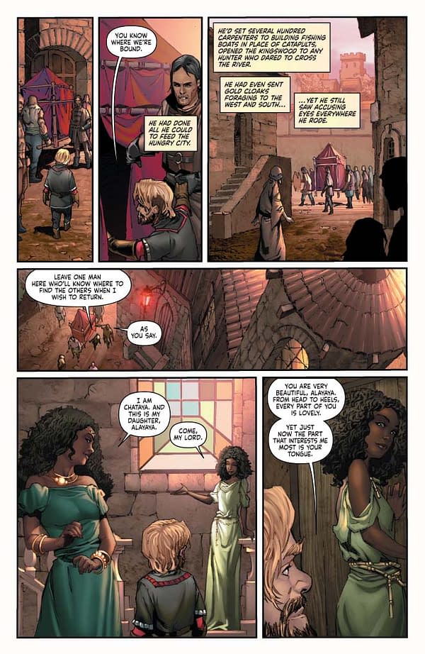
PAGES 8-10:
Again, it's all in the acting. Luckily, GRRM was kind enough to describe the physical actions the characters are undertaking – and it's an important subtext helping define the relationship between these conspirators. Tyrion needs Varys, and has entrusted him. But for all his self-loathing and his recriminations, Tyrion doesn't blink while inconveniencing another, or waiting while someone else serves him. This little bit of performance shows us a great deal about the characters involved.
PAGE 11:
The colors on the background are insanely beautiful here. Soft and organic – important to the mood of the book.
Panel 5: Yoren spits here. Not sure it's clear. But man, this page was packed TIGHT.
PAGE 12:
We learned in heavily on the caption text here, mostly literally transposing GRRM's words. This allows us to summarize important details, while overlaying with incongruous images. Together, the narrative advances more quickly.
I had to come up with the sound of the wolves for an earlier issue – the one where Bran keeps howling. I'm not a fan of SFX in comics of this nature, but the letterer really hit this one on its head. That, combined with the wolf image – solid work from the whole team here.
PAGE 13-14:
The tension builds. As always, limited space. The novel uses Arya's agitation to build the tension well. We know through her that something big is coming. Considering how to translate that build and pay-off visually led to a tight arrangement of small panels on one page (with lots of chatter, but suddenly with no captions), countered by a full spread on the next (with no dialog, but the captions return). Something as small as an absence of captions might be the thing that changes the tone of your page. Especially if you have made the reader get used to them. On that note, I originally wanted the captions to disappear on the splash page rather than the preceding – but that's not always an option when working out pacing.
PAGE 15:
Like a previous issue, I sent in a note for a color adjustment here due to the fire. Smoke in the air turns everything hazy brown. Monochromatic. Everything feels dirty. Beautiful color contrast at work here with the warm and cool on opposing sides.
PAGE 16-17:
Now that we are at the siege, I found myself with ZERO space. I wanted at least five more pages here. Every beat of actions takes up a panel. You have to be careful what you show.
So I tried to get clever with the suggested layout here. We needed a montage to get through the battle, so we could feel like a lot happened and stretch our sense of time. You might notice I obsess a bit over creating a sense of time in these comics. Well, all comics I write, really. But it's especially important here, where a two-page spread might be needed to convey a tremendous amount.
So the center panel is the core anchor here, surrounded by a sequence of panels. Because we eschew traditional structure, we hopefully disorient and slow down the reader. Not so much as to confuse the pacing, but just enough that it subconsciously slows this moment on the page. I dunno if it works for everyone else, but I'm super happy with the result.
PAGE 18:
We've shown the montage. Now we see the weight of it all crashing onto Arya. Love the way this came out, with so much performance being delivered by Mel through the depictions of Arya's eyes.
PAGE 19-21:
I forgot at some point that we had 21 pages to work with rather than 20. I think Anne, my editor, was grateful. It meant she could push and pull the material more. Now I've locked it in my head, and I have taken that gift away from her, just as she grew used to it. I am cruel that way.


